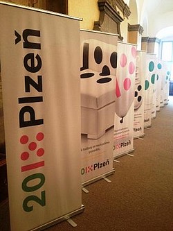
Plzeň has a new logo identical to the project of the European Capital of Culture
 |
| photo: plzen2015.net |
"The title of European City will make Plzeň visible throughout Europe. By adopting the new logo, we proudly identify with the title and the project, from which we expect a significant improvement in the city's life," said Deputy Mayor Eva Herinková (ČSSD). Its adoption will facilitate the city's communication with the public and businesses. Plzeň previously did not have the logo incorporated in its manual for a unified visual style.
The new logo is already on posters for the Pilsner Fest, which will take place on August 31 and September 1. "It is distinct, has a graphic form that integrates well with other logos and, importantly, does not blend in with them, which is why its utility value for us is high. We don't have space for two logos on our materials, which moreover do not communicate with each other," said Jindřiška Eliášková from Plzeňský Prazdroj, a partner of the project.
The change of the logo, planned since last autumn, cost the city 200,000 crowns because the city hall and the Plzeň 2015 company left most documents, gifts, and other items unprinted.
The logo consists of a stylized year 2015 and the word Plzeň. The graphic design is modern and simple, yet the designers drew inspiration from the realities of the city. Five dots symbolize the four rivers merging into one, and the colors are derived from the city coat of arms. It features white, green, black, and instead of red, pink. The logo is variable for different occasions. "There will be different color modifications and an English version," said the deputy mayor.
Similarly, Linz, the Finnish city of Turku, and Maribor in Slovenia unified their logos two to three years before their main cultural year, like Plzeň. "It benefited them because they proudly displayed the title everywhere. And it also had a clear synergistic and economic benefit," said Froyda.
The logo designed by Prague based designers 2011 Designers was selected by the Plzeň 2015 company a year ago. It is based on the project designation, through both the modified flower and the five rivers typical for Plzeň. It is very clean and playful, Froyda added.
The English translation is powered by AI tool. Switch to Czech to view the original text source.
0 comments
add comment
Related articles
0
07.06.2016 | <html>Město Plzeň má nové logo</html>
<html>The city of Plzeň has a new logo</html>
0
16.01.2015 | Plzeň is opening up as a city of culture, the main show is on Saturday
1
01.01.2015 | Plzeň is, from today, the European Capital of Culture
0
20.05.2011 | Plzeň will start looking for the builder of the theater
0
19.05.2011 | Plzeň has officially become the European Capital of Culture 2015
0
09.05.2011 | Plzeň, as the European Capital of Culture 2015, is to receive 100 million CZK from the state
4
13.07.2009 | Plzeň already knows the company for the project documentation for the new theater
0
28.03.2008 | Plzeň will request a study from the studios that have already built the theater
13
11.03.2008 | Plzeň wants a proposal for a new theater only from three studios


