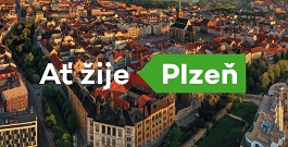
Město Plzeň má nové logo The city of Plzeň has a new logo
 |
"Our goal was to create a logo and visual style that captures the patriotism of the residents and the diversity of the city. This is not just one version of the logo, but an open and playful system. We believe it carries the city's DNA and will gain popularity among the local residents," said the winning company.
The primary colors are green and yellow. The colors are based on the historical emblem, while the logo visually distinguishes Plzeň from the brands of other regional cities on the map. Plzeň will start using the brand immediately, and within approximately two years it should gradually replace the current logo referring to the European Capital of Culture project in promotional materials, business cards, letterheads, as well as, for example, in city organizations or on souvenirs. According to Mayor Martin Zrzavecký, the costs will amount to millions of crowns, but the city would also spend part of the money on promotional materials even without changing the logo.
"There is strength in simplicity. I am convinced that the charm of the new logo will show itself when it is used on various occasions. I said I wanted a logo that people would wear on T-shirts, and I think we succeeded," said the mayor. According to him, the visual style allows for a great number of variations, including humorous phrases referencing the Plzeň dialect or local specifics, such as beer, football, or Škoda cars.
The design was selected and recommended last week by a nine-member committee composed of experts in marketing and graphic design as well as representatives from the city, who approved it today at a special meeting. The competition was held as a small-scale public contract. The city invited nine studios selected from applicants who responded to a call published in February. The cost for processing the winning proposal, logo mutations for the municipality and selected contributory organizations, including complete graphic manuals of the unified visual style, was 1.165 million crowns without VAT.
The English translation is powered by AI tool. Switch to Czech to view the original text source.
0 comments
add comment


