
Euro Palace

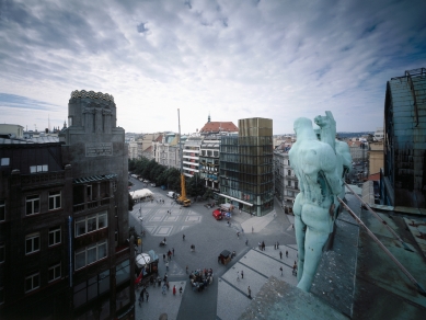
Location
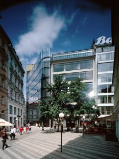
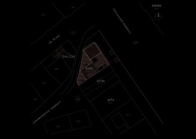
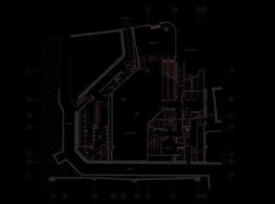
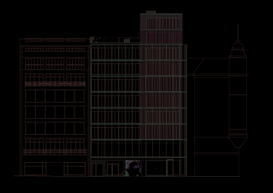
The new building closes a row of structures at the lower end of the western side of Wenceslas Square. On the plot, which approaches a triangular shape, it directly neighbors two significant functionalist "glass" objects (the Astra Palace, the Baťa department store). The predecessor of the Euro Palace was a historic three-story corner house, demolished in the 1970s during the construction of the metro.
Architectural Solution
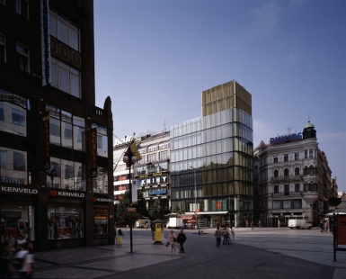
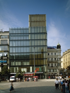
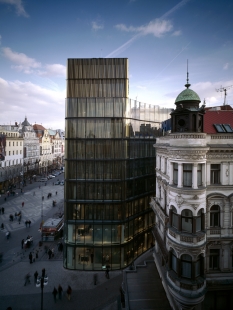
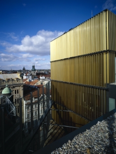
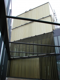
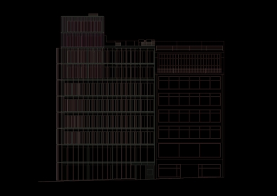
The concept of the design is based on the principle of multilayering and the contrast of “inserted” rectangular mass units with a softly modeled, unifying outer shell. This transparent glass exterior, shaped in a curve in plan, immaterially defines the basic volume of the house. Its delicate appearance is emphasized by using a double-glazed façade with a ventilated air gap. In the background, a contrasting cubic austere mass appears at the corner, formed by a layer of vertical adjustable blinds in a golden color, allowing the regulation of light conditions in the interior. In the most prominent part of the house, this cube breaks through the calm horizontal mass of the outer shell, giving rise to the dominant golden tower – a vertical response to the opposite corner with the Crown Palace, of which the Euro Palace forms a symbolic gateway into the square.
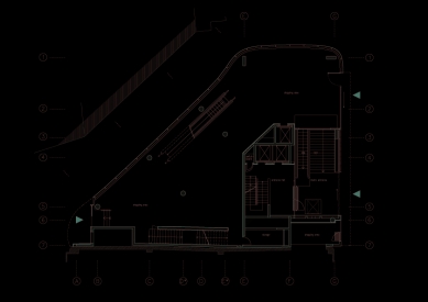
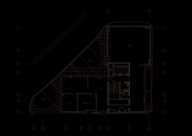
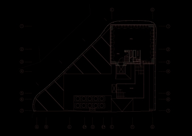
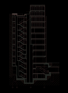
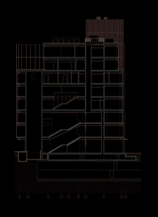
The new building has 3 underground and 10 above-ground floors. On the 6th floor, a terrace with green elements in walkable sandstone pavement is created by retreating the mass of the administrative part. Part of the roof at the level of the last floor, adjacent to the last two floors of the tower, is also utilized for the terrace. This level also contains the last station of one of the elevators, whose atypical design (using a hatch that the cabin lifts onto its roof) minimizes disruptive interventions into the mass of the tower.
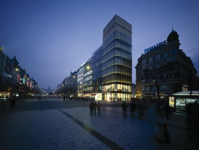
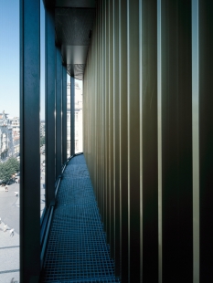
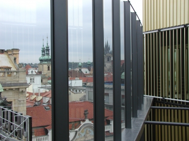
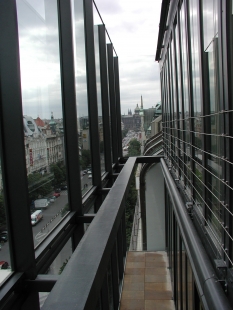
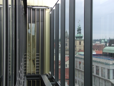
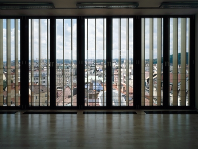
The division and method of glazing the façade correspond to the demand for the highest possible slenderness of the load-bearing elements. The outer glazing is carefully curved throughout the perimeter – no two glasses run parallel – and the corners are formed by arched glasses. All glasses in the outer shell are solid, anchored on a sealed joint, and the ventilation of the double façade is ensured by a system of vent grilles. The cavity is ventilated diagonally and through each floor. This system allows for natural indirect ventilation of all office spaces and positively affects the overall thermal balance of the building throughout all seasons. The inner layer of the façade, starting on the second floor, consists of a series of opening French windows in dark gray aluminum profiles. In the first two above-ground floors, the double façade is reduced to a simple one, and the outer shell here serves a primary insulating function. Outside the area of the tower shaded by the slats, the rest of the building is protected against sunlight with vertical fabric blinds made of special semi-transparent material. In the interest of maintaining the dematerialized smooth appearance of the building, all shading elements are placed in the cavity between the outer and inner shells. At the same time, their various settings, which change automatically according to current lighting conditions, ensure the desired visual variability of the object throughout the day. At night, the façade is closed by retracting the blinds and tilting the rotating slats. The indirect night lighting then gives the tower a festive atmosphere.
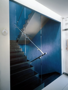
The interior layout was conceived from the beginning to be maximally flexible. The only fixed element passing through all floors is the reinforced concrete core, into which vertical communications and sanitary facilities are concentrated. The mass of this core is another of the "inserted" volumes and is distinguished by surface material and specially illuminated from the joint in the ceiling.
The post-November new buildings in the area of the Prague heritage reserve have brought little joy to architecture lovers. Apart from the Dancing House and a few interesting buildings hidden in courtyards1/, we would hardly be able to recall any other strong and high-quality new work here. A significant part of the responsibility undoubtedly lies with the Prague City Hall, which recklessly sold one plot after another in the city center after 1989, indifferent to whether they would be used only commercially, and rarely ensured that an optimal architectural design of new buildings on these previously municipal lands would be decided by a public competition. But even the rare competitions - for Myslbek, Hypobank, Four Seasons Hotel, for the Sovovy Mlýny or for the house on Karlovo náměstí - failed to secure any extraordinary architectural contribution to the center for various reasons. With the aforementioned exceptions, only average and variously problematic buildings have emerged in the historical parts of Prague over the past twelve years.
Several signs suggested that a similar fate awaited the plot at the lower end of Wenceslas Square, neighboring the functionalist department stores Lindt and Baťa. There once stood a neo-Renaissance house, demolished around the turn of the sixties and seventies for the construction of the metro. Among the attempts to fill it with a good new building, the project of Pavel Kupka from after 1970 and a school design by Markéta Lepilová, a student of Přikryl at the AVU (1991),2/ conceived as an urban cultural and information center, stood out. However, this undoubtedly suitable function meant little to the Prague City Hall, and the plot was sold to a German investment company, which decided to build a commercial and office building on it and commissioned its design to architect Martin Kotík. Among the three alternatives for the building that Kotík's studio worked on since 1997, various commissions and experts from Prague's construction and heritage offices chose the variant combining a building the size of the neighboring Lindt house with a tall and massive tower at the very end of the Wenceslas Square front.3/
This version of Kotík's project faced opposition from the Club for Old Prague, the State Institute for Heritage Protection, heritage conservationists from Platýz, and several creative architects, critics, and architectural historians.4/ I would like to summarize the shortcomings I perceived in it.
It seemed to me that the division of the object into two or even three seemingly separate houses did not correspond to the typical widths of plots on Wenceslas Square. I believe that we should not immediately treat the old parcelation in the historical part of the city as a dogma, as the excellent design of the Senquar department store in Litomyšl by Josef Pleskot's team suffered for in 1992. However, to completely disregard the dimensions and boundary lines of this parcelation is unacceptable in my opinion.
The second weakness of Kotík's project, in my opinion, was that the high volume did not appear above the “mouse hole” as a tower, but rather as a tower building, which does not belong in a historic center, regardless of the fact that we should be vigilant to ensure that the level of Prague’s construction continues to mirror the beautiful Prague terrain.
However, I did not agree with how Martin Kotík shaped and detailed his tower. He treated it as a compact and continuous mass “from bottom to top,” as if it were the tower of an old water tower or town hall. The existing towers in Wenceslas Square do not behave like that. The towers of Schulz's National Museum, the Ligna Palace, the Krone department store, the ČKD building by Šrámek, or the opposing Crown by Antonín Pfeiffer, which is especially important for the context of our new construction, always have the character of an addition to a relatively independent block. This motif of the block and its tower-like addition has settled almost as a type in the area of Wenceslas Square. I acknowledge that we do not have to approach even such typical solutions as dogmas. Nevertheless, I consider them a beneficial guideline for how to behave in a heritage-valuable environment;5/ a reliable scheme that a creative architect can fill with any stylistic content.
I devoted so much attention to Kotík's project, which developed further after the conflict with heritage protectionists,6/ because it ultimately received a building permit, and the realized new building by architects Doležal, Malinský, Burian, and Pokorný from the DaM studio had to respect its basic features, which, by the way, the German investor reportedly desired. It is therefore worth noting how the realized work dealt with the weaknesses of its predecessor. The study by the Doležal-Malinský-Burian-Pokorný team from December 1999 was based on the idea of a continuous semi-transparent shell that would envelop the smaller house and the tower on three sides, so that it would only shine through this envelope or emerge from it at the top. The ratio between the width of the smaller house and the tower acquired a better proportion, more in line with the old parcelation, with the visibly prominent part now significantly dominating only the upper part of the tower itself. Additionally, the DaM architects slimmed down this tower compared to Kotík's project and cautiously trimmed it at the bottom to disrupt the principle of “from bottom to top.” Where it turned to the remnants of the medieval urbanization of New Town, its semi-transparent glass envelope received an elegant curve, somewhat similar to Foster's Willis, Faber and Dumas building in Ipswich (1975), while in Wenceslas Square, it beautifully straightened. And where the flow of the envelope did not coincide with the footprint of the functional volumes organized in an L-shape, the architects left empty courtyards in the upper floors, enclosing the envelope on the outer side like an almost false backdrop, much like Jean Nouvel did during the renovation of the theater in Belfort (1984) or in the new construction of the Fondation Cartier in Paris (1995). When working on the study, the architects finally pondered how to connect the edges of the envelope at the top to the terraced top of the neighboring Lindt house. However, they ultimately addressed this problem with a casual and again somewhat Nouvel-like charm, as if their glass shell should behave everywhere like a gently bent sheet of paper with untrimmed edges.
Thus, it seems that the architects from the DaM studio recognized the contentious points of Martin Kotík's project and eliminated them in their December 1999 study. In the later phases of their own project, other ideas and the investor's demands, who naturally cared that business and office areas were not reduced anywhere, entered into it. The favorable and less favorable consequences of this further development of the project can already be observed in the realized form of the work by the Doležal-Malinský-Burian-Pokorný team, erected between 2001 and 2002.
With almost complete success, they managed to realize the glass transparent shell of the building with its gentle curves. Where it is supposed to act as a mirror to the old buildings next to it, it is appropriately reflective; and where the pulsating life inside the building is to shine through it, that life properly shines through, both day and night.
However, the problem certainly lies in the degree of transparency of this envelope, particularly in the most sensitive part of the entire building, in its tower section. We no longer perceive the presence of the tower volume only in its upper protruding part, as I believe the “typology” of Wenceslas Square demands. The tower now shines through the envelope along its entire height. This impression is further emphasized by the material design, which is different from the neighboring lower section: golden vertical blinds that can be adjusted at different angles against the sun on each floor, allowing the building to change its appearance throughout the day.
The second problem, then, lies in the width proportions of this tower. In the 1999 study, its footprint measured 5x6 modular elements. However, the investor probably found the interior spaces of the tower too cramped and insisted on widening them by one modular element on each side. I believe that this seemingly insignificant adjustment caused the architects to exceed the correct boundary. The tower now appears too massive to me and excessively draws attention to itself. The idea of a dominant shell, from which the tower emerges at the top, has shifted here to the idea of a dominant enveloped tower. The mutual proportions of the volumes within the envelope have thus changed as well. And I truly regret that this shift, which I do not consider fortunate, was caused here solely by the short-sighted desire of the investor to gain just a few more rentable square meters. But how beautifully and with such technical elegance the architects wrapped their golden tower! How many impressive visual experiences this new building provides us, whether on its own or in interaction with its neighbors! My personal favorite is the harmony of the vertical glass fold on the edge of the rear façade into Jungmann Square with the horizontal glass fold of the sixth floor of the Lindt house. The new building certainly has other flaws beyond those I mentioned; they are currently being discussed in the newspapers.7/ However, in my opinion, its merits clearly outweigh its drawbacks. We can now add another building, along with the Dancing House as the only truly beneficial building in the historic center of Prague in the last ten years.
NOTES
1/ See Literární noviny XIII, no. 24, 10.6.2002, p. 13.
2/ Emil Přikryl and his school. GJF, Prague 1995, p. 62.
3/ Martin Kotík, Omicron-K, architectural studio. GJF, Prague 1999
4/ Compare Architekt XLIV, 1998, no. 1-2, p. 6-8. - Právo VIII, no. 27, 2.2.1998, no. 8. - Architekt XLIV, 1998, no. 9, p. 10-12,33-41.
5/ See also Ernst H. Gombrich, “The Beauty of Old Towns.” Architekt XLIV, 1998, no. 25-26, p. 76-78.
6/ Martin Kotík, Omicron-K (cited in note 3), pp. 10, 56-59.
7/ Mladá fronta Dnes XIII, no. 158, 10.7.2002, p. D3. - Právo XII, no. 160, 12.7.2002, p. 16.
The new building closes a row of structures at the lower end of the western side of Wenceslas Square. On the plot, which approaches a triangular shape, it directly neighbors two significant functionalist "glass" objects (the Astra Palace, the Baťa department store). The predecessor of the Euro Palace was a historic three-story corner house, demolished in the 1970s during the construction of the metro.
Architectural Solution
The concept of the design is based on the principle of multilayering and the contrast of “inserted” rectangular mass units with a softly modeled, unifying outer shell. This transparent glass exterior, shaped in a curve in plan, immaterially defines the basic volume of the house. Its delicate appearance is emphasized by using a double-glazed façade with a ventilated air gap. In the background, a contrasting cubic austere mass appears at the corner, formed by a layer of vertical adjustable blinds in a golden color, allowing the regulation of light conditions in the interior. In the most prominent part of the house, this cube breaks through the calm horizontal mass of the outer shell, giving rise to the dominant golden tower – a vertical response to the opposite corner with the Crown Palace, of which the Euro Palace forms a symbolic gateway into the square.
The new building has 3 underground and 10 above-ground floors. On the 6th floor, a terrace with green elements in walkable sandstone pavement is created by retreating the mass of the administrative part. Part of the roof at the level of the last floor, adjacent to the last two floors of the tower, is also utilized for the terrace. This level also contains the last station of one of the elevators, whose atypical design (using a hatch that the cabin lifts onto its roof) minimizes disruptive interventions into the mass of the tower.
The division and method of glazing the façade correspond to the demand for the highest possible slenderness of the load-bearing elements. The outer glazing is carefully curved throughout the perimeter – no two glasses run parallel – and the corners are formed by arched glasses. All glasses in the outer shell are solid, anchored on a sealed joint, and the ventilation of the double façade is ensured by a system of vent grilles. The cavity is ventilated diagonally and through each floor. This system allows for natural indirect ventilation of all office spaces and positively affects the overall thermal balance of the building throughout all seasons. The inner layer of the façade, starting on the second floor, consists of a series of opening French windows in dark gray aluminum profiles. In the first two above-ground floors, the double façade is reduced to a simple one, and the outer shell here serves a primary insulating function. Outside the area of the tower shaded by the slats, the rest of the building is protected against sunlight with vertical fabric blinds made of special semi-transparent material. In the interest of maintaining the dematerialized smooth appearance of the building, all shading elements are placed in the cavity between the outer and inner shells. At the same time, their various settings, which change automatically according to current lighting conditions, ensure the desired visual variability of the object throughout the day. At night, the façade is closed by retracting the blinds and tilting the rotating slats. The indirect night lighting then gives the tower a festive atmosphere.
The interior layout was conceived from the beginning to be maximally flexible. The only fixed element passing through all floors is the reinforced concrete core, into which vertical communications and sanitary facilities are concentrated. The mass of this core is another of the "inserted" volumes and is distinguished by surface material and specially illuminated from the joint in the ceiling.
The post-November new buildings in the area of the Prague heritage reserve have brought little joy to architecture lovers. Apart from the Dancing House and a few interesting buildings hidden in courtyards1/, we would hardly be able to recall any other strong and high-quality new work here. A significant part of the responsibility undoubtedly lies with the Prague City Hall, which recklessly sold one plot after another in the city center after 1989, indifferent to whether they would be used only commercially, and rarely ensured that an optimal architectural design of new buildings on these previously municipal lands would be decided by a public competition. But even the rare competitions - for Myslbek, Hypobank, Four Seasons Hotel, for the Sovovy Mlýny or for the house on Karlovo náměstí - failed to secure any extraordinary architectural contribution to the center for various reasons. With the aforementioned exceptions, only average and variously problematic buildings have emerged in the historical parts of Prague over the past twelve years.
Several signs suggested that a similar fate awaited the plot at the lower end of Wenceslas Square, neighboring the functionalist department stores Lindt and Baťa. There once stood a neo-Renaissance house, demolished around the turn of the sixties and seventies for the construction of the metro. Among the attempts to fill it with a good new building, the project of Pavel Kupka from after 1970 and a school design by Markéta Lepilová, a student of Přikryl at the AVU (1991),2/ conceived as an urban cultural and information center, stood out. However, this undoubtedly suitable function meant little to the Prague City Hall, and the plot was sold to a German investment company, which decided to build a commercial and office building on it and commissioned its design to architect Martin Kotík. Among the three alternatives for the building that Kotík's studio worked on since 1997, various commissions and experts from Prague's construction and heritage offices chose the variant combining a building the size of the neighboring Lindt house with a tall and massive tower at the very end of the Wenceslas Square front.3/
This version of Kotík's project faced opposition from the Club for Old Prague, the State Institute for Heritage Protection, heritage conservationists from Platýz, and several creative architects, critics, and architectural historians.4/ I would like to summarize the shortcomings I perceived in it.
It seemed to me that the division of the object into two or even three seemingly separate houses did not correspond to the typical widths of plots on Wenceslas Square. I believe that we should not immediately treat the old parcelation in the historical part of the city as a dogma, as the excellent design of the Senquar department store in Litomyšl by Josef Pleskot's team suffered for in 1992. However, to completely disregard the dimensions and boundary lines of this parcelation is unacceptable in my opinion.
The second weakness of Kotík's project, in my opinion, was that the high volume did not appear above the “mouse hole” as a tower, but rather as a tower building, which does not belong in a historic center, regardless of the fact that we should be vigilant to ensure that the level of Prague’s construction continues to mirror the beautiful Prague terrain.
However, I did not agree with how Martin Kotík shaped and detailed his tower. He treated it as a compact and continuous mass “from bottom to top,” as if it were the tower of an old water tower or town hall. The existing towers in Wenceslas Square do not behave like that. The towers of Schulz's National Museum, the Ligna Palace, the Krone department store, the ČKD building by Šrámek, or the opposing Crown by Antonín Pfeiffer, which is especially important for the context of our new construction, always have the character of an addition to a relatively independent block. This motif of the block and its tower-like addition has settled almost as a type in the area of Wenceslas Square. I acknowledge that we do not have to approach even such typical solutions as dogmas. Nevertheless, I consider them a beneficial guideline for how to behave in a heritage-valuable environment;5/ a reliable scheme that a creative architect can fill with any stylistic content.
I devoted so much attention to Kotík's project, which developed further after the conflict with heritage protectionists,6/ because it ultimately received a building permit, and the realized new building by architects Doležal, Malinský, Burian, and Pokorný from the DaM studio had to respect its basic features, which, by the way, the German investor reportedly desired. It is therefore worth noting how the realized work dealt with the weaknesses of its predecessor. The study by the Doležal-Malinský-Burian-Pokorný team from December 1999 was based on the idea of a continuous semi-transparent shell that would envelop the smaller house and the tower on three sides, so that it would only shine through this envelope or emerge from it at the top. The ratio between the width of the smaller house and the tower acquired a better proportion, more in line with the old parcelation, with the visibly prominent part now significantly dominating only the upper part of the tower itself. Additionally, the DaM architects slimmed down this tower compared to Kotík's project and cautiously trimmed it at the bottom to disrupt the principle of “from bottom to top.” Where it turned to the remnants of the medieval urbanization of New Town, its semi-transparent glass envelope received an elegant curve, somewhat similar to Foster's Willis, Faber and Dumas building in Ipswich (1975), while in Wenceslas Square, it beautifully straightened. And where the flow of the envelope did not coincide with the footprint of the functional volumes organized in an L-shape, the architects left empty courtyards in the upper floors, enclosing the envelope on the outer side like an almost false backdrop, much like Jean Nouvel did during the renovation of the theater in Belfort (1984) or in the new construction of the Fondation Cartier in Paris (1995). When working on the study, the architects finally pondered how to connect the edges of the envelope at the top to the terraced top of the neighboring Lindt house. However, they ultimately addressed this problem with a casual and again somewhat Nouvel-like charm, as if their glass shell should behave everywhere like a gently bent sheet of paper with untrimmed edges.
Thus, it seems that the architects from the DaM studio recognized the contentious points of Martin Kotík's project and eliminated them in their December 1999 study. In the later phases of their own project, other ideas and the investor's demands, who naturally cared that business and office areas were not reduced anywhere, entered into it. The favorable and less favorable consequences of this further development of the project can already be observed in the realized form of the work by the Doležal-Malinský-Burian-Pokorný team, erected between 2001 and 2002.
With almost complete success, they managed to realize the glass transparent shell of the building with its gentle curves. Where it is supposed to act as a mirror to the old buildings next to it, it is appropriately reflective; and where the pulsating life inside the building is to shine through it, that life properly shines through, both day and night.
However, the problem certainly lies in the degree of transparency of this envelope, particularly in the most sensitive part of the entire building, in its tower section. We no longer perceive the presence of the tower volume only in its upper protruding part, as I believe the “typology” of Wenceslas Square demands. The tower now shines through the envelope along its entire height. This impression is further emphasized by the material design, which is different from the neighboring lower section: golden vertical blinds that can be adjusted at different angles against the sun on each floor, allowing the building to change its appearance throughout the day.
The second problem, then, lies in the width proportions of this tower. In the 1999 study, its footprint measured 5x6 modular elements. However, the investor probably found the interior spaces of the tower too cramped and insisted on widening them by one modular element on each side. I believe that this seemingly insignificant adjustment caused the architects to exceed the correct boundary. The tower now appears too massive to me and excessively draws attention to itself. The idea of a dominant shell, from which the tower emerges at the top, has shifted here to the idea of a dominant enveloped tower. The mutual proportions of the volumes within the envelope have thus changed as well. And I truly regret that this shift, which I do not consider fortunate, was caused here solely by the short-sighted desire of the investor to gain just a few more rentable square meters. But how beautifully and with such technical elegance the architects wrapped their golden tower! How many impressive visual experiences this new building provides us, whether on its own or in interaction with its neighbors! My personal favorite is the harmony of the vertical glass fold on the edge of the rear façade into Jungmann Square with the horizontal glass fold of the sixth floor of the Lindt house. The new building certainly has other flaws beyond those I mentioned; they are currently being discussed in the newspapers.7/ However, in my opinion, its merits clearly outweigh its drawbacks. We can now add another building, along with the Dancing House as the only truly beneficial building in the historic center of Prague in the last ten years.
Rostislav Švácha, written for ARCHITEKT 8/2002
NOTES
1/ See Literární noviny XIII, no. 24, 10.6.2002, p. 13.
2/ Emil Přikryl and his school. GJF, Prague 1995, p. 62.
3/ Martin Kotík, Omicron-K, architectural studio. GJF, Prague 1999
4/ Compare Architekt XLIV, 1998, no. 1-2, p. 6-8. - Právo VIII, no. 27, 2.2.1998, no. 8. - Architekt XLIV, 1998, no. 9, p. 10-12,33-41.
5/ See also Ernst H. Gombrich, “The Beauty of Old Towns.” Architekt XLIV, 1998, no. 25-26, p. 76-78.
6/ Martin Kotík, Omicron-K (cited in note 3), pp. 10, 56-59.
7/ Mladá fronta Dnes XIII, no. 158, 10.7.2002, p. D3. - Právo XII, no. 160, 12.7.2002, p. 16.
The English translation is powered by AI tool. Switch to Czech to view the original text source.


0 comments
add comment