Gantenbein Winery

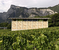 |
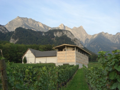
The project was realised as an extension of a small but remarkably successful vineyard. The wine producers wanted a new service building, consisting of a large fermentation room for processing grapes, a cellar dug into the ground for storing the wine barrels, and a roof terrace for wine tastings and receptions. Bearth & Deplazes Architects designed the project, and it was already under construction when they invited us to design its façade.
The initial design proposed a simple concrete skeleton filled with bricks: The masonry acts as a temperature buffer, as well filtering the sunlight for the fermentation room behind it. The bricks are so offset so that daylight penetrates the hall through the gaps between the bricks. Direct sunlight, which would have a detrimental effect on the fermentation, is however excluded. Polycarbonate panels are mounted inside to protect against wind. On the upper floor, the bricks form the balustrade of the roof terrace.
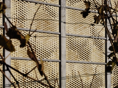
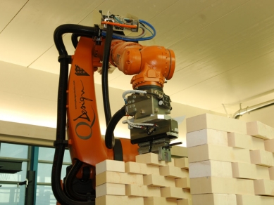
The robotic production method that we developed at the ETH enabled us to lay each one of the 20,000 bricks precisely according to programmed parameters—at the desired angle and at the exact prescribed intervals. This allowed us to design and construct each wall to posses the desired light and air permeability, while creating a pattern that covers the entire building façades. According to the angle at which they are set, the individual bricks each reflect light differently and thus take on different degrees of lightness. Similarly to pixels on a computer screen they add up to a distinctive image and thus communicate the identity of the vineyard. In contrast to a two-dimensional screen, however, there is a dramatic play between plasticity, depth and colour, dependent on the viewer’s position and the angle of the sun.
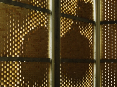
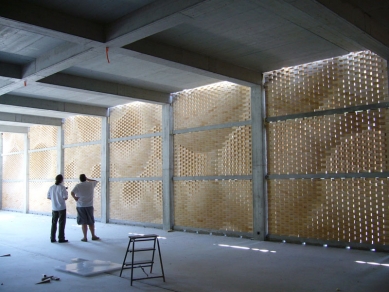
The masonry of the vineyard’s façade looks like an enormous basket filled with grapes. At closer view – in contrast to its pictorial effect at a distance – the sensual, textile softness of the walls dissolves into the materiality of the stonework. The observer is surprised that the soft, round forms are actually composed of individual, hard bricks. The façade appears as a solidified dynamic form, in whose three-dimensional depth the viewer’s eye is invited to wander. In the interior, the daylight that penetrates creates a mild, yet luminous atmosphere. Looking towards the light, the design becomes manifest in its modulation through the open gaps. It is superimposed on the image of the landscape that glimmers through at different levels of definition according to the perceived contrast.
Falling Spheres
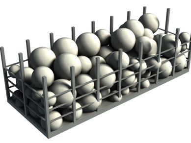
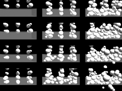
To create the façade, we designed a generation process. We interpreted the concrete frame construction by Bearth & Deplazes as a basket and filled it with abstract, oversized grapes of varying diameters. We digitally simulated gravity to make the grapes fall into this virtual basket, until they were closely packed. Then we viewed the result from all four sides and transferred the digital image data to the rotation of the individual bricks. On the built façades, the visitor discerns gigantic, synthetic grapes, which were virtually inside the building as we developed our design.
However, the architectural implications of this brick façade are more elaborate and diverse than those of a two-dimensional image. To the human eye, able to detect even the finest difference in colour and lightness, the subtle deflection of the bricks create an appearance and plasticity that is constantly changing along with the movement of the observer and of the sun over the course of the day.
The joints between the bricks were left open to create transparency and allow daylight to trickle into the building. In order to make the pattern discernible from the interior we laid the bricks as close together as possible so that the gap at full deflection was nearly closed. This produced a maximum contrast between the open and the closed joints and allowed the light to model the interior walls poetically.
Bricklaying
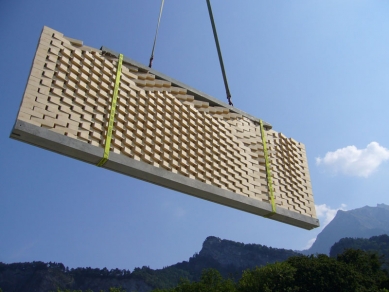
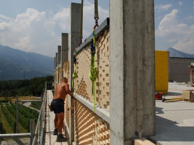
The wall elements were manufactured as a pilot project in our research facilities at the ETH Zurich, transported by lorry to the construction site, and installed using a crane. Because construction was already quite advanced, we had only three months before assembly on site. This made manufacturing the 72 façade elements a challenge both technologically and in terms of deadlines. As the robot could be driven directly by the design data, without our having to produce additional implementation drawings, we were able to work on the design of the façade up to the very last minute before starting production.
To accelerate the manufacturing process for the 400 square metre façade, we had to develop an automated process for applying the two-component bonding agent. Because each brick has a different rotation, every single brick has a different and unique overlap with the brick below it, and the one below that. Together with the brick manufacturer’s engineer, we established a method in which four parallel bonding agent paths are applied, for each brick individually, at pre-defined intervals to the central axis of the wall element. Load tests performed on the first elements manufactured revealed that the bonding agent was so structurally effective that the reinforcements normally required for conventional prefabricated walls were unnecessary.
Project Team: G&K: Tobias Bonwetsch, Michael Knauss, Silvan Oesterle ETH: Tobias Bonwetsch, Michael Lyrenmann, Daniel Abraha, Stephan Achermann, Christoph Junk, Andri Lüscher, Martin Tann
Gramazio & Kohler Architektur und Städtebau
2 comments
add comment
Subject
Author
Date
ondro
20.09.09 05:03
video
tomasgunis
20.09.09 08:15
show all comments


