The Czech House in Bratislava

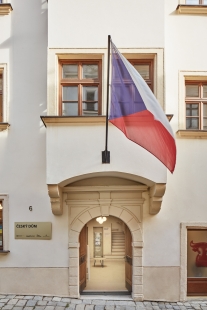
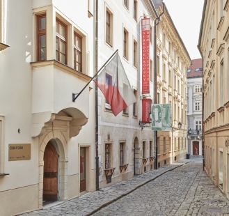
The Czech Centre in Bratislava was housed in the Czech Embassy building until recently (till 2019). The Centre's rich cultural and social activities, much popular in Bratislava, deserved a change in the form of an independent Czech House, the same as the Slovak House (Institute) in Prague. A charming, although small, Renaissance townhouse in Prepoštská No. 6 in the pedestrian zone in downtown Bratislava was selected for the new seat.
The Czech House was inaugurated still in its old state at the new address during the celebrations of the 30th anniversary of the Velvet Revolution in November 2019. This listed building from the beginning of the 17th century was renovated approximately 30 years ago and converted from a single-family house to an office building. So, it needed some structural modifications and had to get a new Certificate of Use to meet its new function as the Czech House and serve as a social and cultural centre with public gathering areas.
The client's brief was to create a dignified and representative centre of Czech cultural diplomacy that would contribute to a comprehensive presentation of the Czech Republic in Slovakia, promote culture, science, and technology, as well as an information and contact place for the public.
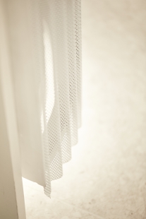
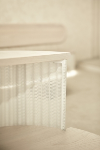
The urgent need to establish multifunctional spaces, ideally on the ground floor of the building directly connected to the street and strict fire safety rules, were the most challenging tasks the building and interior design had to meet. The fire requirements were those principal ones that further influenced the overall appearance of the interior, including the used materials. Due to the requirements for non-flammable materials in the lobby and throughout the partially protected escape route, corrugated perforated sheet metal and metal details (e.g., railings) were chosen as the predominant material for the interior elements.
The design of the new interior, on the contrary, is representative and minimalist, like a neutral envelope uplifting the Renaissance spirit of the building while letting the future accents in the colours of the national tricolour stand out in the form of fine details of the furnishings and the information system of the Czech Centres. Furthermore, the neutral character of the space allows the displayed works of Czech design and art to stand out.
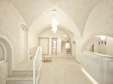
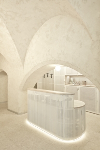
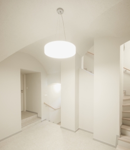
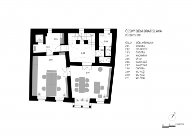
The representative vaulted spaces on the ground floor were given special attention. From the street, one enters the lobby with a reception area (formerly the entrance for horse-drawn carriages). On our first inspection of the building, we discovered a spacious hall with a vaulted ceiling to the left of the lobby, that had the desired potential for multi-purpose use. However, the hall had been originally entered from the rear through a narrow, unsightly corridor.
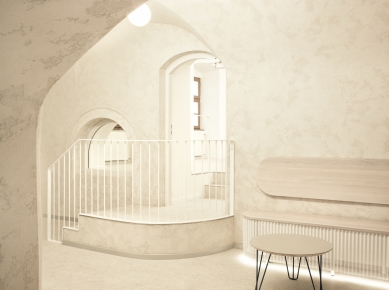
The entrance to the hall around the corner did not suit future purposes and made no sense to us from a historical point of view. That is why we decided to search the archives of the Municipal Office for the Preservation of Monuments (MUOP). We could discover the passage between the hall and the adjacent hall not only in old documents and period photographs from the 19th century but also by careful structural engineering survey on the site. After gathering sufficient evidence, the preservationists gave us the go-ahead to restore this passage. But that was not the end of the story. Insensitive structural interventions in the 1970s significantly increased the floor composition in the hall. For economical and structural reasons, removing these additional layers was not desirable. As architects, together with structural engineers, we had to deal with a difficult situation and find a solution how to connect rooms with significant floor height differences (approx. 70 cm) and, at the same time, maintain a sufficiently high headroom without structurally interfering with the vault's load-bearing structure with the impost of the adjacent lunette. To overcome the height difference, we designed a staircase with a curved landing in the lobby so that it would interfere as little as possible in the direction of escape from the building.
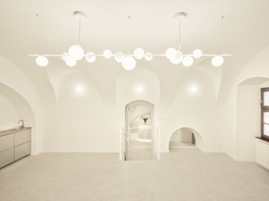
The multi-purpose hall is designed for various social events. It offers a range of uses, including exhibitions, social gatherings, and lectures. In addition, the lobby with a reception area includes a small gathering space where small items designed by Czech designers can be displayed and sold. By interconnecting the two rooms, the potential of the building's ground floor could be fully exploited for social purposes and even further extended to the street's exterior through the designed window gallery in the shop window behind the reception. We are happy that by designing the ground floor, we could contribute to creating the Prepoštská United phenomenon.
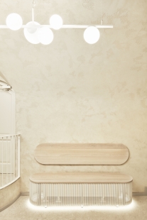
The built-in reception furniture, benches, and built-in cabinetry behind the reception desk are designed with perforated and corrugated white sheet metal on a steel frame structure with solid bleached oak countertops. The design's transparency, lamination, and backlighting make the furniture look light and elegant. The main design criteria were the flame retardant materials, the imaginative nature of the entire ensemble, and the spatial austerity considering the narrow space of the entrance hall. The monochromatic "envelope" of the space consists of a floor made of large-format ceramics tiles á la cement screed together with cement screed on the walls and vaults.
The iconic element of the ground floor is the original 3-meter-long chandelier made of tubular steel and hand-blown opal glass harmonizing with the lobby's vaulted space and the multi-purpose hall. We designed it exclusively for the Czech House in Bratislava in cooperation with the traditional Czech lighting company LUCIS.
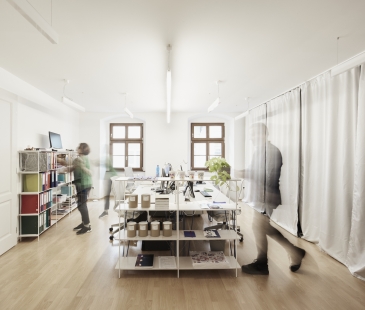
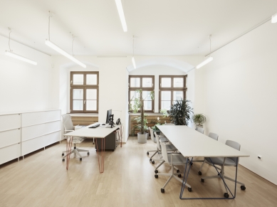
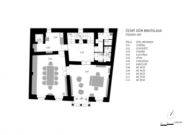
The concept of the interior of the Czech House in Bratislava is based on the promotion and maximum use of original Czech design and artisanship intended to represent the Czech Republic abroad with dignity. The other two floors serving as offices with meeting spaces are designed with lightweight MASTER & MASTER office furniture made of steel bar stock combined with oak plywood clad in natural Marmoleum.
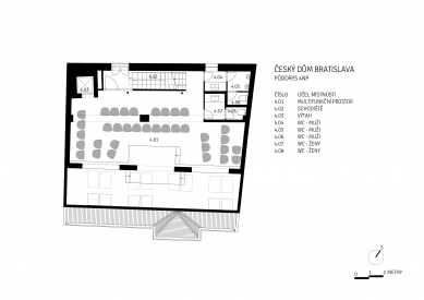
The attic houses another multi-purpose exhibition, cultural, and social space. But it was only minimally modified due to the lower priority.
The façade of the Czech House in Bratislava underwent partial cultivation, especially on the ground floor. The surfaces were unified, and mobile exhibition banners were placed there.
The exhibition space also includes a shop window area that functions as a window gallery and offers showcases of upcoming exhibitions, events, or Czech art, often in collaboration with the neighbouring House of Photography.
The Czech House's interior has an airy, democratic, friendly, natural, creative, and modern feel, just like the institution seated in it.
0 comments
add comment


