
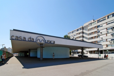
Metro station Casa da Música
Station Casa da Música


The metro project in the Port is based on two station typology variants that repeat without alteration. This project also had to face many difficulties to achieve compatibility between the strict technical standards of a transport system like the metro and the random topography of the city's historical center. In the preparatory phase of this project, I collaborated as the responsible person for the entire project with a group of construction companies.
It was planned to design ten new stations. I decided to take just one for myself and distribute the other nine among my architect friends. The decisive requirement for selecting candidates was the following: the chosen architect had to have some project experience in this area for the entire 80 km length of the new metro route. The candidate architect had to be someone who had either worked in the council for the construction of a new station or someone who had previously completed another project in the given area.
Thus, Alciono Soutinho designed the Mathosinhos metro station, Fernando Távora the airport station, and Álvaro Siza, with whom I had previously collaborated on the city center revitalization project, the station in the historic center of Porto. Everything that initially appeared as an obstacle, something that was a closed and inaccessible whole, suddenly transformed into a great stimulus within the project aimed at reshaping and reconstructing the historic center.
The project, among other things, included subtle changes to the street elevation, transitions between paving, sidewalks, gardens, trees, lighting, and urban furniture. This is just a fraction of what the city lacked and what had to be realized in the new metro project as part of the revitalization. When designing a metro route, it is crucial to use quality materials. We must realize that 30,000 to 40,000 people travel by metro daily. It is necessary to unify the lighting, design the same number of stairs that can be utilized uniformly in all stations, and manage with a minimal budget.
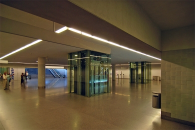
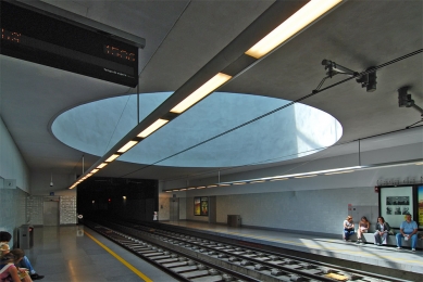
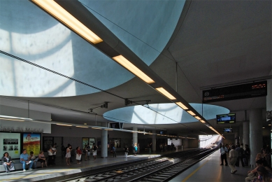
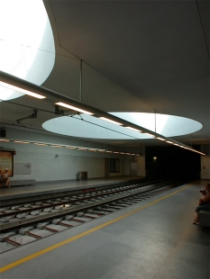
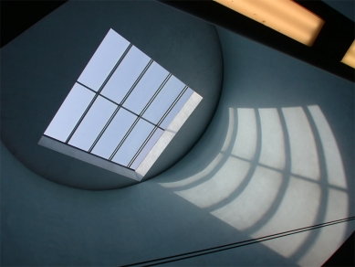
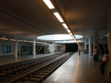
The Casa da Música station is somewhat specific in that it is intended as an interchange station for trams and buses. This was one of the reasons why the ceiling varies in height from three to five meters. As I mentioned, the basic rule is that one must study very important details well, such as the stainless steel elevator, so that the elements can subsequently be adapted to the other stations. The snow-white color of the station interiors contrasts with the blue circular lighting units that seem to float in space. These units do not touch the ceiling and are illuminated at the perimeter by a strip of light. When you enter the station, you will notice that these circular units are actually two large skylights that supply the interior with natural light.
Another problem that had to be solved was the placement of the regular staircase right next to the escalator. In searching for a suitable solution to this problem, we conducted several tests using models, which helped us find an adequate alignment between the two levels. Thanks to the models, we also verified the connection of the steep stairs with the main structure. The relationship between these two types of stairs seems simple, but it is one of the most complicated things to solve. Just go and look at Milan's Malpensa Airport, and you will see that such staircases are never placed next to each other – there is always a wall dividing them.
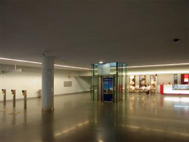
In the interiors of the stations, I used blue cladding. From the colors, I selected black, gray, or white for the ceilings. I chose homogeneous or direct lighting. To cover the installations located in the ceilings, I created a type of panel made from 14x14 cm tiles that act like mirrors and prevent seeing the installations. During the excavation work in the main hall of the station, we encountered an archaeological find. It was the remains of a former medieval aqueduct. It was not easy at all to convince the construction company that the initial project needed to be adjusted to build an intermediate floor. Fortunately, public opinion and the local press greatly supported us in defending our position. So, in the end, I designed a sort of ledge from which the function of this water distribution device can be observed. I decided to replace the entire perimeter of the aqueduct ruins with industrial gray granite paving and make the paving in chestnut color with a hint of gray, which is a color that more closely resembles the natural color of soil. I wanted the remnants of the aqueduct not to stand out like an exhibit, but to appear as if it was intended as part of the design.
It was planned to design ten new stations. I decided to take just one for myself and distribute the other nine among my architect friends. The decisive requirement for selecting candidates was the following: the chosen architect had to have some project experience in this area for the entire 80 km length of the new metro route. The candidate architect had to be someone who had either worked in the council for the construction of a new station or someone who had previously completed another project in the given area.
Thus, Alciono Soutinho designed the Mathosinhos metro station, Fernando Távora the airport station, and Álvaro Siza, with whom I had previously collaborated on the city center revitalization project, the station in the historic center of Porto. Everything that initially appeared as an obstacle, something that was a closed and inaccessible whole, suddenly transformed into a great stimulus within the project aimed at reshaping and reconstructing the historic center.
The project, among other things, included subtle changes to the street elevation, transitions between paving, sidewalks, gardens, trees, lighting, and urban furniture. This is just a fraction of what the city lacked and what had to be realized in the new metro project as part of the revitalization. When designing a metro route, it is crucial to use quality materials. We must realize that 30,000 to 40,000 people travel by metro daily. It is necessary to unify the lighting, design the same number of stairs that can be utilized uniformly in all stations, and manage with a minimal budget.
The Casa da Música station is somewhat specific in that it is intended as an interchange station for trams and buses. This was one of the reasons why the ceiling varies in height from three to five meters. As I mentioned, the basic rule is that one must study very important details well, such as the stainless steel elevator, so that the elements can subsequently be adapted to the other stations. The snow-white color of the station interiors contrasts with the blue circular lighting units that seem to float in space. These units do not touch the ceiling and are illuminated at the perimeter by a strip of light. When you enter the station, you will notice that these circular units are actually two large skylights that supply the interior with natural light.
Another problem that had to be solved was the placement of the regular staircase right next to the escalator. In searching for a suitable solution to this problem, we conducted several tests using models, which helped us find an adequate alignment between the two levels. Thanks to the models, we also verified the connection of the steep stairs with the main structure. The relationship between these two types of stairs seems simple, but it is one of the most complicated things to solve. Just go and look at Milan's Malpensa Airport, and you will see that such staircases are never placed next to each other – there is always a wall dividing them.
In the interiors of the stations, I used blue cladding. From the colors, I selected black, gray, or white for the ceilings. I chose homogeneous or direct lighting. To cover the installations located in the ceilings, I created a type of panel made from 14x14 cm tiles that act like mirrors and prevent seeing the installations. During the excavation work in the main hall of the station, we encountered an archaeological find. It was the remains of a former medieval aqueduct. It was not easy at all to convince the construction company that the initial project needed to be adjusted to build an intermediate floor. Fortunately, public opinion and the local press greatly supported us in defending our position. So, in the end, I designed a sort of ledge from which the function of this water distribution device can be observed. I decided to replace the entire perimeter of the aqueduct ruins with industrial gray granite paving and make the paving in chestnut color with a hint of gray, which is a color that more closely resembles the natural color of soil. I wanted the remnants of the aqueduct not to stand out like an exhibit, but to appear as if it was intended as part of the design.
The English translation is powered by AI tool. Switch to Czech to view the original text source.


0 comments
add comment