Sample flat Opletalova

Layout — This was a reconstruction of a typical, rather old Prague building. We were asked to create a sample flat. Thanks to the initial stage of the reconstruction, we had a possibility to change the layout completely and, therefore, to design a practical flat of 60 square metres. The flat is divided into several zones. The first zone is an entrance hall which is entered through the main door from the courtyard balcony. A tailor-made, built-in high cabinet is designed to be in the hall in the future and will contain a washing machine and a dryer, as well as storage space and a shoe rack. For practical reasons, we maintained the separation of the bathroom and the toilet. The next zone is entered through a glass door above which there is a glazed opening allowing natural daily light to diffuse onwards. Here we see a kitchen and a dining corner, incl. an extraordinary storage space. The third zone is a spacious living room with a reading corner. An added value of this interior consists in a dais where the forth zone is available, i.e. a bedroom, built-in wardrobes and a cosmetic corner.
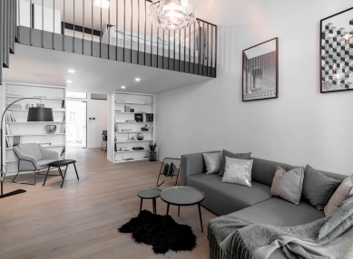
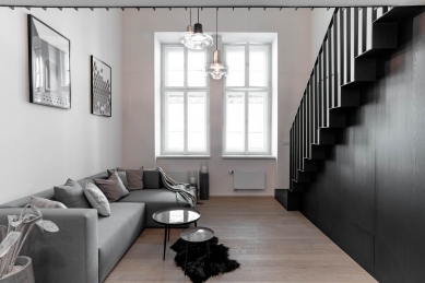
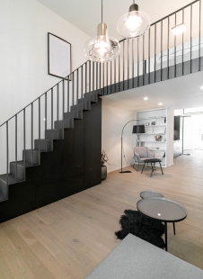
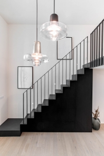
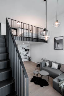
Concept / Colours / Materials — Thanks to the high ceiling and the longitudinal shape of the flat we were able to keep the light concept. A light colour on the walls and a light floor with the whitened-oak surface finish reflects the daily light. Furniture and equipment are mostly white and grey, whereas in the kitchen and storage space under the staircase we selected a dark material as a contrast. Steel tiny elements, such as the staircase and the handrail, add lines to the interior that divide the space optically.
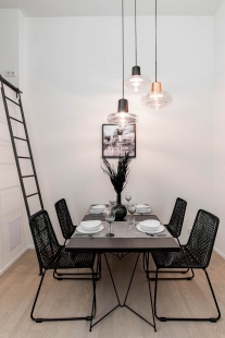
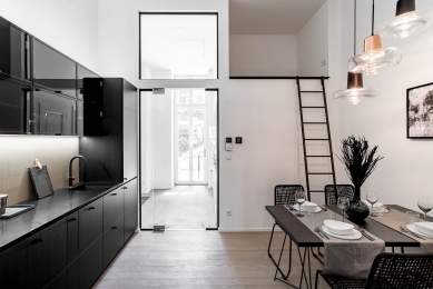
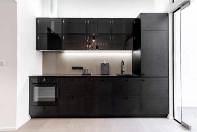
Kitchen and dining room — What will draw your attention first when you enter the dining room is the Lasvit lighting, consisting of three sections, suspended at three levels. The dining table for four to five people was made to measure. Its geometric leg is made by the brand Master & Master. The table board is in the dark-wood colour, corresponding to the kitchen design. Undoubtedly interesting features of the kitchen include a pasted-in dark-metal sink and a striking black tap. The dark worktop of artificial stone is a nice contrast to the light glass paneling from Lacobel. Doors of the upper cabinets are made of a black metal frame and a glazing and a designer detail consisting in a foil resembling expanded metal which is illuminated to stand out. Handles, although they seem to be small, are very handy, thanks to their rough surface which enables a good grip and without slippage. The change to the layout resulted in untraditional space near the ceiling in the dining hall which we made accessible by means of a black steel ladder.
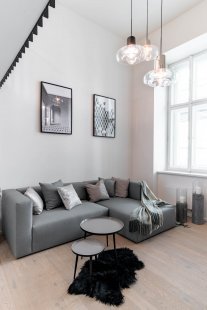
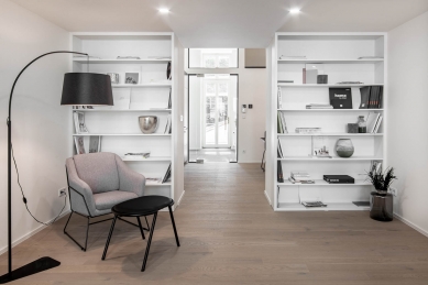
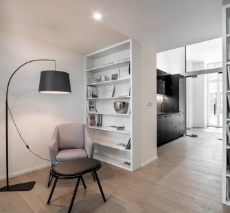
Living room — It is dominated by a black steel staircase under which storage space emerged, also hiding a prepared TV connection unit. Two built-in white-wood bookcases offer another storage space for books and accessories. An indispensable part is the reading corner containing a small armchair and a noticeable lamp. As for the tailored sofa, we designed it in grey and complemented it by cushions and decorations in neutral tones. The modern look is supported by concrete domes (báň přeložena ve smyslu kupole, klenba) and lanterns. However, the interior has maintained the link to the traditional architecture thanks to new, wooden casement windows.
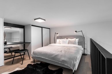
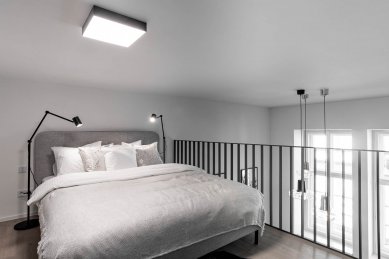
Bedroom — It has been created on the newly added floor. A bed with light grey upholstery and a high headboard makes the ceiling look higher. Handy components of the bedroom are two built-in white wardrobes between which a cosmetic table or a desk (depending on the needs) is situated. A large mirror installed above the table makes the room optically larger. The slatted element around the mirror hides an air-conditioning system. Tiny black steel legs of the bed and small lamps are in harmony with the design of the steel handrail. A striking feature is the carpet of cowhide.
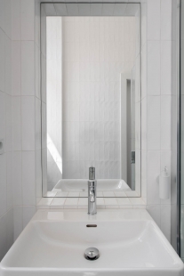
Bathroom and toilet — Both rooms have a vertically designed ceramic tiling on walls. The high ceiling which the flat has available stands thus out. The white colour gives a clean and elegant impression. Grey tiles on the floor make you feel on the ground inside the room and are in harmony with the colours that are present in the entire interior. Bathroom accessories are chrome and white.
Accessories — The interior accessories used within this interior are from the assortment of our showroom LOOOOX.
0 comments
add comment


