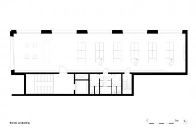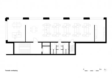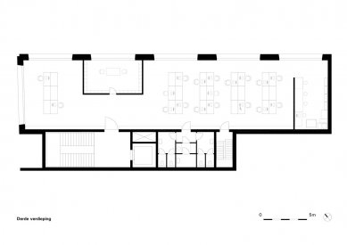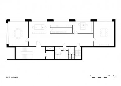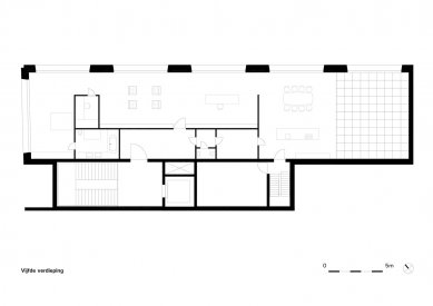
Office Claus en Kaan Architecten

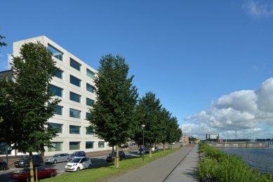
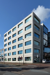
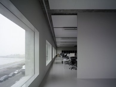
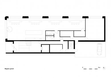
We designed a visiting card in concrete and glass on one of the finest IJburg locations. The accommodation for the Amsterdam branch of our firm was erected on a corner parcel, with a future jetty on one side and on the other the almost infinite IJmeer. Once the adjacent parcels have been developed, the office will form part of a varied but uninterrupted block comprising several buildings of different heights. Once the situation is complete the office will literally be a cornerstone and serviceable part of a larger whole.
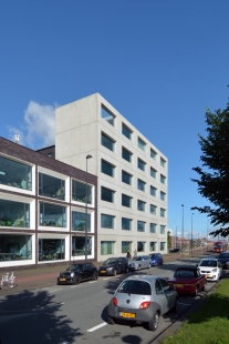
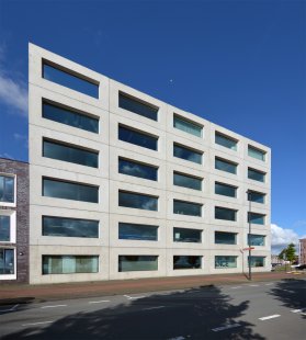
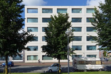
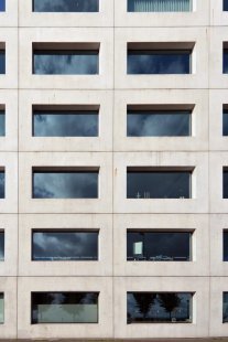
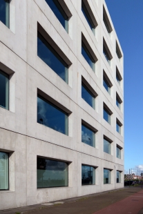
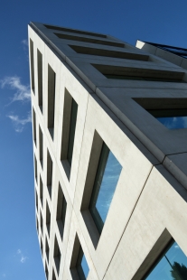
The very sober, rigid, almost monolithic-looking building has six storeys, each with a (gross) height of four metres except for the ground floor and the top floor. Thus although there are three different ceiling heights – ground floor, offices, and top floor – they are indiscernible in the rigid and regular façade grid of supporting prefab panels because the floors are staggered in relation to it.
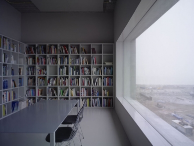
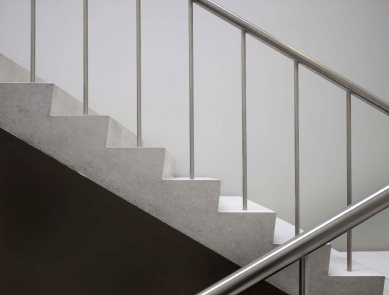
The sum total of these and other choices and interventions has a strong effect on the experience of the interior, particularly from that interior itself. This building demonstrates convincingly that a simple, basic and coherent form and many, sometimes idiosyncratic, repetitive elements can make a spatial statement. The old motto ‘less is more’ is here achieved by an ingenious play of interlocking and mutually reinforcing design decisions. Time will tell whether, besides its functional and aesthetic qualities, the building will also achieve recognition as a comment on the frenzy and stress among architects today and on the standardisation and increase of scale of building and project development.
Claus en Kaan Architecten
0 comments
add comment


