Printshop Veenman

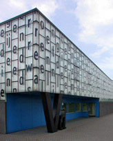 |
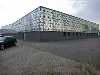
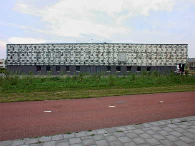
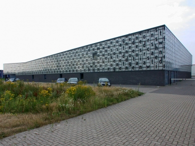
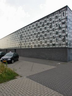
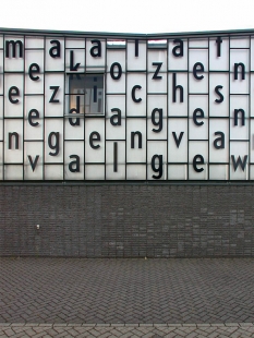
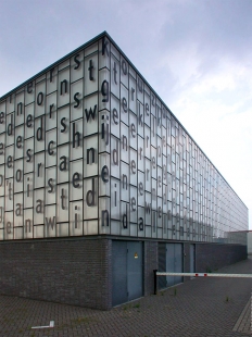
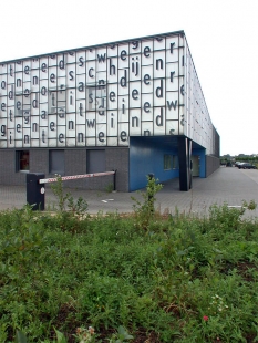
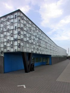
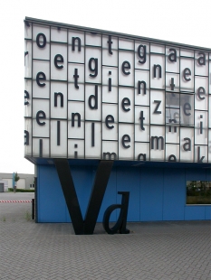
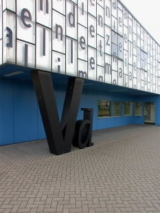
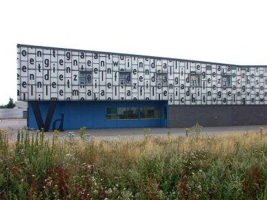
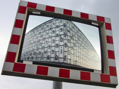
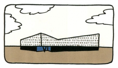
The facade is composed of three sections: a black concrete plinth, a row of windows in the plinth and above this is glazed section. The later consists of glass panels thourgh which it is possible to see the light-reflective insulation. The glazing is mounted in a simple framework derived from greenhouse construction. The glass is printed with a text by K. Schippers - layout by K. Martens -.
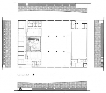
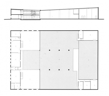
The building has a V-shaped roof. The section is such that the areas requiring a lot of head-space are located under the highest section of the roof. The volume is indented at two spotsů the main entrance, which is marked by the load-bearing company logo, and the despatch entrance. Together with the V-shaped cornice line, they add up to form a striking volume that can be recognized from the motorway.
El Croquis 94, Neuteling Riedijk 1992-99, p.142-51
0 comments
add comment


