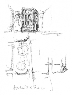
Murcia Town Hall

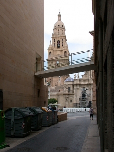
How does one build in a space like Cardinal Beluga Plaza? How does one design a building in the presence of the monumental facade of the Cathedral designed by Bort, as well as in the presence of the Cardinal's Palace, the work of the architect Canestro, which gives the Plaza its name? Next to the palace, timidly off to one side stand residential buildings erected by the local bourgeoisie so they could enjoy the urban life and status of the Plaza. In their modesty they recognise the importance of the Cathedral and the Palace. On the opposite side, at the end, is an empty allotment owned by the city – the result of the demolition of a baroque house that made the transition between Freneria and San Patricio streets. The empty space left by the demolition of the house disrupts the sense of containment and closure of the Plaza. Even worse, the breach makes visible recent construction projects that should never be seen from the Plaza. The Murcia City Council, aware of the difficulties and importance of the site, held a competition amongst architects several years ago. The wining entry, developed later by Alberto Noguerol, aroused such controversy that the Council desisted from building the work and commissioned us for the presented in this memorandum.
The new building literally fills a void and this, without a doubt, will aid the Plaza in regaining its character as such. But how exactly will this new building appear? What should the face of this new construction be? We understand that the Plaza embodies the celebratory spirit of the baroque, and that our proposal should be to design a building content in its role as a spectator, without seeking the status of protagonist held by the Cathedral and Cardinal Belluga Palace. However we do not imagine a commonplace spectator. Civil power will be embodies in this new building on the Plaza. In this space imbued with the importance of the Church and the power which proceeded from it in the 18th century, a building will be erected representing the authority of the citizens, the Municipal Government of Murcia, in this way an old conflict will be resolved.
Until now the Murcia Town Hall, placed on the river, has ignored the Plaza, perhaps the most important urban space in the city, in which are found the Cathedral and Cardinal Belluga Palace.
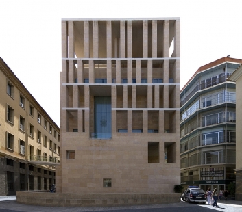
But how does one translate all of this into architectural terms? In a few words: with the design of a facade/retable facing the Cathedral. Thanks to the new building, the city government will be able to take part on the life of the Plaza; it will be able to participate in the public events processions, enhanced by the splendid backdrop of the Cathedral's facade. However, the Town Hall annex will not have an entrance on the Plaza. As we have said, the building is located on the Plaza but respects the pre-eminence of those building which have occupied it for so long. For this reason the entrance door will be placed on one of its flanks, namely on Freneria Street, literally making an end to Polo Medina Street. The continuity between the city and the Town Hall annex is established in this way: when the new building is constructed it will be possible to arrive there directly from the historic centre, from the heart of the city, via Polo Medina Street.
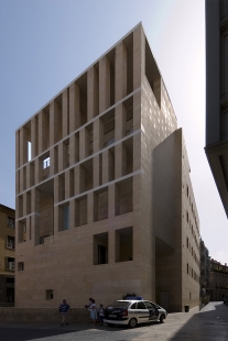
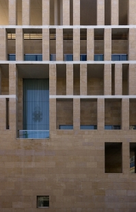
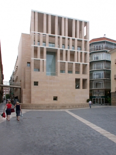
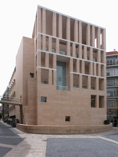
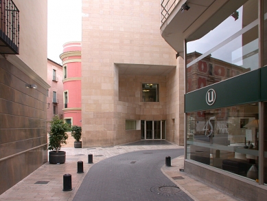
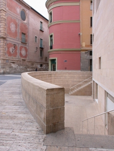
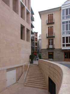
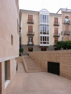
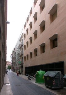
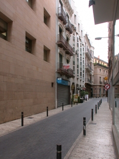
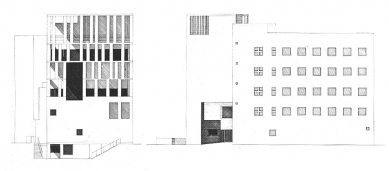
The facade/retable of the new building facing the Plaza could never, nor would ever, want to compete with classical order. It is organised as a musical score, numerically, accepting the system of horizontal levels of the floor slabs. The facade resists symmetries and offers as its key element the balcony of the gallery. The balcony of the Town Hall annex rests on exactly the same horizontal plane as the central balcony of the piano nobile of Cardinal Belluga Palace – both at the same height. The lateral facades, more discreet, with modest openings, are adapted to the dimensions of the streets. Now it is time to recognise the importance of the floor plan, the core of the design. As we have said, the facade of the new building is oriented towards the Cathedral. The four sides of the Plaza are independent; in this way each of its buildings preserves its autonomy. Ours floats without establishing any orthogonal relationship with th existing buildings, deferring only to the facade of the Cathedral despite the distance between them. In this way the corner of the current Town Hall is freed up and the visual relationship between Freneria and San Patricio Streets is established: if we had maintained the oblique orientation of the demolished building it would not have been possible for the new building to face the Cathedral which we think is desirable. The alignment of the building with regard to the other two streets is more obvious. On San Patricio the established alignment is respected which gives greater breadth to the street. On Freneria the alignment is broken, keeping at first to the one already established, then opening later towards the Plaza: in this way a small break is introduced that for those coming from the old town anticipates the full expanse of the Cardinal Belluga Plaza. The old alignment – that of the demolished 18th century house the made the transitions between Freneria and San Patricio – is recalled by means of a sunken court giving access to the cafeteria: the maintenance of this alignment makes an edge that will ease the traffic produced by the connection of both streets.
Te dictates of the new building's urban surroundings provide the logic for its internal geometry: resulting form the convergence of autonomous orthogonal systems in which, generally, the activities remain inscribed. The meeting of these systems is resolved through the development of free, fluid interstitial spaces for civic communication and movement.
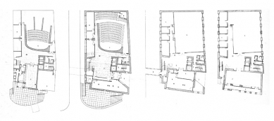
The building is entered through a generous entrance on Polo Medina Street, proceeding with absolute independence from the entrance to the city's information and tourist office. A stairway leads up to the core of elevators and stairs that extend up through the floors of the building within the interstitial space. A legislative chamber/lecture hall, with a capacity for 157 spectators is accessed from this principal circulatory space.
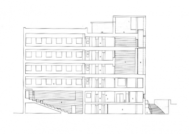
The arrangement of the cafeteria, mechanical spaces and assorted storerooms on the ground floor facilitate the gentle slope of the legislative chamber/lecture hall, reached from this same level. The cafeteria extends onto a sunken court with access form the Plaza.
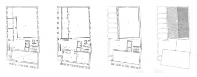
The organisational structure of the plan is reflected in the mezzanine level (+3.90): offices are organised orthogonally following the guidelines dictated by San Patricio and Freneria Streets and by the guidelines defined by the facade facing the Plaza. The areas constructed according to these alignments create interstitial space in which vertical communication is produced. It is also on this floor that the connection to the old Town Hall is made. On the first floor level (+7.50) we find the same organisational scheme. A room measuring 6x14x6.8 meters which looks out onto the Plaza. This room is the key element of the building. It is a room suitable for receptions and with a gallery along the portico of the facade/retable from which one may take in the full panorama of the Cathedral and the Plaza. It is not difficult to imagine this gallery as a balcony from which the representatives of the citizenry of the Murcia and their guests may enjoy the diverse scenes of urban life which the Plaza offers.
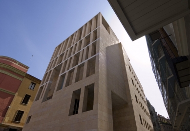
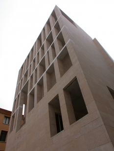
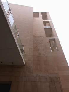
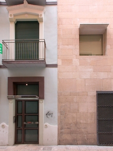
We will now describe the building's construction. It will have a structure of reinforced concrete (pillars and slabs), and exterior finishes in brick and stone. The local sandstone (lumaquela) is a key material in the architecture of the building, and ensures its integration into its surroundings. The texture of this stone is capable of withstanding the vibrant Murcian sun, and the solidity of the pillars which structure the facade/retable emphasize the nobility of the material which transport us, upon careful observation, to its always admirable and remarkable geological past. Few stones allow us to see the decanting of the material over time as clearly as this sandstone from Murcia. We wanted the window openings to be well proportioned and suited to their uses on the one hand while adjusted to the street dimensions on the other. Only those on the most important facade, those facing the Plaza Belluga, are larger, protected as they are by the diaphragm of the supports. The roof is flat on the terrace, over the the portico, as well as along the facade, and pitched above the bulk of the building which is along Freneria Street. The interiors will be enriched with noble materials: stone for the pavements with heavy traffic, wood floors in the work areas, stucco on the walls, wood panelling in the lecture hall, etc.
El Croquis 98, s. 76-82
3 comments
add comment
Subject
Author
Date
krásnej barák
Milan
28.05.07 02:09
Murcia
Daniel John
29.05.07 01:48
nice projcte
04.12.10 09:14
show all comments


