Multifunctional building Miletičova 5

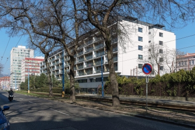
A former administrative building of SEPS on Miletičova Street underwent total reconstruction and also changed its purpose of use to be mainly residential.
Limiting factors that we had to deal with:
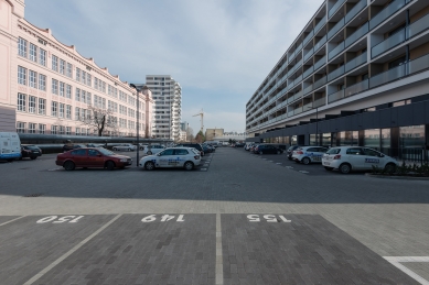
- An almost hundred-meter-long street façade;
- Construction system of standardised block system with a module of 7.2 m in parterre combined with reinforced concrete skeleton;
- Spatial arrangement in form of a five block and related depth of the house;
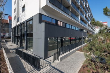
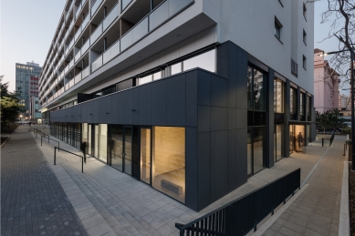
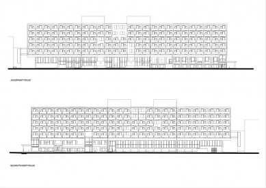
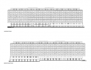
Apart from changing the functional use and related inevitable arrangement modifications, we focused mainly on dealing with the house contact with the environment nearby. Our priorities were to open the once inaccessible parterre from the street and to deal with the enormous length of the horizontally divided façade that was as if designed more for tram passengers than for pedestrians.
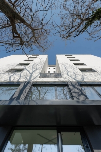
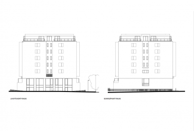
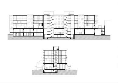
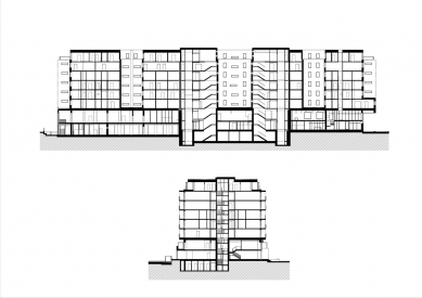
After clearing the parterre of the later layers, the building was clearly tectonically separated to a tie and body. The head was later added too in form of retreated roof superstructure. Each of these parts is not only clearly distinguished by colour – black tie, white body, black head, but it also has its own speed degree of perception. While the parterre divided in a half module and broken up by materially different apartment entrances or by changed height arrangement offers a sufficiently varied visual perception when walking, the body with regularly repeated double module is set for higher speed of tilted perspectives. The superstructure comes back again to a more intimate scale readable only from residential terraces.
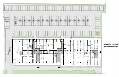
The spatial arrangement of the parterre is relatively varied also thanks to the original skeleton bearing system and above-standard height. This enabled to include a mezzanine floor. This way two-floor commercial premises accessible from the street were created in the part of the tie, the parterre with lowered level of floor was completely divided into two individual floors – commercial premises accessible from the street and courtyard remained on the ground floor, the mezzanine floor turned into administrative part with its own side entrance. The courtyard part of the mezzanine also contains several apartments linked to the main communication core areas of the residential part.
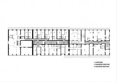
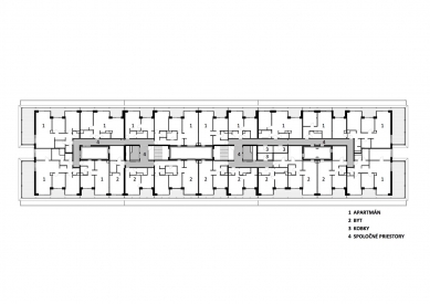
The main functional purpose of the house is housing – permanent and temporary. The rigid panel system of the 3rd through 7th floor, originally serving offices, did not offer many options. In spite of the strictly given coordinates, we managed to create a relatively broad range of sometimes event surprising spaces. We divided the house with three dilatation units into two vertical apartment sections, each with its own entrance and vertical communication core area. The core areas with stairway and two elevators are located in the central part, leaving relatively spacious roof lights in the area between them. This apparent anachronism very elegantly and simply deals with the basic problems related with the thickness of the building. From natural lighting and ventilation of internal passageways through lighting some residential kitchens situated in the depth of the arrangement to residential rooms courageously oriented at the roof light on upper floors.
The house originally had two transversal hallway parts leading to offices. The new proposal only used their necessary part and the rest was annexed by apartments. Small apartments looking over the street are turned in the south-west direction and residential units with north-east orientation overlooking the courtyard serve as temporary housing. These are mostly one to two-room apartments and studios, supplemented with a couple of three-room apartments in the end positions. A typical floor contains a total 31 of them. A limiting factor when designing apartments was the module of the panel system. The apparently constrained unified axis width of rooms of 3.6 m gives in reality an unexpectedly spacious impression also thanks to the large glassed entrances to loggias situated along both main façades. The rhythmical division of on-going loggias with the depth of 1.2 m reflects the apartment division. The clean tectonics with simple logics supported by unobtrusive colour design is not a purposeless ornament, but it contains decorative qualities.
The superstructure houses a total of 20 more luxurious three and four-room apartments.
Nora Vranová
0 comments
add comment


