“Our main challenge has been to maintain the same amount of exhibition area, within the museum’s footprint, while creating new circulation and visitor spaces. Given the way that the different parts of the museum had evolved, there was no such thing as a typical space – every corner is unique and required individual attention and different design decisions. This has been a fascinating process. Another important aspect of our design has been creating new opportunities for works of art to be exhibited outside the traditional confines of the gallery, such as in the atrium. This space develops the idea of the ‘urban room’ – it is the museum’s public and social heart, and point of connection with the wider city.”
Lord Foster
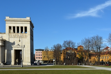
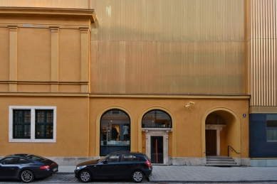
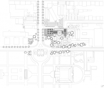
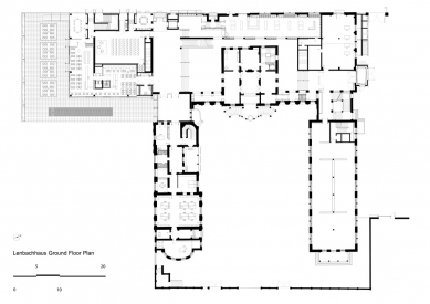
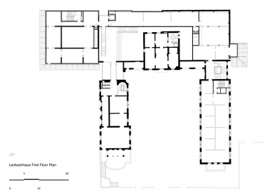
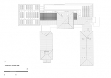
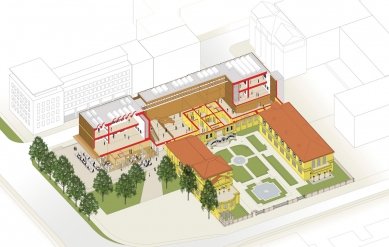
Designed in the Florentine style, and completed in 1891 as a villa and studio for the artist Franz von Lenbach, the Lenbachhaus became Munich’s city art gallery in 1924. Over the succeeding fifty years the building was extended and adapted in two major phases. By the turn of the century, however, with visitor numbers exceeding 250,000 a year, it lacked the facilities needed to cater to its widening audience. The challenge for the museum’s renewal lay in conserving the ensemble of historic buildings and maintaining the amount of gallery space, while providing new circulation and visitor areas, a restaurant, terrace and shop.
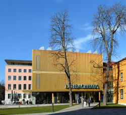
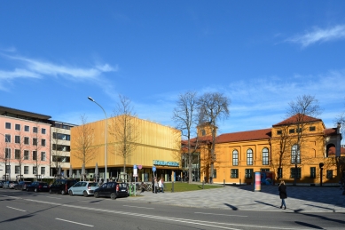
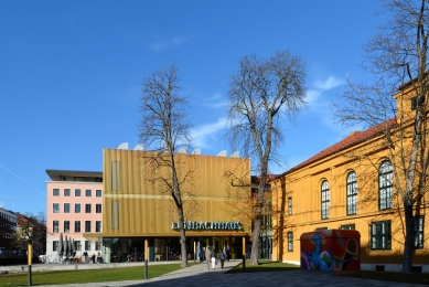
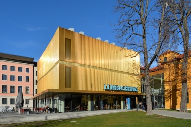
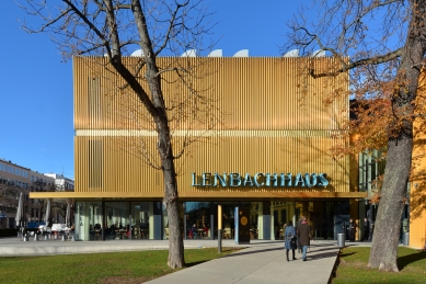
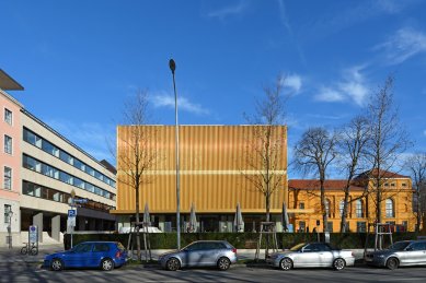
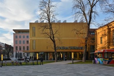
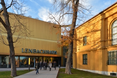
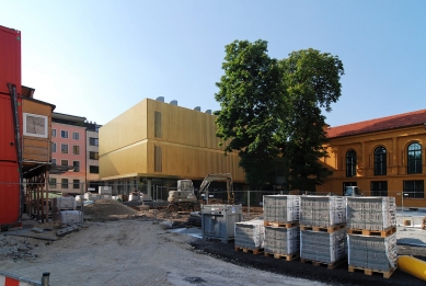
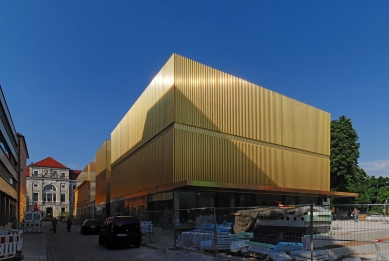
Following an analysis of the existing buildings, a wing dating from the 1970s was removed and replaced with a new building, with two floors of galleries, which unifies the historical elements along Richard-Wagner-Strasse
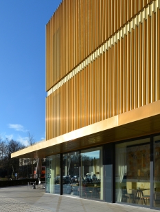
Conceived as a ‘jewel box’ for the gallery’s treasures, the new wing is clad in aluminium-copper-alloy tubes whose colour complements the villa’s rich ochre render. Inside, a sequence of galleries displays the museum’s renowned collection of paintings by the early-twentieth-century group, Der Blaue Reiter, echoing the domestic scale of their original setting. As many of these works were painted en plein air, indirect natural light is drawn into the upper-level galleries to create the ideal conditions for their display.
Circulation through the building has been completely redefined, beginning with a new entrance sequence via a piazza to the east of the museum, which has allowed the historic courtyard to be reinstated as a tranquil garden.
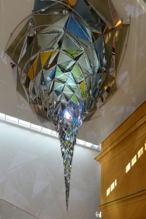
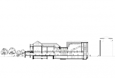
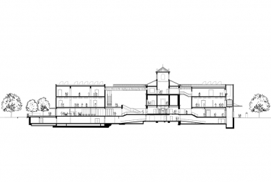
A restaurant with an open-air terrace extends into the piazza, to enliven the surrounding area. The social heart of the building is the three-storey lobby, from where visitors access the temporary exhibition space on the ground floor and the upper-level galleries. Clearly articulating the old within the new, this top-lit volume embraces the exterior wall of the villa and incorporates a large-scale installation by the Danish-Icelandic artist, Olafur Eliasson, which refracts sunlight from a slender clerestory window to cast dynamic patterns of light and shade.
Foster + Partners

