Appartment building at Hauptstrasse

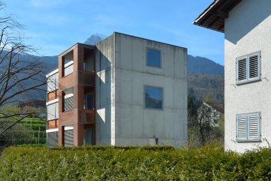
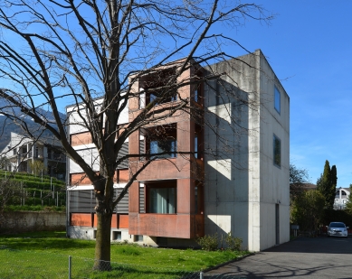
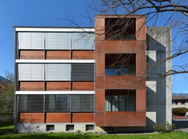
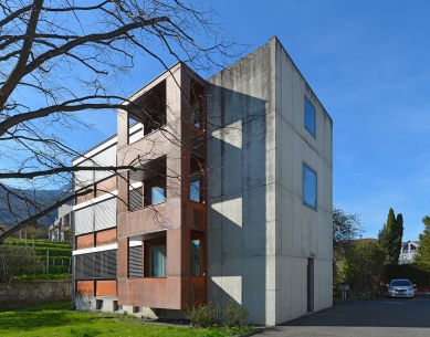
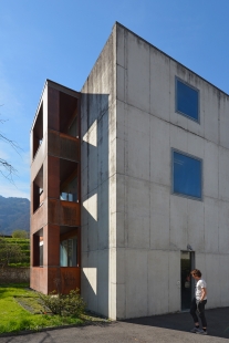
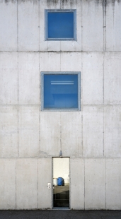
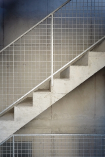
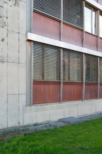
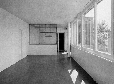
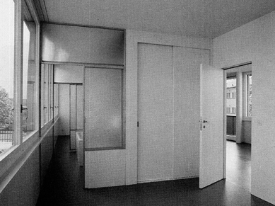
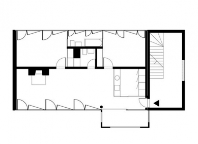
This one took me a long time to figure out. Normally you would enter a building on the long façade, oriented north-south, but doing that here would have made the route from the street too complicated. I made a lot of sketches, all dealing with the relation of the building to the street and the nearby mountain slope. Then it occurred to me: you could enter on the narrow side, as you do in the house at Winterthur. The entrance block defines the scale of the building and gives it a strong expression. It is a crude concrete wall with a narrow door and two square windows, the top one of which is smaller, to create a tapering effect. These windows light a concrete foyer, which is unheated and uninsulated - a space between inside and outside. The long façades are open, allowing unhindered views of the valley in both directions. They're made of marine ply panels and sheet metal. Combined with the concrete, these materials give the building its colour. The timber inserts are thin, and the wind supports in turn are slender. This is the first of my buildings that operates with the elements of classical modernism - light façades set between strong volumes. Each of the three floors contains one apartment. The plan is divided lengthwise - but not quite evenly. The slightly larger portion faces south and contains the living space and the kitchen. The bedrooms and the bathroom face north. In my first houses the service spaces were 'problems' that I only resolved at a late stage. Here they organize the ground plan. The kitchen marks the entry. It is largely glazed and open to the living space, extending into a projecting balcony. The bath-room is placed in the centre of the other side. A sliding door beside it divides the space and creates a three-room apartment.
Peter Märkli
0 comments
add comment


