AN Bistro & Cafe

The new bistro right by the railway is a project of a very successful Vietnamese family, which already owns several popular Prague gastronomic spots. The main ambition was to bring the authentic Vietnamese cuisine to Prague (gastronomically) and the raw atmosphere of the local streets, where they cook and eat at the same place (architecturally). Part of the brief was to work with neons and the red colour typical of Asia. The space we completely renovated was originally (and ironically) a Chinese restaurant.
It was essential for us to grasp the theme in a way that was relevant in the local context and to avoid formal clichés and cheap gestures. We therefore worked on the Czech interpretation of the Asian street and its sympathetic dirt in multiple layers.
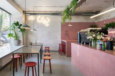
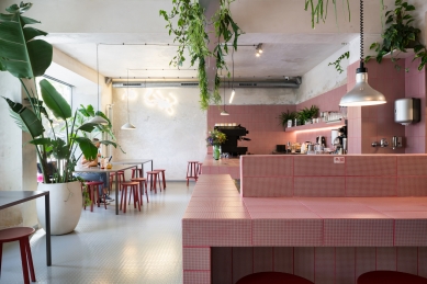
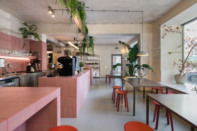
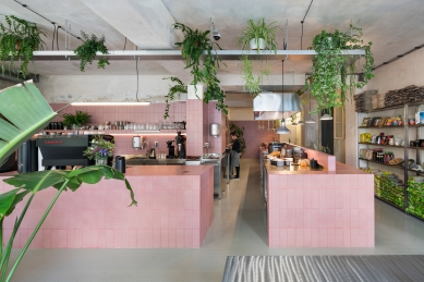
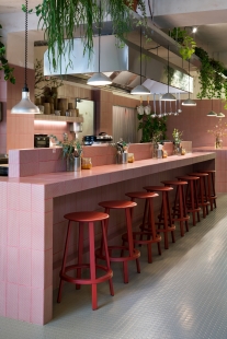
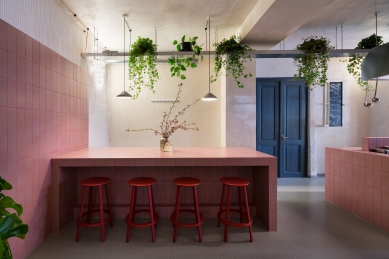
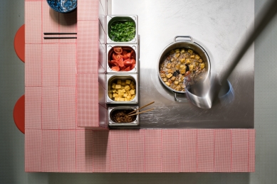
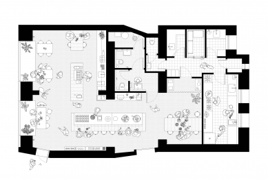
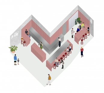
Firstly, the layout: the open kitchen is more open than usual and forms one entity with the tables for guests. The blending of the functions is supported by a uniform floor surface.
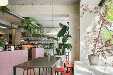
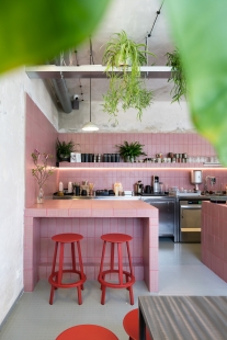
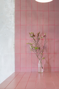
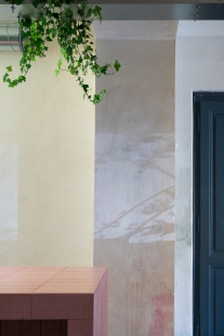
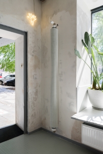
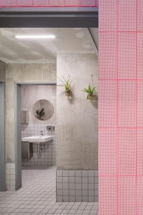
Secondly, materiality: the space is dominated by a uniform block in a subtle red tile. Apart from the distinctive guest stools, the background is made up of natural shades of grey to white: the steel of the kitchen countertops or guest tables, the scraped original walls, the glue or paint on the blocks of the new partitions, the tiles and the rubber floor.
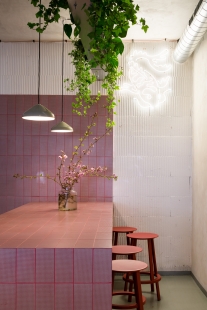
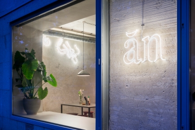
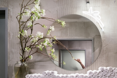
Thirdly, the atmosphere: the hanging pendant lightings create a pleasantly cosy light, and the space is slightly supplemented by neon elements with Asian motifs designed specifically by Barbora Tögel for precise places. Greenery is also an integral part of the Southeast Asian theme, which, in addition to the standard flowerpots, is also found in the continuous cable tray carrying the electrical wiring and luminaires.
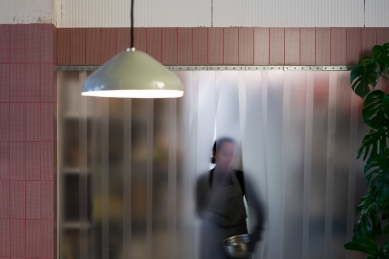
Fourthly, the use of industrial elements: penny pattern rubber flooring, translucent PVC curtains typical of warehouses and visible wiring.
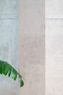
Fifthly, the preservation of the building process: paint stains and workmen's notes on the walls, preserving any imperfections after cleaning off the original stucco.
Authentic imperfection was ensured by working with a construction company that brought many unexpected elements and improvisation to the building process. An important part of the project was working with the graphic designers we invited into the process. Přemysl Zajíček and František Kast are responsible for the graphic identity of the company, including the implementation of the neon signs.
0 comments
add comment


