

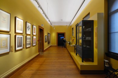
National Gallery and Museum in Weimar
New Museum Weimar

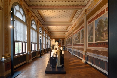
Museum in Weimar – Preller Gallery
The Weimar museum had an interesting history at its inception. A rare case occurred here in the history of architecture: painting prompted the construction, painting brought architecture to life.
Initially, only the so-called Preller Gallery was to be constructed, which was to be situated on the southern side of Alexander Square in a park founded by J. W. Goethe, near the orangerie. Friedrich Preller, who was to find an architect, met Zítek in Italy and had him develop plans for the gallery. These proposals were submitted on January 23, 1861, for evaluation to Petr Cornelius, who spoke favorably about them. The plans were then sent to Weimar along with Cornelius's endorsement and the completed Preller cartoon "Odysseus and the Sirens."
The floor plan of the gallery consists of seven square fields, five of which occupy the actual gallery, while the outer, expanded fields create the side pavilions. These pavilions, conceived as central structures themselves, serve a dual purpose: 1. practical (as thermal and acoustic insulation to prevent drafts), 2. artistic (to prepare the visitor for the main gallery and allow the sensations from the gallery to resonate in the following architecturally shaped environment).
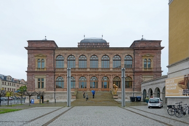
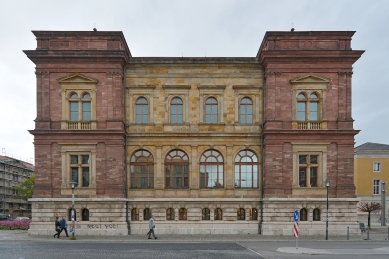
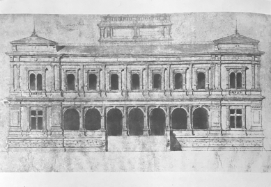
The gallery is single-story and raised on a robust base, which is itself equipped with a plinth and cornice, supporting both the pavilions’ risalits and the landings of the stairs. The main motif consists of arcades, or more precisely, pairs of arcades with a superordinate architrave system, expressed through pilasters and an entablature. The doubling of the arcades is subtly emphasized by the varying accents of the pilasters that separate them: while the pilasters in the middle of the individual fields are simple, with a smooth shaft and Corinthian capital, the pilasters that separate the individual fields are fluted and additionally supported by a wider, smooth pilaster. The doubling of the arcades is also highlighted by corresponding breaks and slight projections of the parts of the entablature – however, the actual cornice of the building runs continuously and follows only the risalits of the pavilions. The pavilions themselves are solid, with their corners emphasized by pairs of fluted pilasters. The solid wall of the pavilions is only pierced by a small double-arched window with an entablature – a repeated and diminished motif from the middle section of the façade. Additionally, the pavilions are emphasized by an attic and individual roofing with flat tent roofs, while the central part is covered with a lower gable roof.
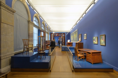
Inside the gallery, the division into individual bays is expressed not only in the decoration of the walls but also in the flooring and ceiling. Massive ceiling beams separate the individual square fields, geometrically divided with rich yet restrained decoration. The wall divisions correspond largely to the exterior, with the difference that the shafts of the pilasters and friezes are richly decorated with arabesques. Rich decoration and geometric division are also present on the wall designated for paintings. “Their decorative framing and the predellas running beneath them, which form the connecting moment of the epic, are so harmonious with the paintings that one might believe the paintings are a perfect conclusion rather than the beginning of the work,” writes Josef Bayer in the contemporary press, thus convincing us, along with the color-schemed designs stored in the archive of the Technical Museum, of Zítek’s inclination towards colorful polychromy. Zítek managed to utilize his stay in Italy and, after careful study and preparation, succeeded in merging the Greek principle of polychromy with the decorative art of the Italian cinquecento.
In the exterior of the building, Zítek’s first neorenessance work already reveals one of the typical features of Venetian architecture, which later became characteristic of Zítek himself – tripartition. Thus, here Zítek constrains the central, immaterial loggia part of the building with large window openings and more substantial, taller side pavilions. The design also features another characteristic of Zítek: the Preller cycle was to include four paintings – yet the gallery itself has five fields. In the floor plan, doors are proposed in the middle field of the gallery, which, however, have no stairs leading to them, although the gallery was significantly raised above the terrain. It seems that these doors were not meant to provide direct access to the very center of the gallery, but rather Zítek wanted to create an odd number of fields by disrupting the middle field – given the four paintings – and to emphasize the horizontal loggia character of the building, suitable for a park environment. Here, Zítek’s effort for centrality manifests, a fondness for central spaces, an attempt to express the focal point of the space, to create a kind of guiding center, even at the cost of a relatively significant increase in construction costs.
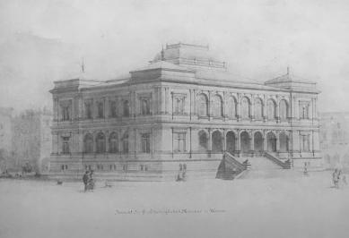
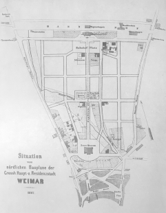
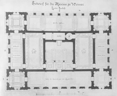
However, the realization of the Preller Gallery as a standalone building did not occur, as in 1862 the Weimar assembly decided that instead of a separate building for the Preller Gallery, a ducal museum would be constructed, in which, besides the mentioned gallery, the art collections gathered by Duke Karl August and Goethe, which had until then only been provisionally stored, would be housed. Zítek was once again commissioned to design the new museum. The program required, in addition to the Preller Gallery on the upper floor, two large halls for large paintings and a domed space into which the statue of Goethe, created by sculptor A. Steinhäuser based on a theme by Bettina von Arnim, which had until then been located in the park, was to be moved. The museum building was to be the dominant feature of the new quarter between the train station and the inner city, such that it would form the focal point for the new main street, Sophienstrasse. Practically, it was to be the first prominent building that a foreigner would see upon entering the city.
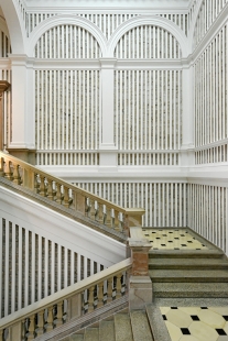
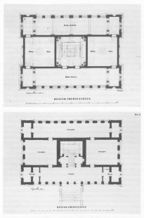
In the design, Zítek positioned the Preller Gallery as favorably as possible in the building's northern façade on the first floor, effectively concluding the museum visit. The number of fields was reduced by the architect to four, and the doors in the middle of the gallery were, of course, omitted, as they would only lead to unwarranted cost increases. The gallery thus becomes one of the passageways of the museum. The function of the orienting focal point of the entire building is assumed by the staircase space, in which Zítek places the statue of Goethe and around which he concentrates the other exhibition spaces. The previous corner square pavilions are more richly articulated and transformed into octagons with semicircular niches (apses) at the diagonals. The Preller Gallery thus forms the longer northern side of the rectangular floor plan of the building. A similar space is on the opposite side and smaller gallery spaces are also on the remaining two shorter sides. Thus, mostly galleries run around the perimeter of the building's floor plan, only interrupted and separated by central octagonal rooms at the corners. The remaining space in the center of the building occupies a robust three-armed staircase and two large halls, illuminated from above. The ground floor of the building is similarly designed; only the side galleries are connected by arcades to the halls in the center of the building, so large rooms for the exhibition of larger objects (statues) are created here, albeit with side lighting. To the south, the gallery of the upper floor is replaced on the ground floor by an open loggia with a wide projecting staircase.
The domed space for the statue of J. W. Goethe, required by the program, was resolved by Zítek in such a way that he placed the statue in a semicircular niche in the staircase space, above a landing that corresponds to the height of the parapet of the first floor. This created a focal point with the Goethe statue, which dominates the entire staircase area – since it can already be seen from the projected outer staircase – and it allowed for both a close view from below and a face-on view from the landing of the first floor.
The hall on the first floor at the landing of the staircase is vaulted with a flat ceiling, supported by trompes between the arches of the arcades, whether real or only indicated on the solid walls. The same solution appears later in the design of the loggia of the National Theatre – but in a richer execution, including a detail that raises the center of the flat ceiling with another smaller arch, a detail that was not realized either in Weimar or in the National Theatre.
The other ceilings in the museum spaces are richly architecturally designed, either as coffered ceilings or as mirror vaults, occasionally broken by lunettes, which, where the mirror is glazed, transition into Renaissance lunette cornices of the type known from the Schwarzenberg Palace in Hradčany.
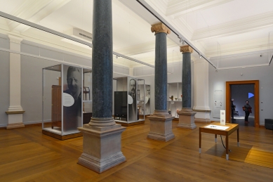
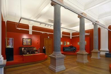
In the staircase space, as the central space of the entire building, Zítek’s sense of noble materials and color combinations is most evident. The columns in the staircase are generally designed with shafts of black marble, with bases and richly Corinthian capitals of white marble. The walls were to be adorned with frescoes, for which a competition was announced.
In the development of the staircase interior, an interesting detail can be noted: in the original design (see reproduction of the colored perspective of the staircase - view from Goethe's statue) the conical railing of the landing, lying between both columns of black marble, is interrupted in the middle by a small pillar, which is shape-wise basically identical to the bases of the columns, only slightly narrower. In the actual execution, the substance of this pillar was reduced to merely a support of the width of the cones, so that the base of the upper railing runs smoothly, uninterruptedly.
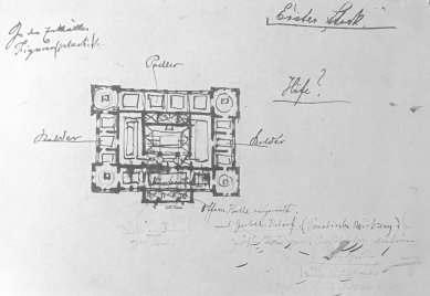
This solution of the detail, this retreat from emphasizing the center and a certain calming has a direct parallel in the overall solution of the Weimar museum. In Zítek’s estate, there are also four vividly sketched original designs for the museum, which significantly differ in architectural conception from both the actual execution and the original project. They reveal an element unusual for Zítek – a tympanum with which we later encounter even in the first sketches for the National Theatre, which, however, finds realization only in the colonnade of Karlovy Vary. The floor plan division in this first sketch is roughly already identical to the actual execution; however, the entrance part of the building is resolved quite differently, which projects with a massive risalit of the middle three fields with an open hall on the ground floor and culminates with a tympanum with sculptural decoration above the first floor. (This solution, including the segmental curve of the roof, is later used in the first design of the Mill Colonnade for Karlovy Vary, with the end pavilions of the one-story colonnade.) Zítek soon retreats from the central risalit and returns to tripartition. In his estate at the Technical Museum, numerous sketches of various facade alternatives are stored. Zítek here proceeds from the simple transference of the original facade of the Preller Gallery to the first floor of the museum and then combines the divisions of the ground floor and first floor with various systems of pilasters and half-columns, while always preserving the differing creation of the corner risalits of the building and the middle sections of the façades. In resolving the windows, Zítek employs various types with semicircular arches, straight lintels, with central stone columns or without them, as well as with stone transoms, with oculi, windows with aedicules and without aedicules, simple and double, of various sizes. All facade proposals, where he generally uses an architrave system with pilasters and an entablature to lighten the walls, are executed with a brush, except for a single pencil sketch where he divides the façade with rusticated pilasters or half-columns in the manner of the rear façade of the Pitti Palace in Florence by Amanati. This last sketch, however, probably did not satisfy Zítek, and therefore he did not pursue it further.
In the final design, Zítek critically removed all deficiencies and disproportions of the earlier sketches. He abandons the doubling of the arcades in the middle part of the building, adjusts the façades mutually, unifies the width of the window openings, and allows the horizontal entablature of the ground floor and first floor to run uninterrupted. The façade is calmed, harmonious in proportions, and the window openings in the ground floor and first floor correspond to the supporting system of the ground floor, which is slightly lower than the first floor, making it visually more robust (in the rear façade), or equally (in the front façade) with the system of the floor. In the main façade on the ground floor, unlike the rear northern front, an open loggia with half-columns (almost 3/4 columns) and with plastic figurative decoration in the arches is proposed.
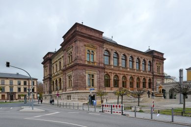
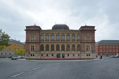
All façades of the museum clearly divide into three parts: the central part with large window openings and possibly a loggia is flanked on both sides by more robustly executed risalits. This tripartition is a direct analogue of the façades of Venetian palaces, which already in the Gothic period had a central part of the building with a porch and gallery clearly differentiated from the more substantial corners.
The side façades of the museum pleasantly contrast with the front and rear façades with a larger area of masonry on the first floor, thus only contributing to the constraint of the central, lightened parts of the main façades. The rusticated basement with a smooth stepped plinth and cordon cornice is only perforated by small grouped windows and forms the massive base of the entire building. Its height in relation to the height of the entire building is well proportioned. (The central part of the main façades, including the basement, i.e., the part constrained by the risalits, forms a rectangle whose sides are in the golden ratio. The risalits from the basement cornice to the building cornice form a similar rectangle whose diagonal is perpendicular to the diagonal of the central part.) The main cornice of the building is relatively insignificantly emphasized in relation to the cordon cornice of the entablature on the ground floor, while the entablature maintains the division into architrave, frieze, and cornice in classical proportions in both ground and first floors.
Overall, the building is designed as a centralized structure, and this corresponds to the method of roofing. The roof is, in principle, tent-like, with a gentle slope, with individual tent canopies at the corners raised by attica masonry, whose cornice runs as a unifying horizontal line also in the broken roof of the main part. Above the center of the building, a segmental roof of Palladio type rises on the attic with balustraded railing, articulated by small pillars, crowned with a broken railing with poles at the corners of the roof – a precursor and model for the roof of the National Theatre. The tent roofs with poles on the pavilions are later also utilized in the design of the Rudolfinum.
The building is executed in the spirit of the Italian Renaissance, has pleasant proportions, fulfills its purpose well, and the design corresponds to the loose setting in the square at the edge of the park.
The Weimar museum had an interesting history at its inception. A rare case occurred here in the history of architecture: painting prompted the construction, painting brought architecture to life.
Initially, only the so-called Preller Gallery was to be constructed, which was to be situated on the southern side of Alexander Square in a park founded by J. W. Goethe, near the orangerie. Friedrich Preller, who was to find an architect, met Zítek in Italy and had him develop plans for the gallery. These proposals were submitted on January 23, 1861, for evaluation to Petr Cornelius, who spoke favorably about them. The plans were then sent to Weimar along with Cornelius's endorsement and the completed Preller cartoon "Odysseus and the Sirens."
The floor plan of the gallery consists of seven square fields, five of which occupy the actual gallery, while the outer, expanded fields create the side pavilions. These pavilions, conceived as central structures themselves, serve a dual purpose: 1. practical (as thermal and acoustic insulation to prevent drafts), 2. artistic (to prepare the visitor for the main gallery and allow the sensations from the gallery to resonate in the following architecturally shaped environment).
The gallery is single-story and raised on a robust base, which is itself equipped with a plinth and cornice, supporting both the pavilions’ risalits and the landings of the stairs. The main motif consists of arcades, or more precisely, pairs of arcades with a superordinate architrave system, expressed through pilasters and an entablature. The doubling of the arcades is subtly emphasized by the varying accents of the pilasters that separate them: while the pilasters in the middle of the individual fields are simple, with a smooth shaft and Corinthian capital, the pilasters that separate the individual fields are fluted and additionally supported by a wider, smooth pilaster. The doubling of the arcades is also highlighted by corresponding breaks and slight projections of the parts of the entablature – however, the actual cornice of the building runs continuously and follows only the risalits of the pavilions. The pavilions themselves are solid, with their corners emphasized by pairs of fluted pilasters. The solid wall of the pavilions is only pierced by a small double-arched window with an entablature – a repeated and diminished motif from the middle section of the façade. Additionally, the pavilions are emphasized by an attic and individual roofing with flat tent roofs, while the central part is covered with a lower gable roof.
Inside the gallery, the division into individual bays is expressed not only in the decoration of the walls but also in the flooring and ceiling. Massive ceiling beams separate the individual square fields, geometrically divided with rich yet restrained decoration. The wall divisions correspond largely to the exterior, with the difference that the shafts of the pilasters and friezes are richly decorated with arabesques. Rich decoration and geometric division are also present on the wall designated for paintings. “Their decorative framing and the predellas running beneath them, which form the connecting moment of the epic, are so harmonious with the paintings that one might believe the paintings are a perfect conclusion rather than the beginning of the work,” writes Josef Bayer in the contemporary press, thus convincing us, along with the color-schemed designs stored in the archive of the Technical Museum, of Zítek’s inclination towards colorful polychromy. Zítek managed to utilize his stay in Italy and, after careful study and preparation, succeeded in merging the Greek principle of polychromy with the decorative art of the Italian cinquecento.
In the exterior of the building, Zítek’s first neorenessance work already reveals one of the typical features of Venetian architecture, which later became characteristic of Zítek himself – tripartition. Thus, here Zítek constrains the central, immaterial loggia part of the building with large window openings and more substantial, taller side pavilions. The design also features another characteristic of Zítek: the Preller cycle was to include four paintings – yet the gallery itself has five fields. In the floor plan, doors are proposed in the middle field of the gallery, which, however, have no stairs leading to them, although the gallery was significantly raised above the terrain. It seems that these doors were not meant to provide direct access to the very center of the gallery, but rather Zítek wanted to create an odd number of fields by disrupting the middle field – given the four paintings – and to emphasize the horizontal loggia character of the building, suitable for a park environment. Here, Zítek’s effort for centrality manifests, a fondness for central spaces, an attempt to express the focal point of the space, to create a kind of guiding center, even at the cost of a relatively significant increase in construction costs.
However, the realization of the Preller Gallery as a standalone building did not occur, as in 1862 the Weimar assembly decided that instead of a separate building for the Preller Gallery, a ducal museum would be constructed, in which, besides the mentioned gallery, the art collections gathered by Duke Karl August and Goethe, which had until then only been provisionally stored, would be housed. Zítek was once again commissioned to design the new museum. The program required, in addition to the Preller Gallery on the upper floor, two large halls for large paintings and a domed space into which the statue of Goethe, created by sculptor A. Steinhäuser based on a theme by Bettina von Arnim, which had until then been located in the park, was to be moved. The museum building was to be the dominant feature of the new quarter between the train station and the inner city, such that it would form the focal point for the new main street, Sophienstrasse. Practically, it was to be the first prominent building that a foreigner would see upon entering the city.
In the design, Zítek positioned the Preller Gallery as favorably as possible in the building's northern façade on the first floor, effectively concluding the museum visit. The number of fields was reduced by the architect to four, and the doors in the middle of the gallery were, of course, omitted, as they would only lead to unwarranted cost increases. The gallery thus becomes one of the passageways of the museum. The function of the orienting focal point of the entire building is assumed by the staircase space, in which Zítek places the statue of Goethe and around which he concentrates the other exhibition spaces. The previous corner square pavilions are more richly articulated and transformed into octagons with semicircular niches (apses) at the diagonals. The Preller Gallery thus forms the longer northern side of the rectangular floor plan of the building. A similar space is on the opposite side and smaller gallery spaces are also on the remaining two shorter sides. Thus, mostly galleries run around the perimeter of the building's floor plan, only interrupted and separated by central octagonal rooms at the corners. The remaining space in the center of the building occupies a robust three-armed staircase and two large halls, illuminated from above. The ground floor of the building is similarly designed; only the side galleries are connected by arcades to the halls in the center of the building, so large rooms for the exhibition of larger objects (statues) are created here, albeit with side lighting. To the south, the gallery of the upper floor is replaced on the ground floor by an open loggia with a wide projecting staircase.
The domed space for the statue of J. W. Goethe, required by the program, was resolved by Zítek in such a way that he placed the statue in a semicircular niche in the staircase space, above a landing that corresponds to the height of the parapet of the first floor. This created a focal point with the Goethe statue, which dominates the entire staircase area – since it can already be seen from the projected outer staircase – and it allowed for both a close view from below and a face-on view from the landing of the first floor.
The hall on the first floor at the landing of the staircase is vaulted with a flat ceiling, supported by trompes between the arches of the arcades, whether real or only indicated on the solid walls. The same solution appears later in the design of the loggia of the National Theatre – but in a richer execution, including a detail that raises the center of the flat ceiling with another smaller arch, a detail that was not realized either in Weimar or in the National Theatre.
The other ceilings in the museum spaces are richly architecturally designed, either as coffered ceilings or as mirror vaults, occasionally broken by lunettes, which, where the mirror is glazed, transition into Renaissance lunette cornices of the type known from the Schwarzenberg Palace in Hradčany.
In the staircase space, as the central space of the entire building, Zítek’s sense of noble materials and color combinations is most evident. The columns in the staircase are generally designed with shafts of black marble, with bases and richly Corinthian capitals of white marble. The walls were to be adorned with frescoes, for which a competition was announced.
In the development of the staircase interior, an interesting detail can be noted: in the original design (see reproduction of the colored perspective of the staircase - view from Goethe's statue) the conical railing of the landing, lying between both columns of black marble, is interrupted in the middle by a small pillar, which is shape-wise basically identical to the bases of the columns, only slightly narrower. In the actual execution, the substance of this pillar was reduced to merely a support of the width of the cones, so that the base of the upper railing runs smoothly, uninterruptedly.
This solution of the detail, this retreat from emphasizing the center and a certain calming has a direct parallel in the overall solution of the Weimar museum. In Zítek’s estate, there are also four vividly sketched original designs for the museum, which significantly differ in architectural conception from both the actual execution and the original project. They reveal an element unusual for Zítek – a tympanum with which we later encounter even in the first sketches for the National Theatre, which, however, finds realization only in the colonnade of Karlovy Vary. The floor plan division in this first sketch is roughly already identical to the actual execution; however, the entrance part of the building is resolved quite differently, which projects with a massive risalit of the middle three fields with an open hall on the ground floor and culminates with a tympanum with sculptural decoration above the first floor. (This solution, including the segmental curve of the roof, is later used in the first design of the Mill Colonnade for Karlovy Vary, with the end pavilions of the one-story colonnade.) Zítek soon retreats from the central risalit and returns to tripartition. In his estate at the Technical Museum, numerous sketches of various facade alternatives are stored. Zítek here proceeds from the simple transference of the original facade of the Preller Gallery to the first floor of the museum and then combines the divisions of the ground floor and first floor with various systems of pilasters and half-columns, while always preserving the differing creation of the corner risalits of the building and the middle sections of the façades. In resolving the windows, Zítek employs various types with semicircular arches, straight lintels, with central stone columns or without them, as well as with stone transoms, with oculi, windows with aedicules and without aedicules, simple and double, of various sizes. All facade proposals, where he generally uses an architrave system with pilasters and an entablature to lighten the walls, are executed with a brush, except for a single pencil sketch where he divides the façade with rusticated pilasters or half-columns in the manner of the rear façade of the Pitti Palace in Florence by Amanati. This last sketch, however, probably did not satisfy Zítek, and therefore he did not pursue it further.
In the final design, Zítek critically removed all deficiencies and disproportions of the earlier sketches. He abandons the doubling of the arcades in the middle part of the building, adjusts the façades mutually, unifies the width of the window openings, and allows the horizontal entablature of the ground floor and first floor to run uninterrupted. The façade is calmed, harmonious in proportions, and the window openings in the ground floor and first floor correspond to the supporting system of the ground floor, which is slightly lower than the first floor, making it visually more robust (in the rear façade), or equally (in the front façade) with the system of the floor. In the main façade on the ground floor, unlike the rear northern front, an open loggia with half-columns (almost 3/4 columns) and with plastic figurative decoration in the arches is proposed.
All façades of the museum clearly divide into three parts: the central part with large window openings and possibly a loggia is flanked on both sides by more robustly executed risalits. This tripartition is a direct analogue of the façades of Venetian palaces, which already in the Gothic period had a central part of the building with a porch and gallery clearly differentiated from the more substantial corners.
The side façades of the museum pleasantly contrast with the front and rear façades with a larger area of masonry on the first floor, thus only contributing to the constraint of the central, lightened parts of the main façades. The rusticated basement with a smooth stepped plinth and cordon cornice is only perforated by small grouped windows and forms the massive base of the entire building. Its height in relation to the height of the entire building is well proportioned. (The central part of the main façades, including the basement, i.e., the part constrained by the risalits, forms a rectangle whose sides are in the golden ratio. The risalits from the basement cornice to the building cornice form a similar rectangle whose diagonal is perpendicular to the diagonal of the central part.) The main cornice of the building is relatively insignificantly emphasized in relation to the cordon cornice of the entablature on the ground floor, while the entablature maintains the division into architrave, frieze, and cornice in classical proportions in both ground and first floors.
Overall, the building is designed as a centralized structure, and this corresponds to the method of roofing. The roof is, in principle, tent-like, with a gentle slope, with individual tent canopies at the corners raised by attica masonry, whose cornice runs as a unifying horizontal line also in the broken roof of the main part. Above the center of the building, a segmental roof of Palladio type rises on the attic with balustraded railing, articulated by small pillars, crowned with a broken railing with poles at the corners of the roof – a precursor and model for the roof of the National Theatre. The tent roofs with poles on the pavilions are later also utilized in the design of the Rudolfinum.
The building is executed in the spirit of the Italian Renaissance, has pleasant proportions, fulfills its purpose well, and the design corresponds to the loose setting in the square at the edge of the park.
Eva Krtilová: Architect Josef Zítek, SNKLHU, Prague 1954, pp. 16-21
The English translation is powered by AI tool. Switch to Czech to view the original text source.


0 comments
add comment