Urban CRÈME Hotel Prague

In the centre of Europe. The metropolis of Czechia. In the Prague Conservation Zone. On Na Poříčí Street.
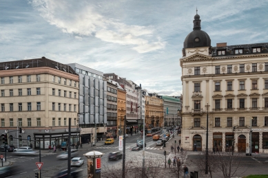
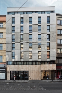
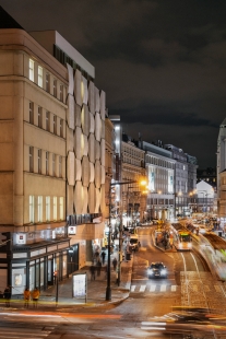
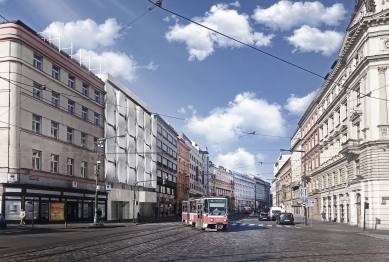
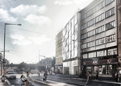
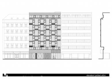
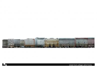
Prague, a unique city of architecture of diverse styles, coexisting harmoniously among each other. And this is no different on Na Poříčí, one of Prague's first streets. Urbanistically speaking, this street is generously widened at the site of the well-known Rondo-Cubist building of the former Legiobank to become an urban commercial boulevard serving a range of functions. Hotels, banks, department stores, with a lively parterre and various architectural style. Classicism, Functionalism, Rondo-Cubism, everything side by side, so typically for Prague. The gap site for the new hotel is situated between the last two buildings having somewhat drab facades, which take away the original grandeur of the commercial boulevard on Na Poříčí. It was clear from the outset that it was necessary to place a more distinct building in the gap site and the function of a hotel was begging to assume this role. The aim was to create a building in this context, that was still distinctive, modern but timeless, emotional and dignified. In human terms, a building with personality.
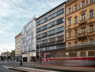
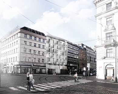
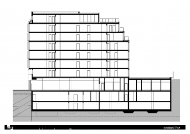
A three-level facade and composition logic. The context creates uniqueness, as a building is to be designed precisely for its location, but with a dose of individuality, which is an ideal mix of characteristics. The existing street front is compact, clearly segmented and its principles are respected in the plan. The street side features include a high parterre extending over two floors, highlighted main entrances, striking shop and restaurants windows, raised (relief) or otherwise differentiated central part of the main function of the building, recessed upper floors and windows traditionally placed above each other. Common are belts dividing the strip windows, separating the main parts of the facades. The adjoining building adjacent to the gap site on the right-hand side had an impact on the design on account of its distinct horizontal structure. The design of the central part of the hotel‘s facade is strikingly vertical so as to prevent the two building from merging into one visual whole.
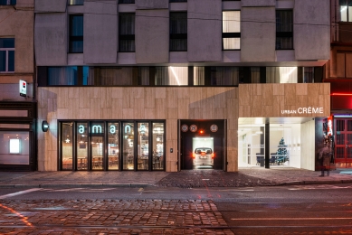
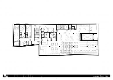
The high parterre addresses three completely distinct demands placed on the entrances to the building. The entrance to the hotel, as the main function of the building, is highlighted whilst at the same time protected from above by an awning. The entrance to the garage is visually concealed at the level of the facade, with the doors lined as adjoining areas. The restaurant is entered via a massively segmented shop window. The tall parterre is lined with travertine, a typical facing stone for the centre of Prague. The entrance to the building is lined with black compact panels.
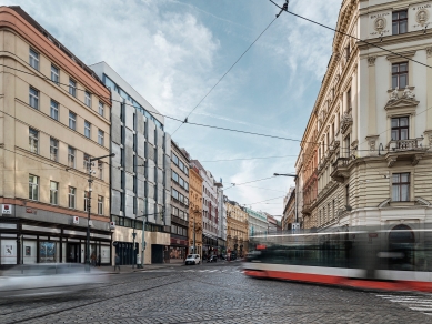
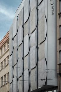
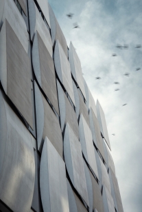
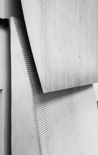
The central part, symbolising the building’s main function, is the most distinctive and incorporating raised (relief) elements as Prague buildings tend to have, but using modern segmentation and expressive elements. Geometrically, the segmented shell structures are used in two types and on the facade they alternate dynamically in rhythm, both in vertical and horizontal directions. Their length extends the height of the floor and their large scale is mitigated by the detail of a tiny flute supporting the play of light and shade on the raised (relief) feature of the facade. The entire central part is slightly tilted, thereby copying the ground plan of the original building that used to stand on the gap site. The tilting feature allows the hotel‘s name to be displayed on the side of the facade, thereby visible from a distance. The segmented shell structures of the raised (relief) part of the facade are cast from thin-walled glass fibre reinforced concrete, a composite material from cement,fine aggregate, water and scattered resistant glass fibres. The heads of the elements feature visual flutes with the help of structural matrices into concrete.
The upper level of the facade recedes, finishes and crowns the entire building.
The three basic sections of the facade are always separated from each other by a single belt of strip windows in the street context.
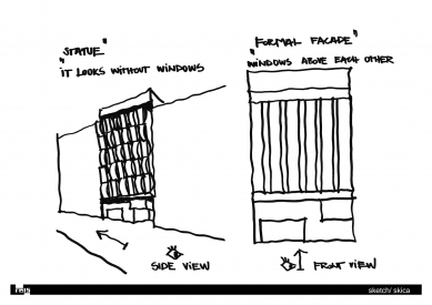
Buildings constructed in gap sites are specific in that that they namely present themselves by a single, street, facade. As such, the spatial dimension of the building is conceptually provided by the raised (relief) features of a single facade. It is designed for the predominant view from the street, i.e. mainly the lateral view, which changes expressively with a change in the position of a passing observer. When viewed from the side, the building’s shell structures create a compact statue, seemingly without windows. When viewed from the front, the facade appears rational, with windows placed one above the other. The building thus “talks” to its “audience”, reacts to his/her position and shows itself in various shapes and light.
0 comments
add comment


