Social Housing Polje

 |
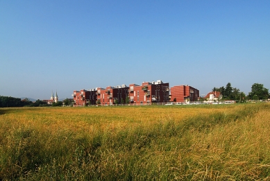
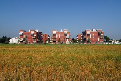
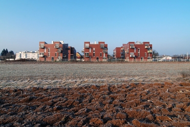
The existing urban plan had to be kept – a series of symmetrically positioned buildings, positioned irrespective of their surroundings.
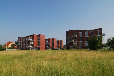
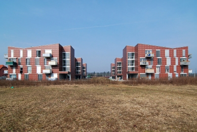
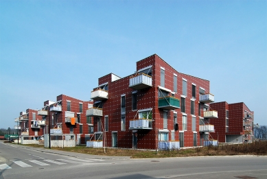
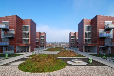
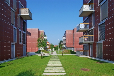
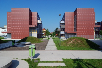
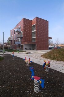
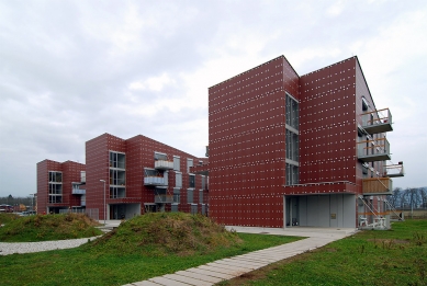
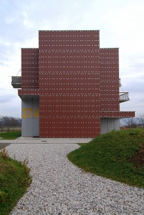
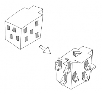
Therefore, the project became the exercise in ‘dissolution’ and rearrangement of the original plan – trying to establish the central open strip of land as a kind of a ‘social condenser’ park-like area, with artificial hills acting as separation ‘walls’ between different social and age-groups of users and trying to ‘dissolve’ the preconceived volumes of the buildings. Each side of the building therefore attains a different ‘profile’, a recognizable silhouette that refuses to fuse into a volumetric reading of the whole object.
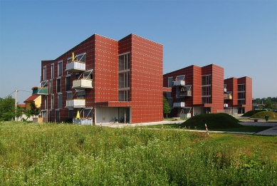
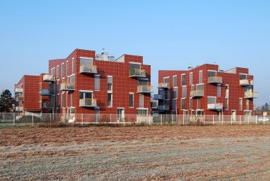
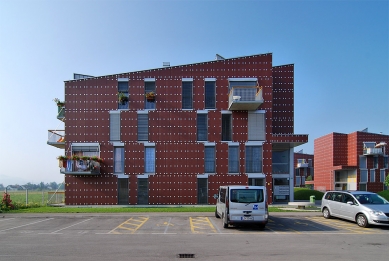
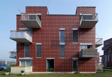
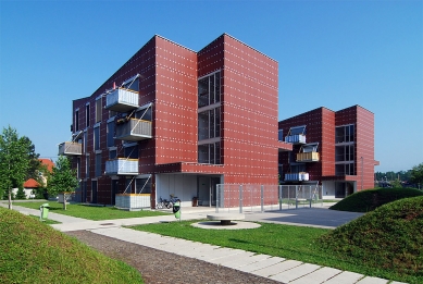
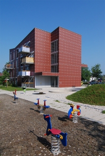
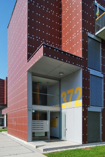
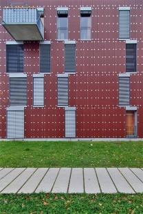
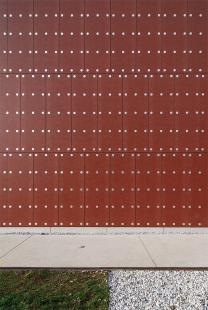
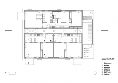
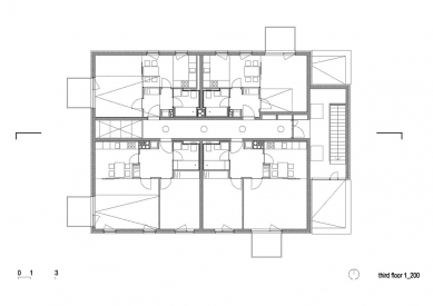
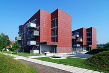
Each building contains 13 apartments, very modest in size. The balconies are ‘pushing-out’ of the building volume, so as to achieve certain ‘openness’ for the units. By being suspended on metal cables, they retain the idea of ‘industrial’ iconography of the nearby railways. The railway theme is further carried out in the ferroxide red colouring of the fibre-cement panelling of the elevation. The super-enlarged attachment plates – 8 cm aluminium discs – on the elevation panels, positioned so as to follow the random sizes of the panels, shift the primary perception of the building volumes towards the idea of skin-wrapping of silver dots.
 |
Bevk Perović arhitekti is a young office in Ljubljana that in the last years confirmed themselves as the one the most promising offices in Slovenia. For their last project Polje social housing in Ljubljana they received the most prestigious architecture award in Slovenia – The Plečnik’s prize for the year 2005. It is not only the quality of their work, what is surprising, is also the tempo and creative energy with which they produce one project after another.
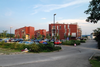
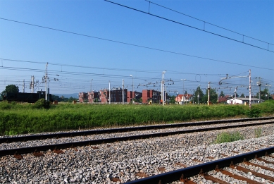
Polje social housing is situated quite far from the city centre, where the prizes of land are more reasonable. The investor was the City of Ljubljana and they rent the flats to socially handicapped families. Such housing has to be as cheap as possible, but on the other hand the client also looked after durability and ease of maintenance. The city also takes care that the tenants come from different social groups in order to avoid the housing to become a ghetto. According to the regulations 10% of the flats should be adapted to handicapped persons and these flats are always on the ground floor. The housing is situated near the railway, not far away from the main freight train station. For this reason the architects found some inspiration for their solution in trains. The red colour of the façade and some details bear reference to this.
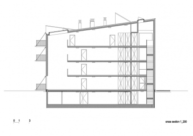
The architects could not affect the situation orientation of the houses. Also the height and roof inclination were fixed. This would not be a great problem if the volume would be too small to house the prescribed programme. Especially in the attic the height was lower than the regulations permitted. One could question himself how the leading city urban planners could produce such an unsuitable (not to say stupid) plan. In any case the architects had to follow it. They solved it by introducing additional attics that give the houses a more plastic shape.
There are 78 flats in six buildings altogether. A park divides three buildings on each side. The park is intended as an addition of the, usually too small, living spaces in flats. For this reason the park is divided in several zones intended for playing, sport and social life (picnic). Different use is marked also by different floor: sand, wood, asphalt and grass, divided by small grass hills. All living spaces in the buildings are turned away from this external communal space avoiding the noise.
The entrances are from the central park area. In fact there are two entrances to each building. The “main entrance” and the “back entrance”. The latter has covered space for bicycles, thus avoiding them to block the main entrance. The architects paid much attention to corridors. They are not dark (danger) but always end with a window (on ground floor) or with the balcony (upper floors) that catches the light from above. The flats are minimal but still the tenants are able to adapt them for their personal needs. For instance, they can remove the wooden partition between the kitchen and living room to create a united space. The architects also introduced balconies, not to enlarge the functional space, but more to create an illusion of bigger space. For this reason the balconies are situated in a way that they never overlap one above the other, preventing the tenants to close them by provisory means in order to create closed spaces (storages, verandas etc.). The balconies are made of prefabricated concrete plates hanged from façade. With some imagination one can find the details of the construction resembling details found on trains. The façade is ventilated and covered with Eternit plates in reddish colour. Double façade of this kind is not the cheapest solution, but it should lower the maintenance costs. The plates are fastened by means of rivets that are emphasized by large aluminium washers. In spite the historic tradition, just think of Otto Wagner’s Postsparkasse in Vienna, here the intention of this solution is to distract the view from not so perfect detailing and uneven gaps between the facade plates. In this way the grid of washers unifies the façade and even act as a kind of ornament.
In a way the social housing surprises with several solutions (façade, lighted corridors) that one hardly finds elsewhere in commercial housing schemes declared as “over standard” luxury dwellings. This proves once again that good architecture has more in common with clever solutions than with money itself.
Andrej Hrausky
0 comments
add comment


