Yale School of Architecture

 |
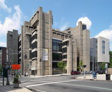
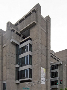
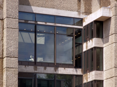
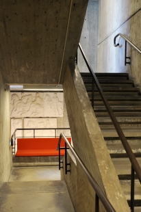
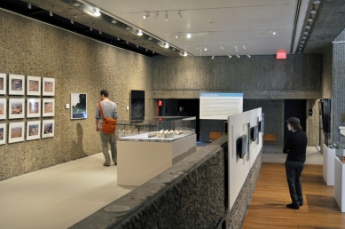
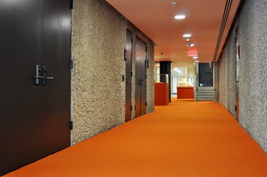
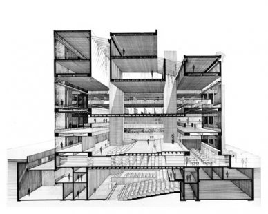
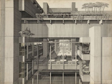
Thirty-seven changes of level accommodate functional and circulation areas, and since walls are de-emphasized these levels are defined principally by floor and ceiling planes. Rudolph, like [Louis I. Kahn], is concerned with the method and drama of natural lighting. This has clearly been an important factor in the design of the building, as it contributes to the changing character and psychological implication of space.
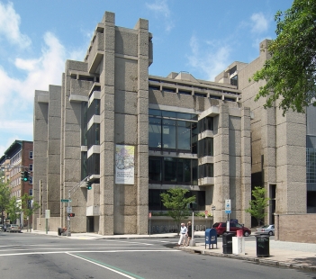
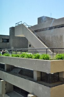
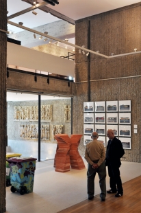
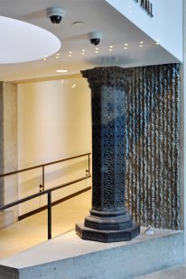
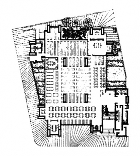
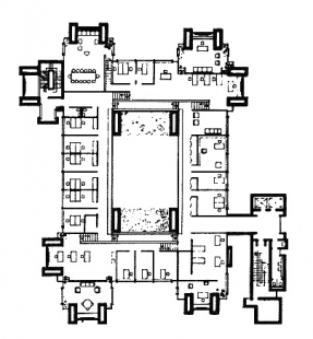
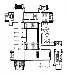
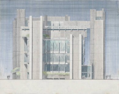
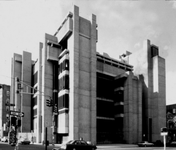
Internally the building is organized around a central core space defined by four large concrete slab columns that, similar to the external towers, are hollow to accommodate mechanical services. On two sunken levels, sculpture and basic design studios encircle a central auditorium, the approach to which is rather torturous and obscure. At street level, the library occupies a single story side. Above this, with the possibility of looking down into the reading area, is a two-story central exhibition hall, with administrative offices on its mezzanine, and a central, sunken jury pit. Starting at the fourth level is the most dramatic space: an architectural zone on five levels, each connected by a few steps, an element in yet a part of the greater space, above which run two parallel mezzanines spanned by a channel- shaped bridge. Between the four central piers two skylights rise as giant clerestories, intensifying natural light in the center of the space that receives it on all four sides through peripheral glazing. Painting and graphic art studios are on the top two levels, with an open terrace for sketching. Finally, there is a penthouse apartment for guest critics, that also has its own terrace.
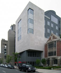
Rudolph has been criticized for the serious functional shortcomings of the building: that he put the areas he cared least about in the basement; that the painters are very disturbed by south light; that the sculptors are in the low-ceiling 'caves'; that the best spaces are reserved for architectural activity. Functionally, Rudolph's building is a studied, politically architectural statement. Architecturally, it tends to extened beyond its own urban context. It cleverly establishes a general urban scale and a particular internal scale, both compatibly and expressively related.
Paul Heyer. Architects on Architecture: New Directions in America. p.300-301
0 comments
add comment


