Schutterstoren

 |
Restructuring
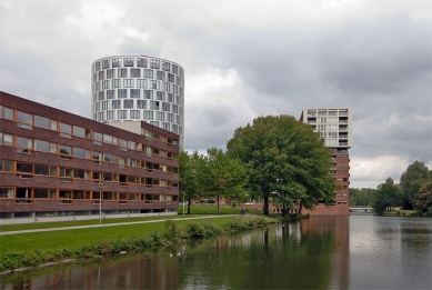
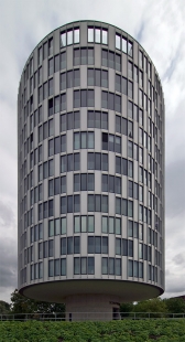
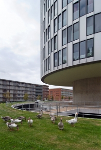
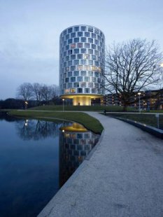
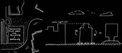
The Meer en Oever Plan is a part of the large-scale restructuring operation in Western Garden Towns of Amsterdam, originally designed by Cornelis van Eesteren. This configuration of residential quarters was built in the 1960s and posseses a strict parcelling of open blocks. The renewed Meer en Oever district to the west of the Sloterplas partly follows the orthogonal structure of the original master plan and partly deviates from it with a parcelling layout based on separate objects, each of which had to be allocated its own orientation. One of these objects, the “Schutterstoren”, is an apartment block that was predestined to be the landmark of the quarter. The self-evident idea of allowing the block to rise above the surrounding construction was precluded by the height restrictions imposed by the zoning plan. Nevertheless, the intended role of the landmark could be substantiated in a surprising way: its exceptional appearance.
Volume
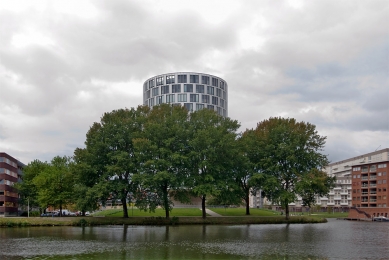
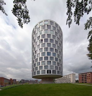
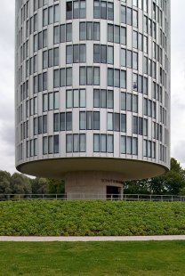
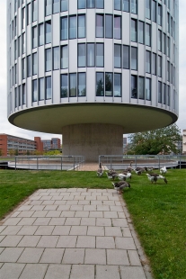
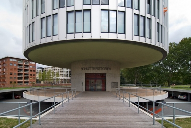
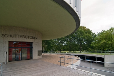
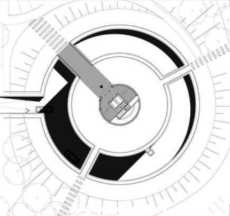
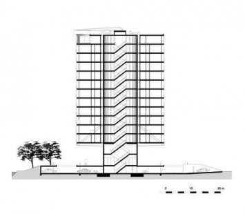
The building was designed as a cylinder elevated 6.5 metres above ground level. At this height, the building cantilevers out in a spectacular manner around a narrow cylinder-shaped core. The large overhang means that a view toward the lake from the residential quarter can be retained. As conceived, the architecture evokes associations with the archetype of a water tower: a cylinder form on a narrow substructure. This powerful image is reinforced by the fact that the tower has been situated on a green artificial mound that conceals a sunken car park.
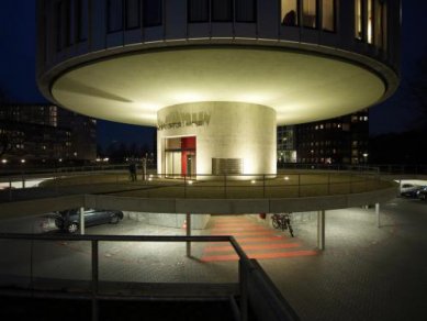
In order to emphasize its exceptional form in the evenings, the building is illuminated from below so that it appears to float above the landscape.
Urban design
The choice of the cylinder shape is relevant to the entire urban planning structure. Due to its form, the tower functions within the area as the pivot that brings cohesion to the many directions in which the surrounding buildings have been scattered. Taking the cylinder concept a little further, an exceptional design solution was formulated at the level of architectural detail. Because the available ground area was too limited for the apartment block and the parking facilities, a strategy of double use was employed. The parking facilities are accommodated in a circular garage with 78 parking bays around the concrete core of the block. This car park has been installed one metre below ground level and then covered with a green bank so that the park-like landscape stretches under the block in the form of a mound under the tower.
Weight watching
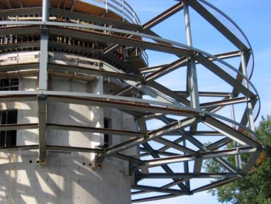
With this type of building, it is important to ensure that not too much weight is involved. This is why the main supporting structure consists of a steel construction of columns and beams, with a concrete core at the centre. The columns are set back in relation to the façade so that the overhang is reduced and the façade division is independent of the construction. The forces generated by the overhang are transferred to the core by the addition of diagonal tie-rods on the two lower floors. As a consequence, the storeys above these can be stacked in the traditional manner. The storey floors have been realized as sheet steel / concrete floors.
Freedom
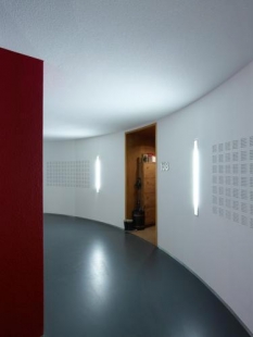
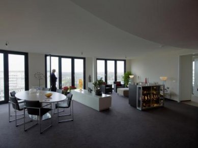
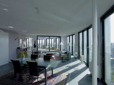
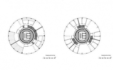
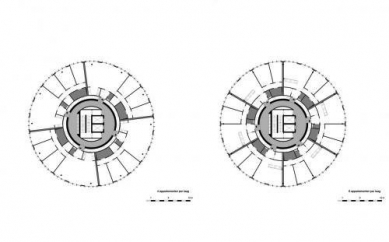
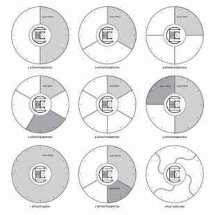
The supporting construction enables a free and flexible layout of the floor surfaces on the standard storeys. The lifts and staircases are concentrated in the concrete core. In circular zones around this core there are the communal horizontal access points and, moving outwards, the shafts containing pipes and ducts. Between these shafts, there are recesses for the entrances to the apartments. Beyond these there are the service areas of the apartments themselves. The rest of the surface area is completely free, right out to the façade. There are no supporting walls whatsoever in this part of the building, thus allowing a free apartment layout and even a flexible apartment size. Three storeys deviate from this principle. In the two lower storeys, the free layout is restricted to a certain extent by the construction diagonals. On the top floor, it is limited by the patio-like loggias. In the partitioning of the free floor areas, use is made of metal-stud separating walls, which are easily installed, even in a circular configuration. They are just as easily removed. Plaster ceilings have been installed to cover the sheet steel / concrete and the course of the pipes and ducts.
Apartment type
The principle of open-plan floor surfaces offers the freedom to apply any required layout to the apartment, as well as the possibility of creating apartments of different sizes. After an extensive inventory, a catalogue was compiled, showing individual apartments varying in size from 90m2 to 275 m². On the basis of circular rooms, various layouts were designed for each type of apartment. An open variant in the form of a loft was also developed for each type. The catalogue also displays the combinations that can be made on the whole floor of a single storey.
Lightweight
The design of the façade was also formulated in the context of weight-watching. The entire façade is made of materials that are as light as possible. To reinforce the continuous round form, vertical posts have been accommodated in the finishing. These vertical profiles, installed in proportion to the façade and extending up the entire height of the building, are made of aluminium while the filling between them consists of aluminium panels and glass fronts, based on a curtain wall principle. The division is based on an ongoing rhythm of transparent and closed surfaces that does not restrict the housing differentiation in any way. At the transparent surface sections, it is possible to install conservatory fronts to any required degree, without disrupting the image of the façade. The basis of this is a tilt-and-turn system with storey-high frames that can be fully opened, thus converting the adjoining living area into a large outdoor space.
DKV architecten
0 comments
add comment


