Euralille Commercial Center

 |
Rem Koolhaas, master planner for the Euralille Project
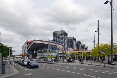
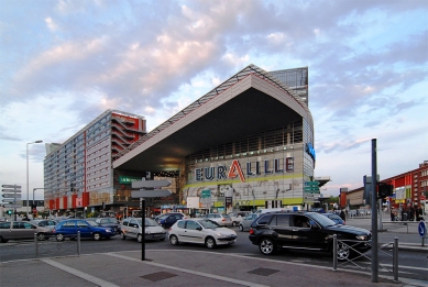
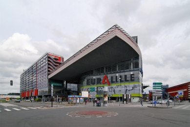
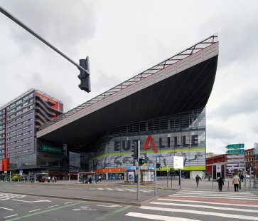
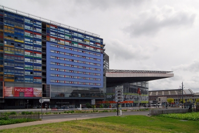
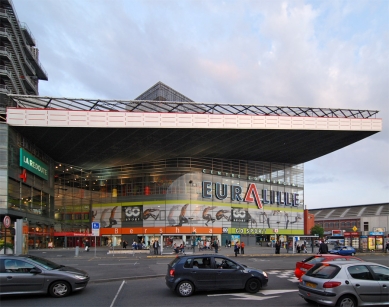
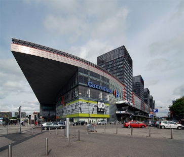
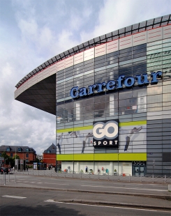
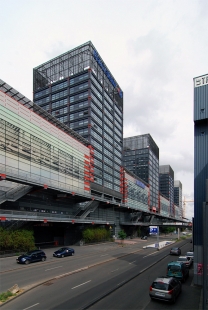
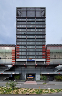
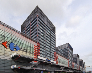
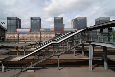
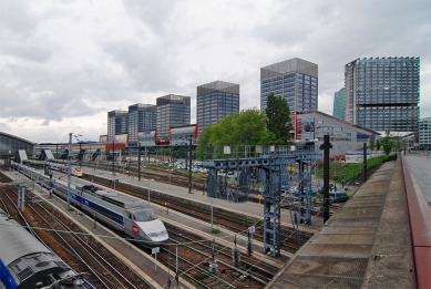
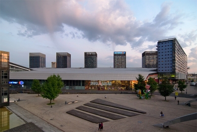
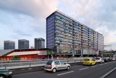
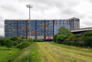
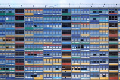
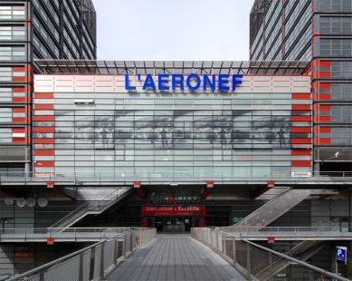
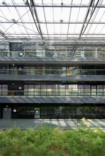
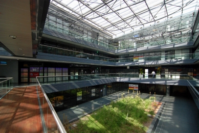
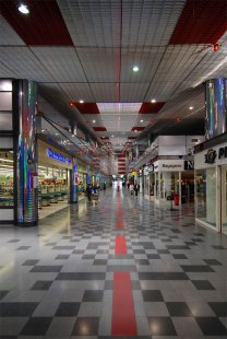
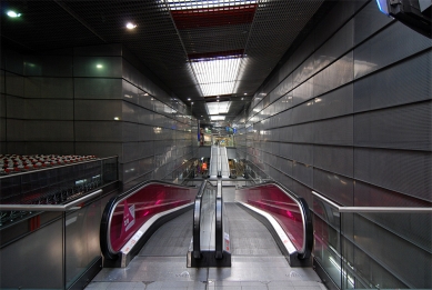
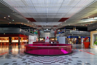
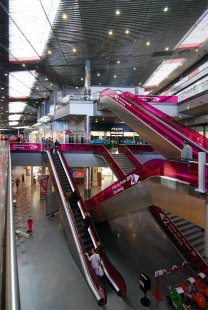
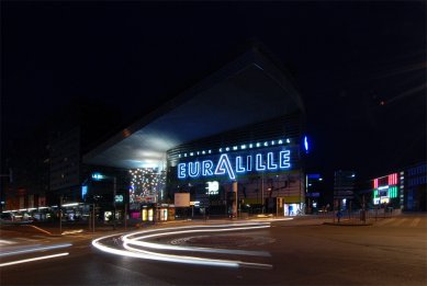
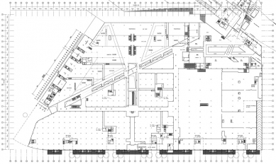
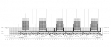
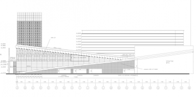
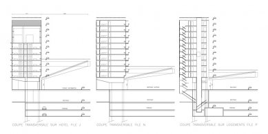
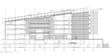
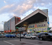
Nouvel's site is roughly triangular in plan, with the southwest corner next to the existing SNCF railway station, and the opposite northern side flanking the new high-speed train station. The building slopes down towards the TGV station, partly following the slope of the land. The brief was to deliver two floors of shops together with a series of five additional units: two for the Lille business school, two as sports center, and one as a cultural center, all under a single roof, together with access to five towers. These towers line the southern façade of the building; on the western side there is another hotel, a housing block, and offices and accommodation for SNCF personnel. The floor plan for the commercial center at Euralille is best understood through its function of linking the two railway stations, of bridging the gap between center and periphery formerly created by the highway. The main entrance is onto the SNCF station. This corridor crosses, at an angle, another main artery halfway through the building, which opens on the north façade opposite the high-speed train station. This deliberate irregularity not only creates interesting shop plans but also a range of different and unexpected perspectives, especially on the upper floors, under the slope of the roof. The roof itself is just over four hectares in area, comprising an openwork metal grid set on top of an asphalt surface. Colored lights and patterns on this surface, like the coded abstract signage of airport runways, create strange and dimly perceived patterns from above the grid. The roof plays an important role in linking the disparate elements of the large site. In addition, for Nouvel, light, materials, and color are as important as form and volume in the definition of architectural space. This principle has been carried over onto the façades of the shopping centre and towers. Over a neutral grey background a series of immense holographic images has been silkscreen. They create patterns that echo and accompany the signage of individual shops, establishing the immateriality of the architecture on its very surface.
Conway Lloyd Morgan: The Elements of Architecture
0 comments
add comment


