
Hearst Tower

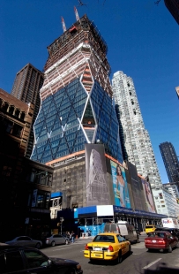
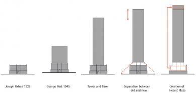
A few years ago, it seemed as if America had turned its back on Norman Foster. On September 12, 2001, a meeting was scheduled with the leadership of Hearst Corporation to approve plans for the expansion of their headquarters. For well-known reasons, the meeting had to be postponed, and at the same time, the entire world began to look at skyscrapers in a completely different way. In the competition for the new WTC, the public chose Foster's project, but the contract was awarded to Daniel Libeskind and later David M. Childs. Foster experienced similar failures in the competition to redesign the New York Philharmonic’s headquarters. The tide is finally beginning to turn, and it seems that he has also won over the American continent with his work. Architecture critic Paul Goldberg has already labeled the recently completed Hearst headquarters as “the most beautiful skyscraper in Manhattan since 1967”. The 182-meter-tall building is Foster's first major project on American soil. The forty-story crystalline form rests on a six-story base from 1928 by Viennese architect Joseph Urban. The original design planned for a multi-story superstructure. However, we only saw that after three-quarters of a century. (pš)
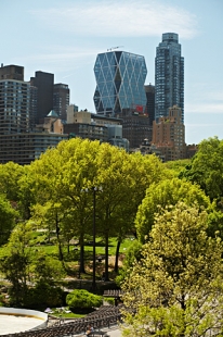
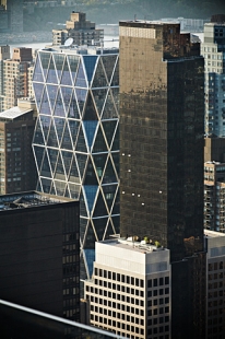
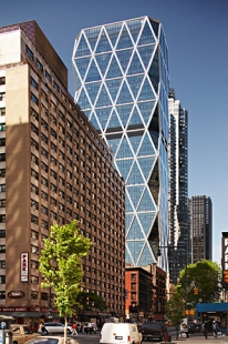
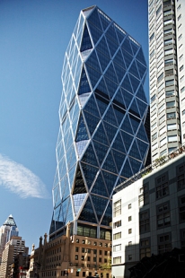
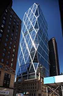
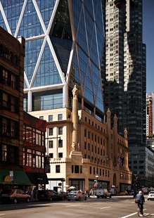
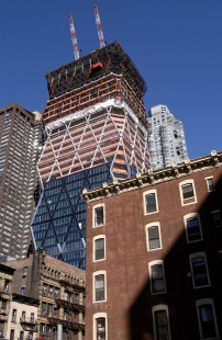
The New Hearst Tower by Norman Foster rises from its 1928 base
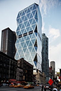
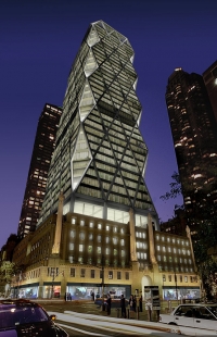
New York architecture has suffered a lot in recent years. The brief optimism born from public resistance to early Ground Zero proposals has long turned into cynicism. Since then, it often seemed that worry and melancholy would overwhelm all of our creative boldness. The new Hearst Tower by Norman Foster arrived just in time and struck the lethargic environment like a hammer. The sculpted glass tower, crisscrossed by a network of massive steel braces, rises from the core of the old Hearst building built in 1928 at the intersection of 57th Street and Eighth Avenue. The past and present do not blend smoothly; they collide here with ferocity.
This 46-story tower could be the most striking symbol of the corporate society's confidence erected in New York since the 1960s when modernism was in full bloom, and most Americans welcomed technological bravado as a reliable pathway to social progress.
While fires raged in Lower Manhattan on September 11, Lord Foster was presenting his design to the Hearst Corporation's building commission. Four and a half years later, the celebratory opening coincided with the expansion of the Morgan Library by Renzo Piano, another significant sign that the city was beginning to come alive again.
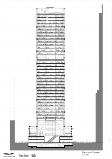
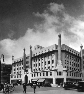
Foster’s building somewhat fulfills the vision born in the late 1920s when William Randolph Hearst hired Joseph Urban to design a new headquarters for his journalistic empire. Although Urban designed the New School in 1930, one of the earliest examples of functionalist style in the city, this fantastic beige concrete Hearst building is an eclectic nod to the author’s past when he was still an architect mixing Viennese “fin de siècle” with a touch of Art Deco. (Hearst originally planned for a tower rising above a six-story base, which was never built due to economic recession.)
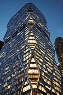
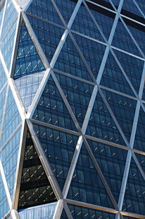
What makes Lord Foster’s building so fascinating is the constant transformation in its visual relationship to the city’s skyline. Viewed from the south, the horizon of tall, sleek glass and brick towers lining Eighth Avenue presents a truncated crystalline form, unexpectedly touching the sky. As you approach, the giant triangular windows begin to confuse, creating a scale of the building that is hard to grasp.
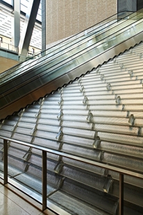
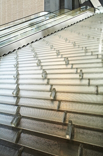
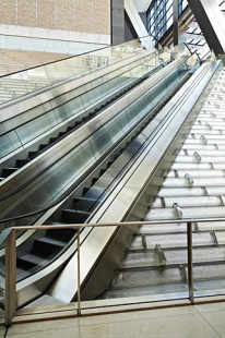
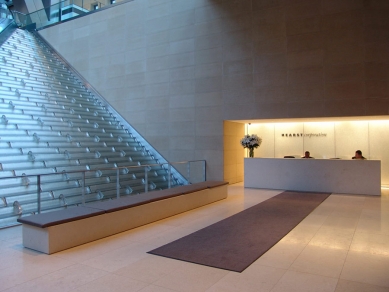
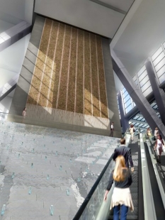
Upon entering the lobby, the aggressive exterior gives way to a form that would comfortably fit postwar corporate America. At the back of the lobby are water cascades on sloped glass surfaces designed by artist Jamie Carpenter. A pair of escalators rises from the edge of the water fountain to the café and exhibition space on the second floor, dominated by a giant painting by Richard Londe suspended on a black polished stone wall of the elevator core. The luxurious atmosphere resembles more I.B.M. in 1955 than a global media company from 2006.
The lobby is a reminder of the journey British architect Lord Foster has traveled during his long career. In the 1970s, he was one of the most visible representatives of high-tech architecture that fetishized machine culture. His famous Hong Kong and Shanghai Bank building from 1986, based on the concept of blocks embedded in a tower-like steel superstructure, was the capitalist response to the populist Pompidou Center in Paris. Since then, his architectural practice has grown from 65 to over 700 employees.
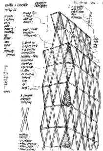
Although his work has become sleeker and more predictable in recent years, the shapes of his designs are always driven by internal structural logic. They communicate with the environment with refreshing audacity. For example, while the exterior of the original building remains untouched, six floors inside have been completely stripped bare. What was once exposed concrete is now presented in a smooth beige, raw setting for what Lord Foster calls “the urban square.”
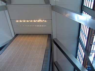
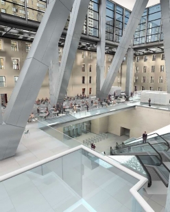
The project slightly resembles his renovation of the British Museum, where he enclosed the main courtyard under a glass canopy, and what were originally the exterior facades are repurposed as interior decor. All results obscuring the difference between new and old have the charm of a better supermarket. Here, Lord Foster's approach to history is direct and sincere. It’s as if the facades of the original building were meant solely to protect against the rain. A series of enormous steel columns rises through this space, supporting the tower above. The entire entrance lobby is enclosed under a glass roof, allowing you to fully feel the power of the tower rising above you when you look up.
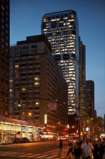
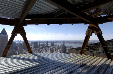
The upper floors are designed just as clearly. By pushing the elevator core to the back of the tower, Lord Foster was able to open the floor plans as much as possible, ensuring most offices have expansive views from north to south. The diamond pattern of the exterior facade results in attractive sloped glass walls at the corners of each floor, which serve as social areas for office workers. The employee cafeteria at the top of the building occupies two floors and offers eastern views framed by the triangular supports of the facade’s structure.
The panoramic view made me think about the creative tendencies of many major New York architectural firms. Fifty years ago, companies like Skidmore, Owings & Merrill transformed the language of European modernism into a style that became the progressive face of corporate America. Led by architects like Gordon Bunshaft, they created some stunning contributions to the urban skyline – from the receding glass form of Lever House (1951) to the slightly cantilevered concrete slabs of the Pepsi-Cola building (1959).
By the late 1970s, many of these firms had descended into mediocrity, creating compromises, trying to please everyone, and moreover incorporating into their work the postmodern pastiche of the then-contemporary style.
These disturbing results are visible directly from the employee cafeteria of Hearst Tower. To the north towards Columbus Circle are the jagged, dull towers from Skidmore, Owings & Merrill, which today house Time Warner, and a few blocks to the south is another massive beige-brick Worldwide Plaza from 1989 capped with a sleek copper pyramid.
At first glance, these two towers have little in common. Yet both designs rely on style – one postmodern and the other contemporary – as a way of sheathing their mundane boxes, adding a touch of charm to the urban skyline and, worse yet, transforming relationships with the streets below. (The curved internal street of Time Warner, a timid attempt to employ street life around Columbus Circle, is a nonsensical echo of the circular walkway surrounding the lobby at the base of Worldwide Plaza.)
Despite this long-standing state, Skidmore lost its proper direction long ago.
Similar to Skidmore, Lord Foster's firm is a corporate enterprise boasting offices in 18 cities. Most of its clients come from the commercial sector. Even as his office continues to grow, Lord Foster manages to ensure that all of his works bear a distinct architectural identity while maintaining high design standards.
And that is no small feat. For the uncertain age of Hearst Tower, it is perfectly comforting: a building with the certainty of its own values.
The New Hearst Tower by Norman Foster rises from its 1928 base
New York architecture has suffered a lot in recent years. The brief optimism born from public resistance to early Ground Zero proposals has long turned into cynicism. Since then, it often seemed that worry and melancholy would overwhelm all of our creative boldness. The new Hearst Tower by Norman Foster arrived just in time and struck the lethargic environment like a hammer. The sculpted glass tower, crisscrossed by a network of massive steel braces, rises from the core of the old Hearst building built in 1928 at the intersection of 57th Street and Eighth Avenue. The past and present do not blend smoothly; they collide here with ferocity.
This 46-story tower could be the most striking symbol of the corporate society's confidence erected in New York since the 1960s when modernism was in full bloom, and most Americans welcomed technological bravado as a reliable pathway to social progress.
While fires raged in Lower Manhattan on September 11, Lord Foster was presenting his design to the Hearst Corporation's building commission. Four and a half years later, the celebratory opening coincided with the expansion of the Morgan Library by Renzo Piano, another significant sign that the city was beginning to come alive again.
Foster’s building somewhat fulfills the vision born in the late 1920s when William Randolph Hearst hired Joseph Urban to design a new headquarters for his journalistic empire. Although Urban designed the New School in 1930, one of the earliest examples of functionalist style in the city, this fantastic beige concrete Hearst building is an eclectic nod to the author’s past when he was still an architect mixing Viennese “fin de siècle” with a touch of Art Deco. (Hearst originally planned for a tower rising above a six-story base, which was never built due to economic recession.)
What makes Lord Foster’s building so fascinating is the constant transformation in its visual relationship to the city’s skyline. Viewed from the south, the horizon of tall, sleek glass and brick towers lining Eighth Avenue presents a truncated crystalline form, unexpectedly touching the sky. As you approach, the giant triangular windows begin to confuse, creating a scale of the building that is hard to grasp.
Upon entering the lobby, the aggressive exterior gives way to a form that would comfortably fit postwar corporate America. At the back of the lobby are water cascades on sloped glass surfaces designed by artist Jamie Carpenter. A pair of escalators rises from the edge of the water fountain to the café and exhibition space on the second floor, dominated by a giant painting by Richard Londe suspended on a black polished stone wall of the elevator core. The luxurious atmosphere resembles more I.B.M. in 1955 than a global media company from 2006.
The lobby is a reminder of the journey British architect Lord Foster has traveled during his long career. In the 1970s, he was one of the most visible representatives of high-tech architecture that fetishized machine culture. His famous Hong Kong and Shanghai Bank building from 1986, based on the concept of blocks embedded in a tower-like steel superstructure, was the capitalist response to the populist Pompidou Center in Paris. Since then, his architectural practice has grown from 65 to over 700 employees.
Although his work has become sleeker and more predictable in recent years, the shapes of his designs are always driven by internal structural logic. They communicate with the environment with refreshing audacity. For example, while the exterior of the original building remains untouched, six floors inside have been completely stripped bare. What was once exposed concrete is now presented in a smooth beige, raw setting for what Lord Foster calls “the urban square.”
The project slightly resembles his renovation of the British Museum, where he enclosed the main courtyard under a glass canopy, and what were originally the exterior facades are repurposed as interior decor. All results obscuring the difference between new and old have the charm of a better supermarket. Here, Lord Foster's approach to history is direct and sincere. It’s as if the facades of the original building were meant solely to protect against the rain. A series of enormous steel columns rises through this space, supporting the tower above. The entire entrance lobby is enclosed under a glass roof, allowing you to fully feel the power of the tower rising above you when you look up.
The upper floors are designed just as clearly. By pushing the elevator core to the back of the tower, Lord Foster was able to open the floor plans as much as possible, ensuring most offices have expansive views from north to south. The diamond pattern of the exterior facade results in attractive sloped glass walls at the corners of each floor, which serve as social areas for office workers. The employee cafeteria at the top of the building occupies two floors and offers eastern views framed by the triangular supports of the facade’s structure.
The panoramic view made me think about the creative tendencies of many major New York architectural firms. Fifty years ago, companies like Skidmore, Owings & Merrill transformed the language of European modernism into a style that became the progressive face of corporate America. Led by architects like Gordon Bunshaft, they created some stunning contributions to the urban skyline – from the receding glass form of Lever House (1951) to the slightly cantilevered concrete slabs of the Pepsi-Cola building (1959).
By the late 1970s, many of these firms had descended into mediocrity, creating compromises, trying to please everyone, and moreover incorporating into their work the postmodern pastiche of the then-contemporary style.
These disturbing results are visible directly from the employee cafeteria of Hearst Tower. To the north towards Columbus Circle are the jagged, dull towers from Skidmore, Owings & Merrill, which today house Time Warner, and a few blocks to the south is another massive beige-brick Worldwide Plaza from 1989 capped with a sleek copper pyramid.
At first glance, these two towers have little in common. Yet both designs rely on style – one postmodern and the other contemporary – as a way of sheathing their mundane boxes, adding a touch of charm to the urban skyline and, worse yet, transforming relationships with the streets below. (The curved internal street of Time Warner, a timid attempt to employ street life around Columbus Circle, is a nonsensical echo of the circular walkway surrounding the lobby at the base of Worldwide Plaza.)
Despite this long-standing state, Skidmore lost its proper direction long ago.
Similar to Skidmore, Lord Foster's firm is a corporate enterprise boasting offices in 18 cities. Most of its clients come from the commercial sector. Even as his office continues to grow, Lord Foster manages to ensure that all of his works bear a distinct architectural identity while maintaining high design standards.
And that is no small feat. For the uncertain age of Hearst Tower, it is perfectly comforting: a building with the certainty of its own values.
Nicolai Ouroussoff for NYT June 9, 2006
The English translation is powered by AI tool. Switch to Czech to view the original text source.


0 comments
add comment