Santa Maria Church
Igreja de Santa Maria Marco de Canaveses

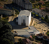 |
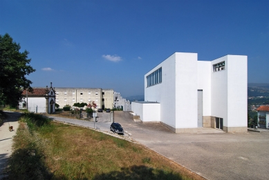
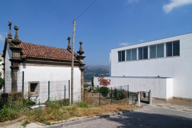
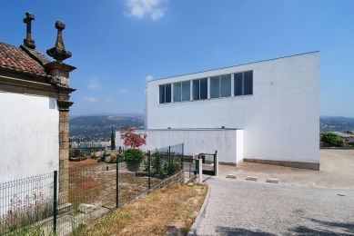
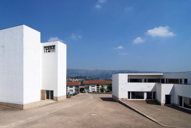
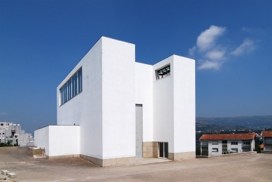
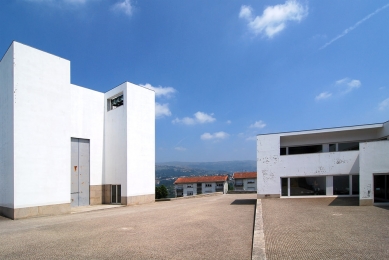
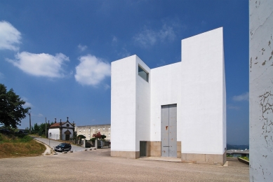
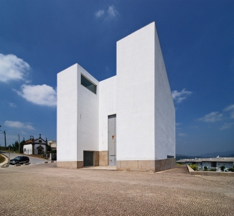
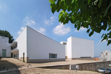
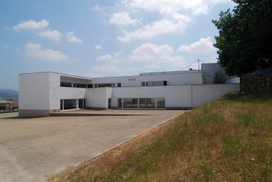
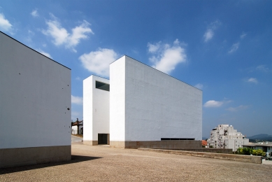
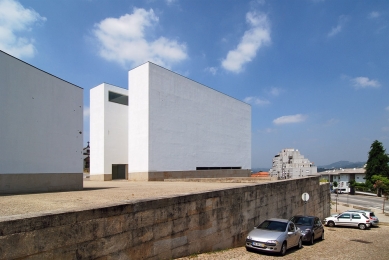
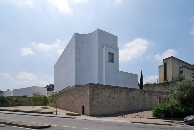
The initial reference was a construction that already existed, a residence for the third age, of a correct and ordinated architecture , located in the superior quota of the scarp and with a very significant extension in relation to the highway. Starting from this new level, everything else went pronouncing, resisting the complexity of the existent constructions and allowing the creation of a churchyard finally, open on the beautiful worth of Marco de Canaveses. Let us hope that new constructions don’t come her to lean on the terrible ones that already exist and stay opened, that is essential.
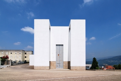
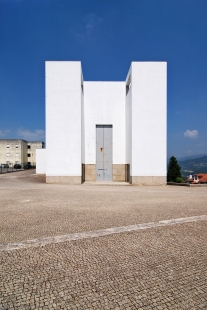
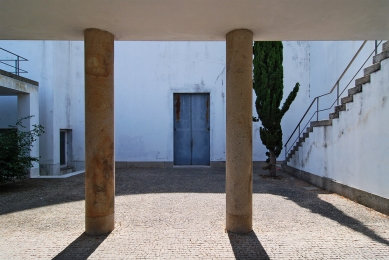
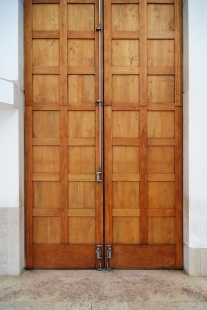
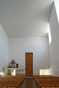
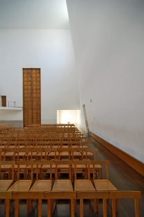
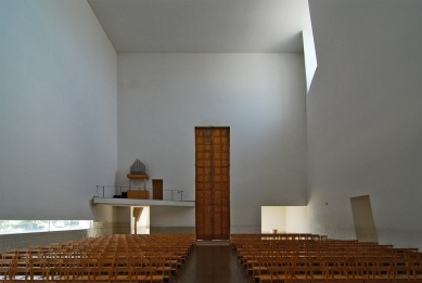
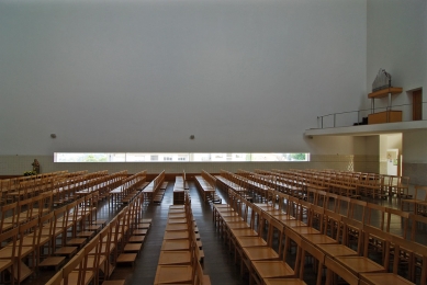
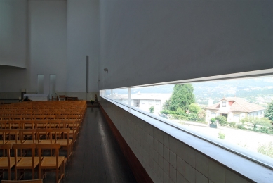
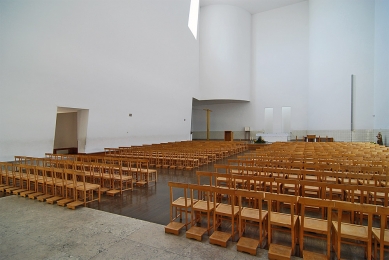
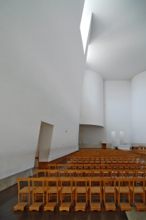
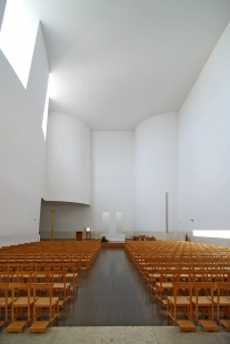
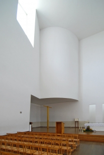
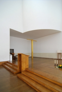
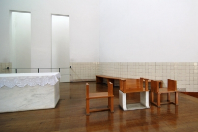
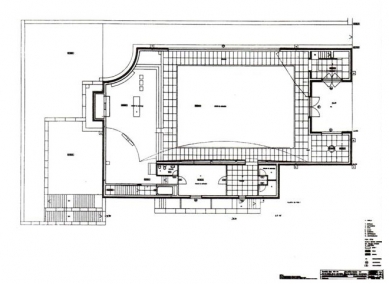
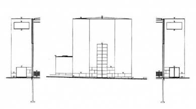
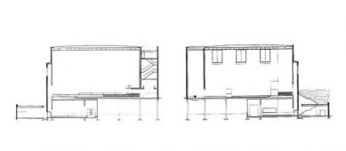
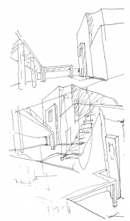
The great door of the church, with its ten meters of height, should exist in relation to this vast view. The entrance is made, usually, through a glass door, under the right tower, while the big door is only open in special circumstances. After the lateral movement of entrance, the perception of a low and long window, on the right side, that allows the view to the exterior. In that instant, if it doesn’t seat the diffuse light that arrives of the high openings in the wall curves and sloping to the, left: They see each other, still and immediately, it is worth it and the constructions in front. The window contradicts the withdrawal atmosphere that are habituated at a church and for this reason it generated controversy. The same with the placement of the statue of the Virgin, that is almost as high as the followers and is not agrees in pedestal. Though surprisingly, a theologian, very dear in Porto eulogized the respect for the actuais beginnings of the liturgy, that accentuate the function of mediation of the Virgin between God and the men and by consequence among men. Is facto the statue of Our Lady has an intermediate position: put in the extremity of the window and submited to a very intense light, it introduces the space of the altar, that who enters doesn’t notice immediately. Three steps elevate the plan of the celebration, that ended with two doors, for which enters clear light, filtered by a high chimney. This disposition dialogues with the light bath on the curve forms of the lateral limits of the apse and on the space of the church in general.
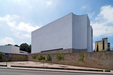
The natural illumination varies with the time, depending on the position of the sun, and it is going from the projection of the drawing of the ray of light to the silence of the aspersion: a great interval, rigorous and tangible. The assembly of all of the elements is, evidently, coherent. Though this order, characterized by some existent contradictions, it was built in a slow and laborious way. There were not pré-defined ideas, given by priori. What is now readable is the result of the decantation of certain reflections of the space, today so difficult, of the church. This difficulty is because of the a series of important alterations in the liturgy: think of the celebration of the mass, that now finds the priest turned to the assembly. Such a change transforms the carácter of the celebration entirely and it annuls the sense of traditional space organization, in their several forms and in its slow and permanent evolution. At the same time, this new condition doesn’t justify the interpretation of the church as auditorium. Almost all of the recent projects doesn’t deepen this aspect properly. It was indispensable, consequently, a reflection of the conditions, we could say functional, of the space of the church. However the discussions with the theologians put in evidence the contradiction that involves the several interpretations today. And so it is an unstable program, still to be solved. Though it was evident the need to create a projection of the celebrant, a communion with the assembly, without, unavoidably, if it created its own distance of any auditorium. For this reason I proposed, for the apse, curvatures no longer concave but convex. It is also in this case not a pré-conceived idea, immediately derived of the variation of the liturgy: it is an intuition, born of a series of demands, among the ones which the need to conserve the relationship among the objects and the movements that are part of the celebration.
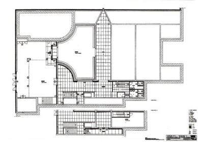
In the space around the altar a series of elements that participate in the ritual exist: the pulpit, the own altar, the tabernacle, the chairs of the celebrants and the cross, the ones which slowly took form and they defined the space later, in the respect for the movements, pré-established, of the mass. Like this the church acquired form as a sculpture in negative, in which it went establishing continuity relationships and tension among several parts. The plan of the course that, in the inferior floor, links the exterior to the mortuary chapel is the result of the study of what happens in these spaces. It was decisive, in the reality, the knowledge of the meaning of the funeral in the area of Minho.
When I visited the wonderful crematory cemetery of the Dutch arquitecto Pieter Oud, I had the possibility to attend a funereal cerimony I verified that the atmosphere and the relationship of the people are decisively different from what happens in Portugal.
Here, during the funeral, the family and the close friends are very close to the deceased, while many other people, like neighbors stayed at a certain distance, naturally with smaller pain and emotion. It became necessary a sequence of spaces with different characteristics.
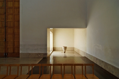
Also for this reason I thought of a monastery, in which the people would smoke, talk or eventually, why not, talk of businesses: it is a way to react to that certain discomfort at the encounter, so direct, with the problem of death. This reacção to the pain is not, for instance, in the funerals in Holland, during which it dominates the total silence. The monastery is followed by a first gallery, quite wide, marked by the entrance door, the wall curves and goes down by the apse. Few meters ahead it open up, to the left, another gallery that has, in the bottom, a vertical window from where you can see the highway again. I don’t know what is the connection between this window and the horizontal window of the superior level, but I have faith that the vertical position of the one that is in bass, in the embasament is owed in search of the necessary sensation of the weight, of the gravity. The course finishes at the mortuary chapel, that communicates with the first gallery thanks to a horizontal window.
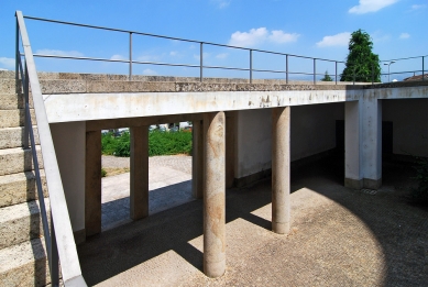
The people that are in the interior have, the perception of the ones that enter or leave, exactamente as it happens in the superior level, it finishes like an opening that allows the view of the monastery. One returns then, once again, to the starting point, with the noise of the water of a source. In the yard is imposed with private relief the presence of a stairway, that leads again to the superior level. In this project, the unit is checked by the courses that finish in the starting point, circularly. The final sensation is really of a closed place, well delimited.
It always impressed me the obsessive invitation to the meditation that we feel in most of the churches. In fact the openings are frequently put to such height to doesn’t allow look at the exterior, at the same time that the use of the stained glass windows eliminates the continuity and the transparency. ON the other hand, I think that the recent modifications in the liturgy contrast with this vision of closed and segregated space. When I began to study the program, I quickly understood the enormous reach of this rupture in the secular continuity of the tradition. Though I think that this aspect doesn’t have any parallel one in the real life of the Church, in the relationship between the church and the society. For this reason, and in spite of the necessary adaptations, I tried to preserve the continuity with the tradition. And so, observing the carácter of this church sincerely, it seems evident that its conception is substantially conservative. This intention emerges with clarity of the drawing of the plant that in fact expresses a rigid axialidade.
Contextualy, the verticality of the interior is very strong. In fact, in spite of the ship being ofasquare section, the articulation certain elements, such as the two openings behind the altar, it gives the sence of elevation. Several discussions would come to reinforce this continuity idea with the canonic espaciality . The theologians’ pieces of advice were constant and decisive. And so for instance, the baptistery, initially put beside the altar, was later deviated close to the entrance, so that announced the presence of the assembly. Besides, once of the procession of the celebrants has to travel the longitudinal axis of the church, it became necessary the presence of a door, in the wall it curves.
The ritual of the celebration demands, evidently, certain options in the treatment of the space and in the organization of the courses. On some of the interior walls tile was used. It was necessary a resistant baseboard, that obviated the problems of the cleaning and of the maintenance. In the first moment I had thought wasn’t the best about a covering in wood. But this choice soon I thought, because it would have annulled the verticality of the wall and overcoat because the reflection of the light would have been inadequate.Then I thought then about the tile that, produced artistically, conserves a surface slightly irregular; that allows peculiar reflexes of light, while the committees, that are left empty, manifest a sensitive presence.
The continuity with tow and the unit of the color is cut for that presence and for those reflexes. In a first phase, the tile flanked the whole church; then, the wall curves to arrive at the soil, the solution the problem of contact with the doors, was its limited use. One of the objectives that one could not abdicate consisted exactly in avoiding that the details were so evident that it competed with the structure of the space. I worked intensely in the relationship, encounter and transition of the materials. The tile has the function of solving the problem of the continuity, lessening the existent ruptures. The way to solve the problem of the continuity. Lessening the existent ruptures. The way which these three materials are linked - wood, tile and tow - is very special, and there are probably things, that I cannot describe, that appeared to me by the experience of the space, during the construction. In the chapel baptismal I have intention of drawing - inside the wall of the access - illustrations with about six meters of height, deformed according to the perspective. These characters, that together represent Christ’s baptismo, they are of a decisive importance, in this space exceptional, high and narrow, and they will be stylized in way the one that don’t result excessive. They will have a very strong presence, in a dark blue or in black, in way they emphasize her/it in the white tile. I already finished the drawings, but I didn’t have courage of giving begin to the accomplishment: I still have need of time.
The elements that should be drawn are still many.
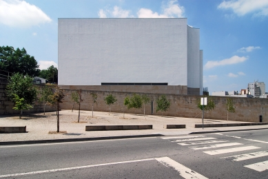
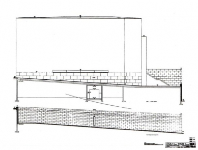
The own cross was only put after the inauguration. In a first phase I had thought about a cross in wood, with a work of the outlines not very well defined and with volumes, that suggested Christ’s illustration. Then the drawing passed by many other phases, much more simplified, to define, finally, in a cross in that, in the encounter between vertical and horizontal, in the form of the vertical and in the vibrations of the wood, it is immediately evident the human presence. Now I want to cover it with a sheet of gold. The cross was put in a position sincerely gaged, close to the altar, and with light. The sheet gold will give, then, a larger dematerialization and, not demanding protagonism, will react imprevisivelmente with the space. Returning to the exterior, it is noticed a solid presence of the granite that, in this area, is one of the most important elements in the landscape, in the Nature and in the construction. In this project, the platform in granite appears as necessary counterpoint to the lightness and a great geometric conciseness of the white volume. In some hours of the day the church almost seems it dematerializes: some times it seems to disappear, other times in other occasions, it almost stands out violently. And so it was necessary a base that arrested it to the soil.
I had already been in Turkey, where I had studied the Pré-Columbus constructions, that evidently left the mark in certain volumes so accentuated.
0 comments
add comment


