

Announcement of the results of the competition for the visual identity of ČKA
Publisher
Tisková zpráva
16.01.2013 09:35
Tisková zpráva
16.01.2013 09:35
The Czech Chamber of Architects (ČKA) has concluded a public competition for a new visual identity and is now announcing the results. Designers Jakub Straka and the MÜTANTA studio ranked first and second, while the Deep Throat studio came in third and Jaromír Hárovník fourth. The awarded participants have been paid their respective prizes, and negotiations are currently underway to finalize a contract for developing the competition proposal with all four finalists.
In 2012, the Board of the Czech Chamber of Architects decided to create a new website. This step is part of the ČKA's Communication Strategy, particularly in promoting Czech architecture and the architectural profession more intensively, as well as serving as a quality service for ČKA members. This decision was also tied to resolving the need for a unified visual style, which has been discussed for several years but had not yet been addressed. The aim was to find a partner in graphic design for long-term collaboration and the development of the ČKA's visual identity.
Since the ČKA promotes architectural competitions, it wanted to set an example and chose a public competition instead of a direct selection of a graphic designer. "We aimed to find a creative partner for long-term collaboration who is well-versed in digital media. We have conceived a variety of features and platforms that our new website should include, such as portfolios of individual ČKA members or an intranet to facilitate easier communication within the architectural community,” said Petr Janda, chair of the ČKA Architecture Promotion Working Group. In the competition brief, the ČKA recommended that participants retain the lion motif; however, the logo and its application should also suggest greater openness of the Chamber, ease, and flexibility in its communication. The expected concept of visual identity should confirm the role of ČKA as an authority in the fields of architecture and urbanism while also demonstrating its openness to current trends and a fresh approach to architectural issues.
At the end of September 2012, the Czech Chamber of Architects announced a public non-anonymous competition for the concept of a new unified visual identity for ČKA, with an emphasis on digital media. By the submission deadline of November 5, proposals from a total of 21 submitting authors or teams were received.
The judging committee, comprising Petr Babák, Lukáš Brom, Adam Gebrian, Petr Janda (chair), Aleš Mička, Josef Panna, and Martin A. Tomáš, met for the first time on November 8 and selected 8 proposals in the first round, inviting their authors for personal presentations.
The second round took place on November 23, 2012. Each author or team had 20 minutes to present their visual identity and website concept proposal for ČKA. Participants in the second round included: Deep Throat, Matěj Hanauer, MÜTANTA, studio mančaft, Jaromír Hákovník, Pavlína Morháčová, Jan Čumlivski, Matěj Görner, Jakub Škrhla, and Jakub Straka.
In the subsequent evaluation, four proposals were eliminated, and four advanced to the final assessment. In the following part of the press release, you will find the jury's comments on the finalist proposals and texts from individual authors.
The jury proposed awarding fourth and third places, but could not agree on a clear winner between the two highest-rated proposals, thus recommending that ČKA request clarifying materials and declare first and second places based on them.
Proposal No. 11 (Jakub Straka) - 1st-2nd place
Opinion A: Probably the most refined concept, elegant and clean solution. The brand itself is usable without problems, even though it does not use the lion symbol - it is airy, yet firmly holds its form. The visual style is a significant theme. The author has long been honing his strong handwriting on each new task, and ČKA could be the next in line. One might wryly ask whether we want to purchase this ready-made universal template. In my opinion, probably not, as the competition can also yield solutions uniquely created for ČKA that will present the institution more distinctly and authentically.
Opinion B: A clear, graphically refined proposal with good possibilities for further development. A significant shift towards the current trends in web design (color scheme, readability, uncomplicated navigation). The author's graphic consistency and current (and anticipated) productivity is also a pitfall in the potential interchangeability of ČKA's identity. A minimalist approach to the proposed identification elements can be seen as a plus and at the same time as a pitfall lying in their invisibility. The application to printed materials lacks the quality of a clear graphic solution readable in the web proposal, simplicity here borders on a stylistic inadequacy. Proportional inconsistency of the shortened version of the logo comes off as unintentional.
Opinion C: A concept that tries to be minimalist, intellectual, and academic. Behind this form (the execution of which is debatable) there is nothing substantial hidden. The line as a unifying principle is generic; its interpretation is vague, and the manner of use is not particularly consistent as a whole. Visually, it is a subtle identity that may simplify and clarify ČKA's presentation but will not be a significant visibility boost or a fundamental shift.
I consider the web solution quite uninteresting, but capable of meeting expectations and function.
Proposal No. 22 (MÜTANTA) - 1st-2nd place
Opinion A: Studio Mütanta's proposal ignited passion and discussion from the start of the competition to its very end. I consider this simple fact a success and a sign of strong potential for possible future operations. It is unequivocally one of the most distinctive and graphically high-quality proposals. The well-managed institutional brand connects back to the original lion. I highly value the retention of the small state symbol (albeit in a more abstract form) and consider it strategic to maintain it. The main arsenal, however, lies in the proposed form of the website, which dynamically (not confusingly) plays out the basic layout and integrates elements of contemporary internet - Facebook, Google plugins, PDF printing, discussion forums, etc. Everything happens very intuitively and cleverly. Long texts are healthily formatted into blocks, supported by lead-ins and distinctive headings and subheadings. I personally consider Proposal No. 22 the winner of the competition and despite many inaccuracies and ambiguities, it is a good solution. It is certain that refining the proposal into a functional form would not be without pain, but I am convinced it would be worth it.
Opinion B: Probably the only acceptable design for the redesign of the lion, although I consider the logo itself the weakest part of the whole system. The "tiles" principle is extremely simple and allows for easy application to anything (successful title pages of the Bulletin). The concept is recognizable, distinctive, functional, and will significantly advance ČKA's identity.
I consider the web solution very good; the modular system will be functional and will allow any content to be fulfilled. Adhering to simple rules during implementation should not pose a readability problem for the website; on the contrary, the tiles allow for easy and clear navigation, especially since this method of navigation may soon become quite standard.
Opinion C: A technically interesting proposal built on a progressive structure of the website, likely predicting the development of web presentations in this direction. The proposal considers the possibility of integrating a multitude of current elements used for websites with the character of an entry portal to the field (here architecture). Modification of the visual identity is based on manipulation with the existing logo; it suggests a direction, but it is not a convincingly clear solution, which can be said about the entire visual aspect of the proposal (coloring close to the existing ČKA website, font choice). The gained added value and at the same time a pitfall for ČKA may be the (non)challenging orientation on the pages, as well as their production and operation.
Proposal No. 2 (Deep Throat) - 3rd place
Opinion A: The personal presentation of the Deep Throat studio was a pleasant surprise for me (in a good way). The best analysis of the existing website and its problems, and a logically constructed and functional structure of its own proposal. Supported by a firmly held graphic/artistic quality of the proposal. The weaker side might be the brand itself, which balances on the edge of the assessment that it was not actually proposed at all. However, I consider this a solvable issue, and in my view, it is one of the two best proposals in the competition.
Opinion B: A proposal that works with suggesting a wide range of options for work with the graphic substance of the visual style. Not dominant at the level of striking visuality or in the extension towards an innovative website structure. The presented division into three columns, which is the basis of the graphic layout, is not important for reading the quality of the proposal. Overall, a very balanced proposal without readable weaknesses, but sadly also without strong motivators supporting the memorability of the brand and the interest of the website and printed materials.
Opinion C: A concept based on a grid system (three columns) as a certain architecture of layout has its relevance. However, its adherence must be absolutely strict and obvious, which is lacking in the proposed solution. As a result, the identity is unreadable, indistinct, and essentially seems non-existent. If the grid is not "strikingly evident," there is no identity... and it simply remains boring.
I can't even remember the web solution.
Proposal No. 18 (Jaromír Hárovník) - 4th place
Opinion A: An identity based on the principle of "elongated letters," whose symbolism is quite apt and evident but not trivial. Visually, it is by far the most personal and, for me, the most appealing proposal from the whole selection. The solution is contemporary, bold, witty, and especially playful, with sufficient variability. The character of the used lion could be more serious, and the work with initials (which leads to nonsensical word breaks) is in many cases merely redundant and unnecessary. However, the work with individual identity elements is also very interesting, prominent in layouts, and the identity is easily and quickly recognizable. Such a solution for identity would bring ČKA a strong and recognizable visual language for years to come.
The web solution itself is logical, and the division into columns is justified, as is the absence of a "back" button. However, I consider this solution overly experimental, inaccessible, and ultimately unergonomic.
Opinion B: Graphically interesting, predominantly focused on the redesign of the logo, the proposal most closely approaches an intriguing result in the area of ČKA's rebranding. However, the interesting aspect might be for conservatively thinking users on the verge of graspability; nonetheless, for the identification of ČKA, a slight controversy would likely play a very significant role due to its memorability. The weakness of the proposal is the website solution, which does not fulfill the ambitions of the brief and is unconvincing both in its clarity and in the shift towards a more interesting arrangement structure.
Opinion C: I appreciate the bolder approach to the brand, which is very memorable and appears very fresh in printed applications. Unfortunately, it is not supported by a similarly elaborate visual style. The weaker part of the proposal is the website, which however, future ČKA will rely heavily on and build upon.
The main goal of the new identity is to simplify overall communication, emphasize what is essential, and create space.
The identity is based on the way the name Czech Chamber of Architects is used, including its variants, Chamber, ČKA, and is designed to function in every variation.
The identity consists of three variants of the name itself, each typographically creating a new whole. Each variant has its version of the name's abbreviation, which conversely creates a new space from the original whole. The lion symbol is used only as a supplementary part, as demonstrated in the Bulletin example.
Proposal No. 22 - MÜTANTA
The logo and visual style concept stems from ČKA's request in the competition brief - to create a brand that will have a state institutional character while also showing greater openness of the chamber toward the public, and modern trends while retaining the lion symbol.
We decided to divide the lion into parts and compose new combinations, options, visions (greater ease and openness of the chamber toward the public). Thus, a refined path emerges that points to the importance of new perspectives while referencing tradition. The logo is the cornerstone of the visual style and represents movement, a desire to embark on new directions. The lion thus embarks from its original static position into a space that it further explores.
The entire visual style is significantly influenced by the proposed ČKA website, which is to be the main communication channel of the chamber. (A significant play and further development of the logo, simplicity, and striking color.)
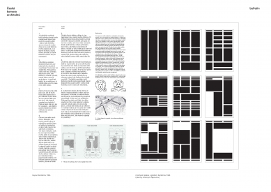
Proposal No. 2 - Deep Throat
Analysis as part of the process:
At the beginning, we conducted an analysis of the current ČKA website and other materials, whether digital or printed, that ČKA works with or has worked with in the past. After a brief discussion, we realized that ČKA does not even need a logo (what is associated with the term logo in the context of the logo competition). The original, therefore, the then logo, which represents the lion with the heraldic character of the Czech symbol, and some font that appears characterless, is completely unnecessary. The lion, for example, does not have any association with architecture besides being from the Czech symbol, and the font choice is not the best either. We thus decided to create a system of language that will represent ČKA without needing to be forcibly visible and loud, because something that is called and textually marked as Czech Chamber of Architects, and still associates in this written composition with the lion from the Czech symbol, is a duplicating of information…
Therefore, our opinion is that redesigning the logo, the lion symbol, is completely pointless in this case, as the very name Czech Chamber of Architects evokes the feeling of a state institution that can undoubtedly function without the support of the lion in the logo.
Logo is a grid, grid is a system.
What we decided to create is thus a universal grid that will represent ČKA. Grid as a substitute symbol. Grid as a logo. Grid, a grid, a system that is divided into three paragraphs or parts, which have their limitations - a limitation but also offer variable options, solutions for use.
Basically, it is that whenever working with printed or digital media, the grid functions as a censor, a filter, something like a system that organizes and divides information (see examples). Through the project, we aimed to shift thinking about what a logo is and what role it plays, and bring a discussion about the fact that not always does an icon, visual symbol (visual character) have to be a logo. Similar tendencies and systems used with the work of a logo can be seen, for example, in the cultural space Casco in the Netherlands, where the inscription Casco is always positioned in the center of the composition, whether in a digital or printed form.
Proposal No. 18 - Jaromír Hárovník
"Idea of Space"
This broad architectural theme is processed in a simple form of a logotype and is further developed in individual applications, primarily within typography. Letters as a communication tool are transformed into an object form, opening the possibility of viewing the typeface as an object while keeping it in the plane of readability.
The logotype has several variants in which the visual angle of the displayed space changes. The national symbol is preserved as recommended, yet in a simpler form and new context, which gives the logotype weight and dominance.
In 2012, the Board of the Czech Chamber of Architects decided to create a new website. This step is part of the ČKA's Communication Strategy, particularly in promoting Czech architecture and the architectural profession more intensively, as well as serving as a quality service for ČKA members. This decision was also tied to resolving the need for a unified visual style, which has been discussed for several years but had not yet been addressed. The aim was to find a partner in graphic design for long-term collaboration and the development of the ČKA's visual identity.
Since the ČKA promotes architectural competitions, it wanted to set an example and chose a public competition instead of a direct selection of a graphic designer. "We aimed to find a creative partner for long-term collaboration who is well-versed in digital media. We have conceived a variety of features and platforms that our new website should include, such as portfolios of individual ČKA members or an intranet to facilitate easier communication within the architectural community,” said Petr Janda, chair of the ČKA Architecture Promotion Working Group. In the competition brief, the ČKA recommended that participants retain the lion motif; however, the logo and its application should also suggest greater openness of the Chamber, ease, and flexibility in its communication. The expected concept of visual identity should confirm the role of ČKA as an authority in the fields of architecture and urbanism while also demonstrating its openness to current trends and a fresh approach to architectural issues.
At the end of September 2012, the Czech Chamber of Architects announced a public non-anonymous competition for the concept of a new unified visual identity for ČKA, with an emphasis on digital media. By the submission deadline of November 5, proposals from a total of 21 submitting authors or teams were received.
The judging committee, comprising Petr Babák, Lukáš Brom, Adam Gebrian, Petr Janda (chair), Aleš Mička, Josef Panna, and Martin A. Tomáš, met for the first time on November 8 and selected 8 proposals in the first round, inviting their authors for personal presentations.
The second round took place on November 23, 2012. Each author or team had 20 minutes to present their visual identity and website concept proposal for ČKA. Participants in the second round included: Deep Throat, Matěj Hanauer, MÜTANTA, studio mančaft, Jaromír Hákovník, Pavlína Morháčová, Jan Čumlivski, Matěj Görner, Jakub Škrhla, and Jakub Straka.
In the subsequent evaluation, four proposals were eliminated, and four advanced to the final assessment. In the following part of the press release, you will find the jury's comments on the finalist proposals and texts from individual authors.
Jury's Statement on the Proposals for the Visual Style of ČKA
During the final evaluation of the jury, it became apparent that two types of opinions or streams of thought (up to three in the case of proposal no. 18) had emerged among the members, which could not be reconciled into a consensus. Therefore, the outcome of the jury's deliberations presents a rather diverse perspective on the submitted proposals. Since it was not possible to condense the evaluations into a single consistent text without contradiction, we decided to keep the individual opinions separate and rank them in the evaluation from the most favorable to the most rejecting, regardless of the author. We are aware that the written evaluation is proportionally unbalanced and does not represent the views evenly (it was truly 50:50), nonetheless, we preferred to publish a larger number of texts, which would lose their emphasis if compiled, over an attempt at balanced representation of both opinions.The jury proposed awarding fourth and third places, but could not agree on a clear winner between the two highest-rated proposals, thus recommending that ČKA request clarifying materials and declare first and second places based on them.
Proposal No. 11 (Jakub Straka) - 1st-2nd place
Opinion A: Probably the most refined concept, elegant and clean solution. The brand itself is usable without problems, even though it does not use the lion symbol - it is airy, yet firmly holds its form. The visual style is a significant theme. The author has long been honing his strong handwriting on each new task, and ČKA could be the next in line. One might wryly ask whether we want to purchase this ready-made universal template. In my opinion, probably not, as the competition can also yield solutions uniquely created for ČKA that will present the institution more distinctly and authentically.
Opinion B: A clear, graphically refined proposal with good possibilities for further development. A significant shift towards the current trends in web design (color scheme, readability, uncomplicated navigation). The author's graphic consistency and current (and anticipated) productivity is also a pitfall in the potential interchangeability of ČKA's identity. A minimalist approach to the proposed identification elements can be seen as a plus and at the same time as a pitfall lying in their invisibility. The application to printed materials lacks the quality of a clear graphic solution readable in the web proposal, simplicity here borders on a stylistic inadequacy. Proportional inconsistency of the shortened version of the logo comes off as unintentional.
Opinion C: A concept that tries to be minimalist, intellectual, and academic. Behind this form (the execution of which is debatable) there is nothing substantial hidden. The line as a unifying principle is generic; its interpretation is vague, and the manner of use is not particularly consistent as a whole. Visually, it is a subtle identity that may simplify and clarify ČKA's presentation but will not be a significant visibility boost or a fundamental shift.
I consider the web solution quite uninteresting, but capable of meeting expectations and function.
Proposal No. 22 (MÜTANTA) - 1st-2nd place
Opinion A: Studio Mütanta's proposal ignited passion and discussion from the start of the competition to its very end. I consider this simple fact a success and a sign of strong potential for possible future operations. It is unequivocally one of the most distinctive and graphically high-quality proposals. The well-managed institutional brand connects back to the original lion. I highly value the retention of the small state symbol (albeit in a more abstract form) and consider it strategic to maintain it. The main arsenal, however, lies in the proposed form of the website, which dynamically (not confusingly) plays out the basic layout and integrates elements of contemporary internet - Facebook, Google plugins, PDF printing, discussion forums, etc. Everything happens very intuitively and cleverly. Long texts are healthily formatted into blocks, supported by lead-ins and distinctive headings and subheadings. I personally consider Proposal No. 22 the winner of the competition and despite many inaccuracies and ambiguities, it is a good solution. It is certain that refining the proposal into a functional form would not be without pain, but I am convinced it would be worth it.
Opinion B: Probably the only acceptable design for the redesign of the lion, although I consider the logo itself the weakest part of the whole system. The "tiles" principle is extremely simple and allows for easy application to anything (successful title pages of the Bulletin). The concept is recognizable, distinctive, functional, and will significantly advance ČKA's identity.
I consider the web solution very good; the modular system will be functional and will allow any content to be fulfilled. Adhering to simple rules during implementation should not pose a readability problem for the website; on the contrary, the tiles allow for easy and clear navigation, especially since this method of navigation may soon become quite standard.
Opinion C: A technically interesting proposal built on a progressive structure of the website, likely predicting the development of web presentations in this direction. The proposal considers the possibility of integrating a multitude of current elements used for websites with the character of an entry portal to the field (here architecture). Modification of the visual identity is based on manipulation with the existing logo; it suggests a direction, but it is not a convincingly clear solution, which can be said about the entire visual aspect of the proposal (coloring close to the existing ČKA website, font choice). The gained added value and at the same time a pitfall for ČKA may be the (non)challenging orientation on the pages, as well as their production and operation.
Proposal No. 2 (Deep Throat) - 3rd place
Opinion A: The personal presentation of the Deep Throat studio was a pleasant surprise for me (in a good way). The best analysis of the existing website and its problems, and a logically constructed and functional structure of its own proposal. Supported by a firmly held graphic/artistic quality of the proposal. The weaker side might be the brand itself, which balances on the edge of the assessment that it was not actually proposed at all. However, I consider this a solvable issue, and in my view, it is one of the two best proposals in the competition.
Opinion B: A proposal that works with suggesting a wide range of options for work with the graphic substance of the visual style. Not dominant at the level of striking visuality or in the extension towards an innovative website structure. The presented division into three columns, which is the basis of the graphic layout, is not important for reading the quality of the proposal. Overall, a very balanced proposal without readable weaknesses, but sadly also without strong motivators supporting the memorability of the brand and the interest of the website and printed materials.
Opinion C: A concept based on a grid system (three columns) as a certain architecture of layout has its relevance. However, its adherence must be absolutely strict and obvious, which is lacking in the proposed solution. As a result, the identity is unreadable, indistinct, and essentially seems non-existent. If the grid is not "strikingly evident," there is no identity... and it simply remains boring.
I can't even remember the web solution.
Proposal No. 18 (Jaromír Hárovník) - 4th place
Opinion A: An identity based on the principle of "elongated letters," whose symbolism is quite apt and evident but not trivial. Visually, it is by far the most personal and, for me, the most appealing proposal from the whole selection. The solution is contemporary, bold, witty, and especially playful, with sufficient variability. The character of the used lion could be more serious, and the work with initials (which leads to nonsensical word breaks) is in many cases merely redundant and unnecessary. However, the work with individual identity elements is also very interesting, prominent in layouts, and the identity is easily and quickly recognizable. Such a solution for identity would bring ČKA a strong and recognizable visual language for years to come.
The web solution itself is logical, and the division into columns is justified, as is the absence of a "back" button. However, I consider this solution overly experimental, inaccessible, and ultimately unergonomic.
Opinion B: Graphically interesting, predominantly focused on the redesign of the logo, the proposal most closely approaches an intriguing result in the area of ČKA's rebranding. However, the interesting aspect might be for conservatively thinking users on the verge of graspability; nonetheless, for the identification of ČKA, a slight controversy would likely play a very significant role due to its memorability. The weakness of the proposal is the website solution, which does not fulfill the ambitions of the brief and is unconvincing both in its clarity and in the shift towards a more interesting arrangement structure.
Opinion C: I appreciate the bolder approach to the brand, which is very memorable and appears very fresh in printed applications. Unfortunately, it is not supported by a similarly elaborate visual style. The weaker part of the proposal is the website, which however, future ČKA will rely heavily on and build upon.
From the Author's Texts of Individual Studios/Authors:
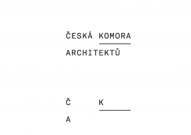
Proposal No. 11 - Jakub StrakaThe main goal of the new identity is to simplify overall communication, emphasize what is essential, and create space.
The identity is based on the way the name Czech Chamber of Architects is used, including its variants, Chamber, ČKA, and is designed to function in every variation.
The identity consists of three variants of the name itself, each typographically creating a new whole. Each variant has its version of the name's abbreviation, which conversely creates a new space from the original whole. The lion symbol is used only as a supplementary part, as demonstrated in the Bulletin example.
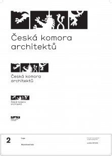
Proposal No. 22 - MÜTANTA
The logo and visual style concept stems from ČKA's request in the competition brief - to create a brand that will have a state institutional character while also showing greater openness of the chamber toward the public, and modern trends while retaining the lion symbol.
We decided to divide the lion into parts and compose new combinations, options, visions (greater ease and openness of the chamber toward the public). Thus, a refined path emerges that points to the importance of new perspectives while referencing tradition. The logo is the cornerstone of the visual style and represents movement, a desire to embark on new directions. The lion thus embarks from its original static position into a space that it further explores.
The entire visual style is significantly influenced by the proposed ČKA website, which is to be the main communication channel of the chamber. (A significant play and further development of the logo, simplicity, and striking color.)
Proposal No. 2 - Deep Throat
Analysis as part of the process:
At the beginning, we conducted an analysis of the current ČKA website and other materials, whether digital or printed, that ČKA works with or has worked with in the past. After a brief discussion, we realized that ČKA does not even need a logo (what is associated with the term logo in the context of the logo competition). The original, therefore, the then logo, which represents the lion with the heraldic character of the Czech symbol, and some font that appears characterless, is completely unnecessary. The lion, for example, does not have any association with architecture besides being from the Czech symbol, and the font choice is not the best either. We thus decided to create a system of language that will represent ČKA without needing to be forcibly visible and loud, because something that is called and textually marked as Czech Chamber of Architects, and still associates in this written composition with the lion from the Czech symbol, is a duplicating of information…
Therefore, our opinion is that redesigning the logo, the lion symbol, is completely pointless in this case, as the very name Czech Chamber of Architects evokes the feeling of a state institution that can undoubtedly function without the support of the lion in the logo.
Logo is a grid, grid is a system.
What we decided to create is thus a universal grid that will represent ČKA. Grid as a substitute symbol. Grid as a logo. Grid, a grid, a system that is divided into three paragraphs or parts, which have their limitations - a limitation but also offer variable options, solutions for use.
Basically, it is that whenever working with printed or digital media, the grid functions as a censor, a filter, something like a system that organizes and divides information (see examples). Through the project, we aimed to shift thinking about what a logo is and what role it plays, and bring a discussion about the fact that not always does an icon, visual symbol (visual character) have to be a logo. Similar tendencies and systems used with the work of a logo can be seen, for example, in the cultural space Casco in the Netherlands, where the inscription Casco is always positioned in the center of the composition, whether in a digital or printed form.
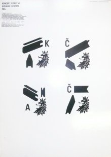
Proposal No. 18 - Jaromír Hárovník
"Idea of Space"
This broad architectural theme is processed in a simple form of a logotype and is further developed in individual applications, primarily within typography. Letters as a communication tool are transformed into an object form, opening the possibility of viewing the typeface as an object while keeping it in the plane of readability.
The logotype has several variants in which the visual angle of the displayed space changes. The national symbol is preserved as recommended, yet in a simpler form and new context, which gives the logotype weight and dominance.
The English translation is powered by AI tool. Switch to Czech to view the original text source.
6 comments
add comment
Subject
Author
Date
panebože
16.01.13 10:26
re: paneboze
TJ
17.01.13 10:54
Kdo z porotců zastával názory A/B/C?
17.01.13 10:24
A/B/C
Simona Jurackova
18.01.13 05:08
-
-
18.01.13 05:02
show all comments