
The exhibition 'Libuše Jarcovjáková'
National Gallery Prague | 27.9.2024 – 31.3.2025

The retrospective photographic exhibition "Libuše Jarcovjáková" was presented by the National Gallery Prague in September 2024. The exhibition is located in the mezzanine of the Veletržní Palace, Dukelských Hrdinů 47, Prague 7, until March 2025.
The exhibition showcases a unique collection of photographs by the artist, who naturally and spontaneously maps her life and surroundings over half a century. It highlights key themes from her rich photographic work, tracking her successes, failures, and search for herself not only in former Czechoslovakia but also documenting her visits to Japan, her departure to West Berlin, the fall of the Iron Curtain, and her return to Prague in the 1990s. It guides the viewer through both the archive and the contemporary work of Jarcovjáková, presented here in a wide range of her analog and digital photographs.
The concept of the exhibition is developed through the joint efforts of curator Lucie Černá and architect Anna Matoušková (atelier annaMAT). The diversity of the artist's work is reflected not only in the spatial arrangement of the exhibition and the materials used but also in the play with variable atmospheres and unconventional visual effects that accentuate the architecture of the Veletržní Palace itself.
The design emotionally separates the character of the exhibition in the entrance corridors and the spacious respire from the character of the classic balcony floor of the small hall, dominated by the visible supporting skeleton of the building and open views into other floors. It is considered that the exhibition is not intended only for visitors on the mezzanine floor but should also appear visually inviting and appealing from views on other floors of the building.
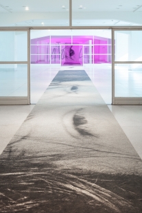
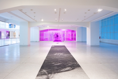
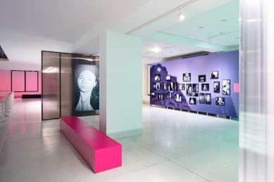
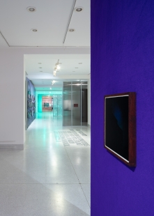
The start of the exhibition is unusually placed in the entrance corridor on the right side of the respire. The introductory thematic circles have a logical order and sequence in the exhibition related to the work and its timeline, but they are intentionally not strictly separated, interweaving and visually communicating across the entire floor.
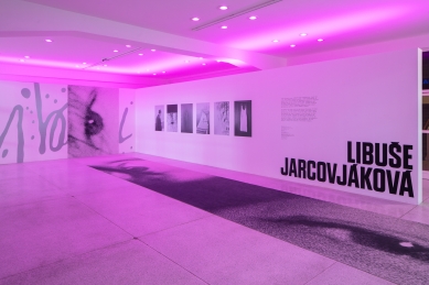
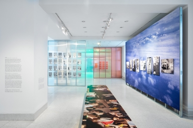
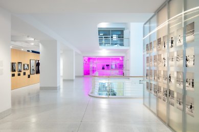
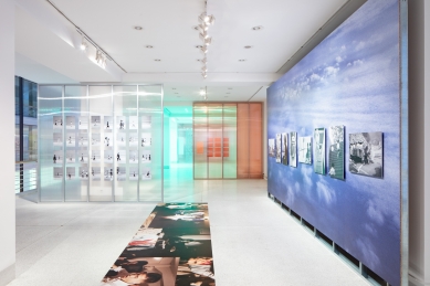
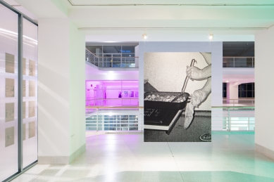
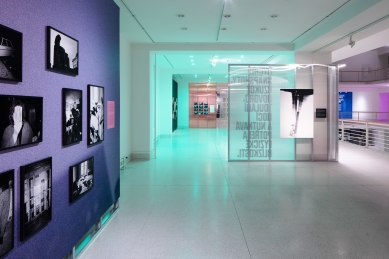
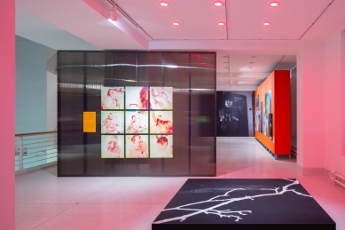
To guide visitors in the correct direction of the exhibition, a long strip of custom-printed flooring is designed in the respire area. This vinyl material symbolizes a welcome mat for the exhibition, applied both horizontally and vertically on the walls of the existing panels, and naturally guides visitors towards the pink light - a color that permeates the design through architecture and graphic design. This 'carpet' transforms into an artwork carrying fragments from selected self-portraits of Libuše Jarcovjáková and thus offers a first taste of her work in an unusually presented position upon entering the exhibition. The space of the second anteroom is bathed in pink light, and under this color filter, the artist's first works appear on the existing panel.
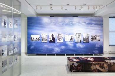
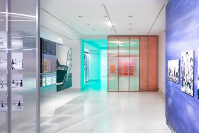
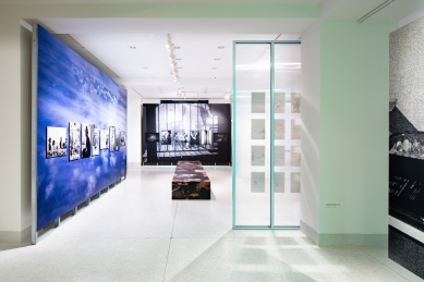
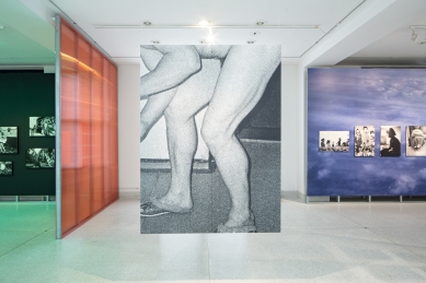
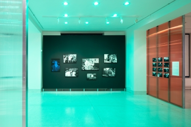
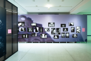
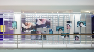
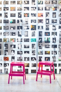
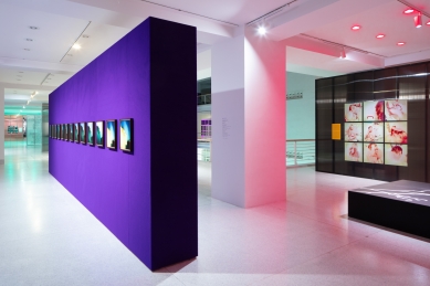
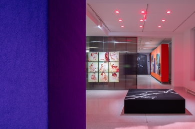
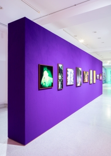
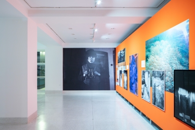
The significant reinforced concrete skeleton on the balcony of the small hall remains visible, thanks to the work with translucent material on the designed paneling. The cladding of the exhibition panels is designed from translucent hollow polycarbonate in various colors to underscore the feeling of depth and regular articulation of the space. This material fits thematically with the artist's work, and her pieces are applied on it in the form of stickers. Other prominent elements in the exhibition include panels covered with large-format prints bearing fragments of the artist's work. The actual works are further layered on this substrate in various compositional arrangements inspired by the relevant thematic units. For visitors' relaxation, three prominent spatial benches are placed in the balcony area, conceived as additional exhibition surfaces for displaying works. Thus, visitors can perceive the artworks in a non-traditional way from different perspectives.
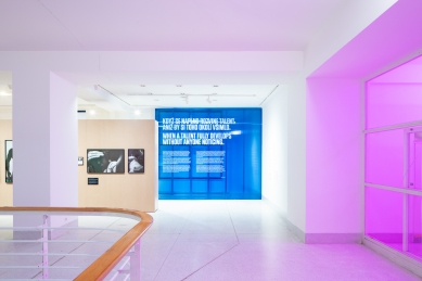
In the installation, the work with colored light is crucial, giving the exhibited photographs an unusual color filter and emphasizing the diversity of the artist's work. This light creates colored bays, reacts to various atmospheres of the exhibited pieces, and forms a color composition that enlivens the space of the small hall across all floors.
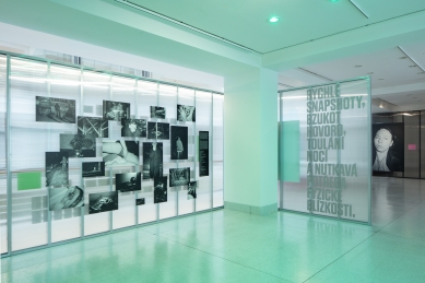
The design of the exhibition's graphic elements was developed alongside the concept of architecture, thus reflecting the same color scheme and playfulness in the graphics, which create a unifying visual thread.
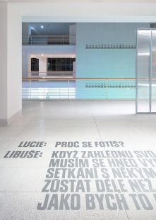
In addition to more prominent graphic applications at the entrance to the exhibition, significant text from cut graphics also appears on the paneling and the floor in the balcony. Aside from a striking panel made of raw particle board, where information for each piece is provided due to the original vintage photographs, labels are limited to a summary text for the entire collection or sequence of photographs. Thus, the works have more space and can function as a free composition without the spatial limitations of traditional labels.
The exhibition showcases a unique collection of photographs by the artist, who naturally and spontaneously maps her life and surroundings over half a century. It highlights key themes from her rich photographic work, tracking her successes, failures, and search for herself not only in former Czechoslovakia but also documenting her visits to Japan, her departure to West Berlin, the fall of the Iron Curtain, and her return to Prague in the 1990s. It guides the viewer through both the archive and the contemporary work of Jarcovjáková, presented here in a wide range of her analog and digital photographs.
The concept of the exhibition is developed through the joint efforts of curator Lucie Černá and architect Anna Matoušková (atelier annaMAT). The diversity of the artist's work is reflected not only in the spatial arrangement of the exhibition and the materials used but also in the play with variable atmospheres and unconventional visual effects that accentuate the architecture of the Veletržní Palace itself.
The design emotionally separates the character of the exhibition in the entrance corridors and the spacious respire from the character of the classic balcony floor of the small hall, dominated by the visible supporting skeleton of the building and open views into other floors. It is considered that the exhibition is not intended only for visitors on the mezzanine floor but should also appear visually inviting and appealing from views on other floors of the building.
The start of the exhibition is unusually placed in the entrance corridor on the right side of the respire. The introductory thematic circles have a logical order and sequence in the exhibition related to the work and its timeline, but they are intentionally not strictly separated, interweaving and visually communicating across the entire floor.
To guide visitors in the correct direction of the exhibition, a long strip of custom-printed flooring is designed in the respire area. This vinyl material symbolizes a welcome mat for the exhibition, applied both horizontally and vertically on the walls of the existing panels, and naturally guides visitors towards the pink light - a color that permeates the design through architecture and graphic design. This 'carpet' transforms into an artwork carrying fragments from selected self-portraits of Libuše Jarcovjáková and thus offers a first taste of her work in an unusually presented position upon entering the exhibition. The space of the second anteroom is bathed in pink light, and under this color filter, the artist's first works appear on the existing panel.
The significant reinforced concrete skeleton on the balcony of the small hall remains visible, thanks to the work with translucent material on the designed paneling. The cladding of the exhibition panels is designed from translucent hollow polycarbonate in various colors to underscore the feeling of depth and regular articulation of the space. This material fits thematically with the artist's work, and her pieces are applied on it in the form of stickers. Other prominent elements in the exhibition include panels covered with large-format prints bearing fragments of the artist's work. The actual works are further layered on this substrate in various compositional arrangements inspired by the relevant thematic units. For visitors' relaxation, three prominent spatial benches are placed in the balcony area, conceived as additional exhibition surfaces for displaying works. Thus, visitors can perceive the artworks in a non-traditional way from different perspectives.
In the installation, the work with colored light is crucial, giving the exhibited photographs an unusual color filter and emphasizing the diversity of the artist's work. This light creates colored bays, reacts to various atmospheres of the exhibited pieces, and forms a color composition that enlivens the space of the small hall across all floors.
The design of the exhibition's graphic elements was developed alongside the concept of architecture, thus reflecting the same color scheme and playfulness in the graphics, which create a unifying visual thread.
In addition to more prominent graphic applications at the entrance to the exhibition, significant text from cut graphics also appears on the paneling and the floor in the balcony. Aside from a striking panel made of raw particle board, where information for each piece is provided due to the original vintage photographs, labels are limited to a summary text for the entire collection or sequence of photographs. Thus, the works have more space and can function as a free composition without the spatial limitations of traditional labels.
The English translation is powered by AI tool. Switch to Czech to view the original text source.
0 comments
add comment