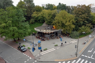
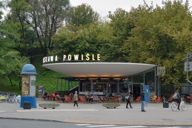
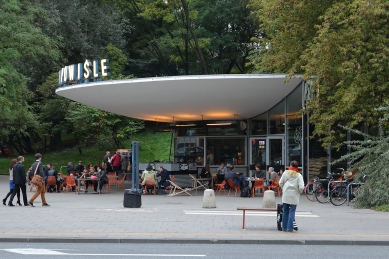
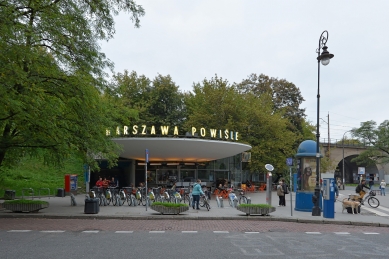
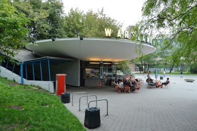
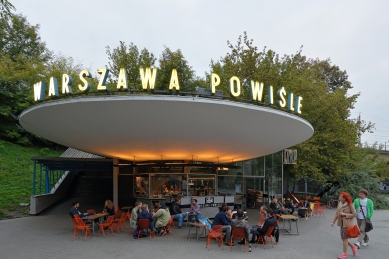
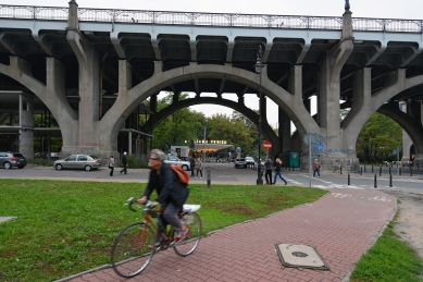
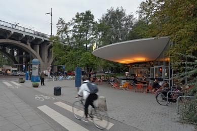
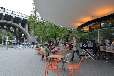
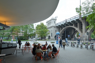
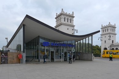
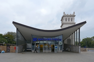
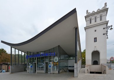
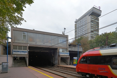
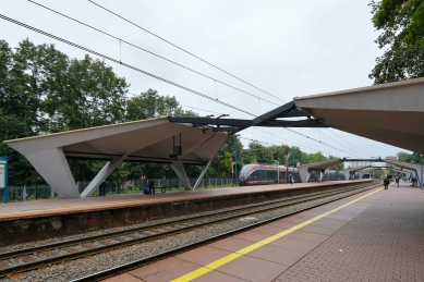
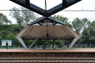
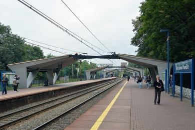
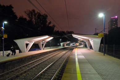
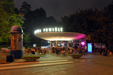
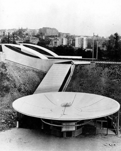
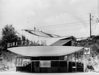
Background of the Project: The project is a direct and surprising consequence of a series of press provocations done by CENTRALA in the years 2002- 2008 which were meant to provoke a public discussion about the necessity of preserving Polish post-war modernist heritage from devastation and common oblivion. Since only a limited group of architects and theoreticians shared our position and concern, our aim was to initiate public discussion outside of niche architectural media and build understanding of the problem of inhabitants of Warsaw trough articles in key daily newspapers and widely read free press distributed on every corner of the streets. The tactic seemed to be a success: the buzz around building such as Centralna Train Station, Chemia Pavilion, Gdańska gas station and Rotunda Bank contributed to the discourse about identity of Warsaw and necessity of differentiation between politically steered socialist realism (paradoxically perceived by Warsawers better than modernism) and modernist, in may times oppositionist, concepts built between 1945 and mid-70ties, which resulted in creation of special list of post-war patrimony created by joint efforts of Polish Architectural Association SARP and Patrimony Conservation Office. Being on the list though doesn’t guarantee the real, physical protection of buildings: since the beginning of our and other activists’ actions, the most interesting buildings were already demolished to leave space to new developments, in many cases designed by charismatic corporate architects regardless of their unique historical and formal values. This was the case of Moskwa and Praha cinemas, Chemia Pawilion as well as that of Supersam, the most daring structural experiments in post-war Warsaw. In consequence of these activities, surprisingly to us, a duo of young entrepreneurs convinced by one of Warsaw activists asked us to undertake a project of revitalization design of the lower pavilion of Powiśle Station originally designed by Arseniusz Romanowicz and Piotr Szymaniak which they wanted to convert into a cultural bar, a new fashionable venue dedicated to retro-modernist sentimentalism. At the time the upper pavilion of the same authors was to be refurbished by Maas Architects. We gladly agreed on taking care of the pavilion, originally a ticket-selling booth of roughly 70m².
The main issue was to keep the aesthetical consistency of original design while enhancing and remodeling building's technical and functional side. Another difficulty was the financing, and a very modest budget of two young and ambitious investors- dreamers.
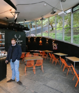
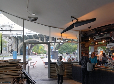
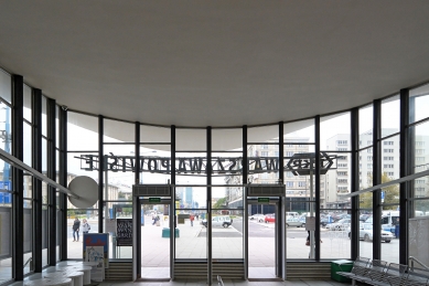
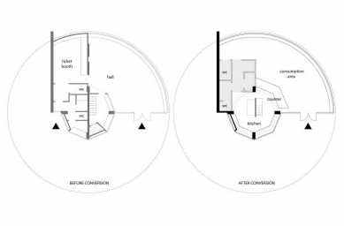
Our goal was to maintain the central structure of the building and a character of kiosk, servicing clients both from inside and from outside. Our natural decision was in this case placing of the kitchen part in the center of the structure. The old selling hall naturally turned into the main sitting space hosting clients.
As far as the external shell of the building was concerned, we had to think about thermal insulation. Beautiful but too much degraded to be maintained steel facade with one-layer glazing had to be entirely replaced with not-so-beautiful, but more efficient in terms of performance aluminium one. We did our best to choose as thin profiles as possible, which were still three times thicker than the original ones. We have kept the same layout of openings and the same gray and black color as well. Next stage was the plan: fitting bar services, storage and toilets without limiting the consumption space was crucial here.
Another issue was that of style, and maintenance and recomposing of the original black and white tile mosaics, of granite pavement and of lastriko wall finishing. Finally we decided not to fill empty zones of mosaic walls with new tiles, as the difference be would be too big. Instead we have asked our friend street-artist Krzysztof Syruć (alias ROEM) to make an interpretation of classic mosaic with a paint. Krzysztof made an graphic composition on degeneration of the tile pattern which was put on the bar counter. This successful intervention also helped to develop another idea: the coming end of financial resources consumed mainly on new facade, installations and kitchen technology asked for a nice and cheap way (as we call it after Barcelona’s street vendors "bonito-barato") to finish the walls of the newly inserted kitchen-cube with graffiti, changing it every couple of weeks for new one as an on-going project. Since the opening, already eight artists contributed to that. The coup-de-grace was a design of two internal steel lamps continuing the external semi-circular lamp from the original design. Since the lamps were supposed to be adjustable we've proposed wing-alike rotating forms painted with light grey color also used for other steel elements sticking out from the facade. Just after the opening the leading Polish architecture review "Architektura - Murator" organized a dressed ball in order to collect funds for fixing the incomplete neon writing on top of the pavilion. Since the opening a number of events related to modernist heritage, such as lectures, book presentations and exhibitions took place in Warszawa Powiśle attracting public from all-over Warsaw.
Thanks to the successful conversion we managed to bring back to Warsaw inhabitants not only the building itself but also its all surrounding. The continuity of the city was restored. And the Powiśle building, with its characteristic modernist form became an icon and a symbol of cultural life of young Warsaw.
Centrala

