Wine Tavern and Direct Sales
Weinblick

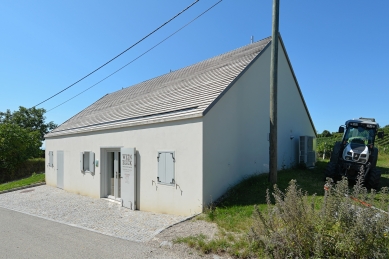
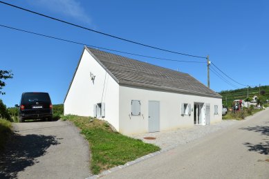
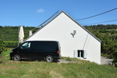
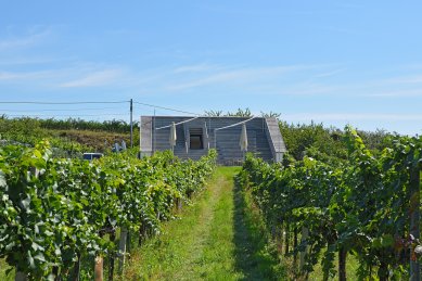
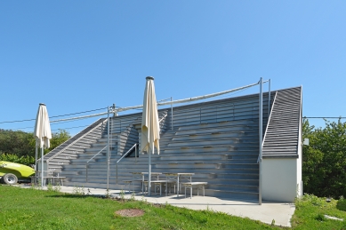
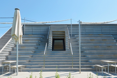
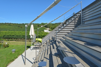
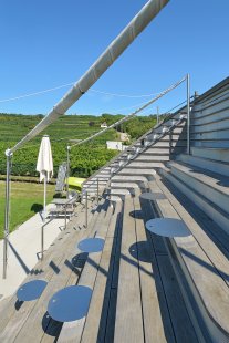
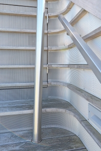
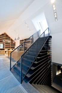
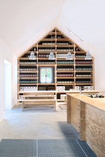
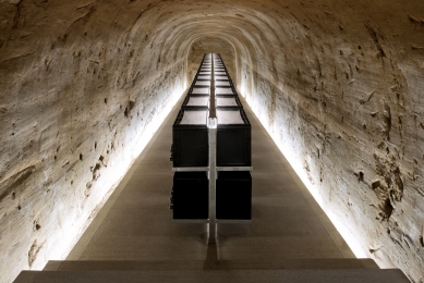
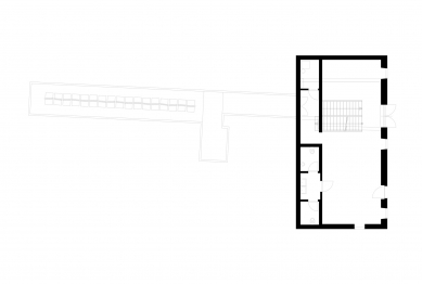
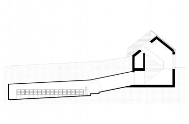
In our approach to the design of Weinblick we focused on the themes of wine-tasting and lingering. The formerly simple and classic architecture of the building on the side of the garden was radically changed, so that a landscape of seating steps now offers the perfect place to look out into the vineyards while relaxing and tasting wine. This architectural detail has thus provided the name for the project: “Weinblick”, wine-view. The step form outside is continued inside the building, winding as a staircase or in the form of shelves into the cellar. Arriving in the cellar, visitors find themselves on an illuminated presentation bridge. The loess clay typical for this region was left in its unfinished state – the cellar offers an insight into the ground soil and the deeply rooted grapevines. For the presentation of the wines we created surroundings that are elegant without being aloof. We wanted to highlight the production character of a vineyard and we focused here too on earthy materials: metal, cement, and cluster pine conjoin the new architecture with parts of the old remainders of the building. In this way, we achieved an optimum use of the only 70- square-meter small room. Honoured with the AIT - AWARD 2016, 2nd prize in the retail category.
1 comment
add comment
Subject
Author
Date
využití terénu
helenabox
15.08.19 08:52
show all comments


