University of Television and Film
SMÄK / Staatliche Museum Ägyptischer Kunstb

 |
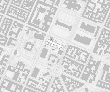
The starting point for the planning here at the heart of Munich’s museum and art gallery district has to be the beautiful and fascinating spacious urban development of Maxvorstadt. The spirit in which Leo von Klenze created these generously proportioned areas remains as impressive today as ever, and offers lots of possibilities for development. My main idea was to bring this spirit into the present day, to continue building this part of the city in this way – in other words, not to reconstruct it or to juxtapose the new with the old.
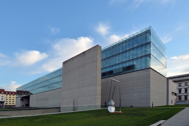
Thus, for instance, restoring the old building line was not very important to me; rather, I wanted to create a very simple and harmonious urban area in which I contrasted the “Klenzebau” with a modern structure of very similar dimensions. The large meadow was to find its special quality as an urban area in the contrast with these two buildings.
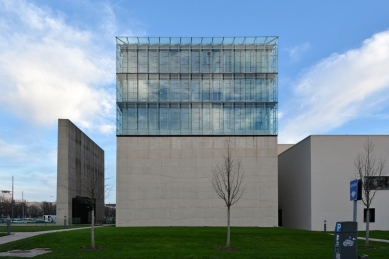
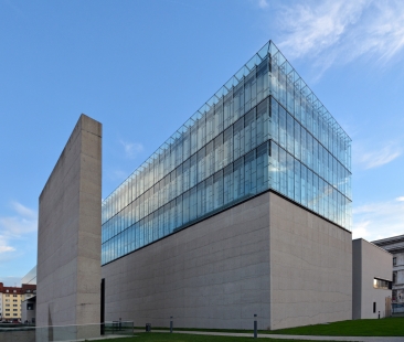
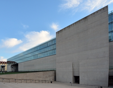
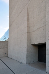
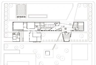
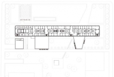
This led to the idea of setting the university block back from the Gabelsbergerstrasse with the Museum of Egyptian Art in front of it and underneath the actual square. Its presence within the urban infrastructure is created by a massive portal wall that marks the entrance like a freestanding sculpture.
The endeavours to blend the new building as harmoniously as possible with the surrounding area were followed by a certain formal understatement; at the same time it was to be able to present itself confidently opposite the Alte Pinakothek as an appropriate counterpart.
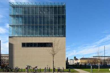
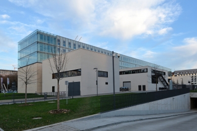
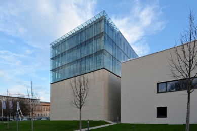
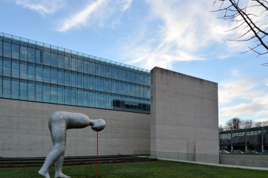
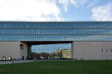
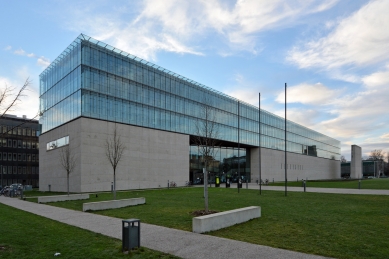
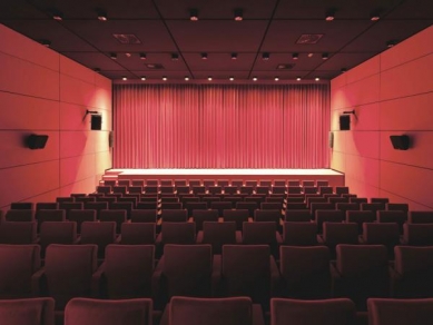
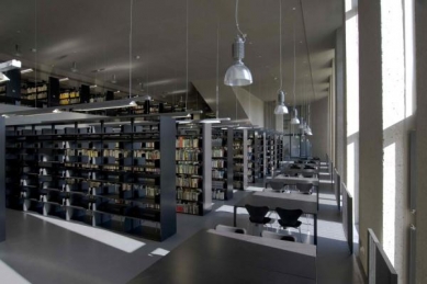
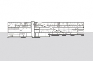
What occupied me most about the university was the contrast between the 150 m long stone plinth wall and the delicate, very finely constructed glass body on top of it. Behind this wall, protected against noise and other disturbances, are the studio, the cinemas and a library with large windows that open to the south and with only narrow window slits to the north, overlooking the square.
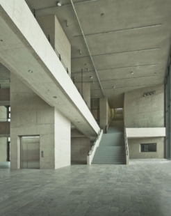
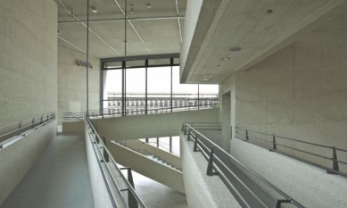
The foyer, inserted into the structure like a little piazza, penetrates the plinth at the entrance to the university. Around it are grouped the cinemas, the library and a cafeteria; this is where the public is invited to attend various events, cinema presentations and festivals, and to make use of the various public facilities.
I am particularly pleased with the quality of the concrete used for the eye-catching plinth wall, its very coarse, almost rocky surface in which the individual layers, poured at different times of the day, flow into each other like a watercolour. This special production method was structurally and technically a tremendous challenge for everyone involved in the project; an experiment, since the results were dependent on many coincidences, so could not really be controlled. So this material represents the “workshop” character of the building. Students must also often leave the smooth and well-travelled paths they follow in their work to address new things, be bold, be prepared to go out of their way and to take risks. That is often what gives their work its artistic dimension.
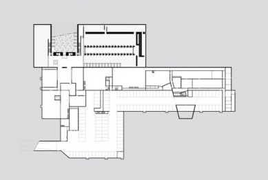
My aim in the museum was to create a space for the precious exhibits that translates the mood of old temples – which is, after all, where most of them came from – into a modern architectural language. The pathways with the exciting room sequences in Egypt’s ancient temples have also always fascinated me – as have those of other cultures. And so here too, I have made a topic of the dramaturgical sequence of the individual rooms in the museum.
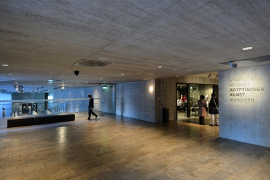
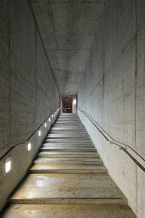
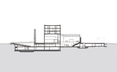
The path starts in a forecourt that is cut into the large meadow as a flat stepped ramp and leads underground. The visitor then climbs down to a mighty portal wall with a small opening at the foot that is the entrance to the museum.
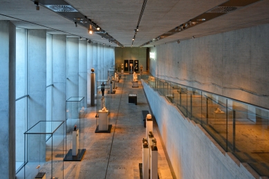
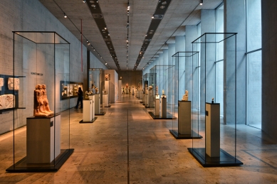
This leads into a very low entrance area where the eye is guided upwards to the high, light-flooded sculpture rooms dug 3.5 m down into the earth. This is then followed by a series of themed halls of varying sizes and proportions with staged transitions between the rooms, each one offering endlessly surprising insights and lighting atmospheres that reveal their individual characters.
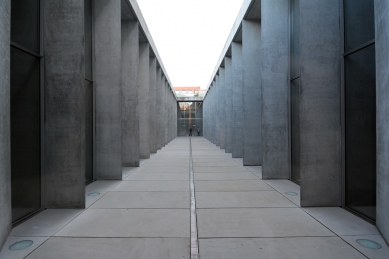
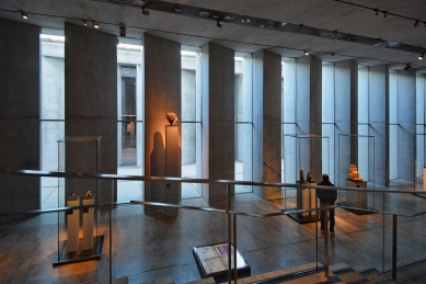
The heart of the museum consists of the two sculpture rooms that are fed with daylight from the elongated courtyard. The special atmosphere in the room is created by the soft light as it falls through a series of closely positioned, massive columns.
These very solid structures, 1.6 m in diameter, are triangular in shape, which gives them a very fine, delicate edge that completely transforms their heaviness and solidity. A similar association always fascinates in the Egyptian originals, where the highly solid walls and pillars are often covered with very finely worked reliefs.
So I hope that the rooms create an atmosphere that provides a pleasantly calm and appropriate setting for the works of art on display.
Peter Böhm
0 comments
add comment


