Extension of Museo Nacional Centro de Arte Reina Sofía

 |
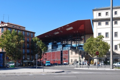
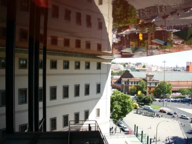
In the shadow, yes, because we can not put the nuseum itself in shadow. Instead the existing building must be clearly dominant. The hulking austere edifice, “besieged“ by its glass elevators, is the guardian of our most recent masterpieces. We must pledge our allegiance, express our respect and devotion. The museum is growing. Its site has become larger. It is annexing a portion of the neighbourhood, yet it does not wish to také over or traumatize; instead it hopes to adapt and enhance.
But this is simply a prerequisite: the inscription of all contemporary architecture into a pre-existing built site will only be successful if it contributes to the enhancement of the neighbourhood that is around it, and if in return, it enhances its more immediate surroundings.
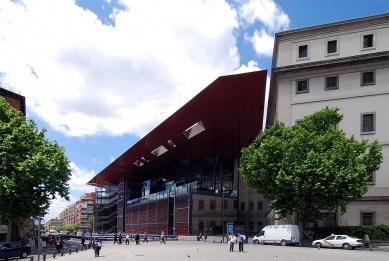
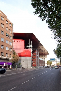
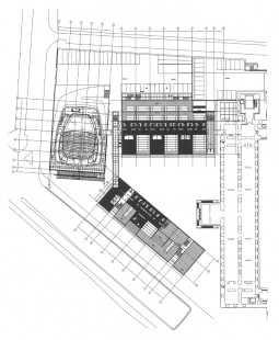
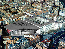
I propose a gentle and natural intervention. The museum takes under its wing a triangular block to the west three or four existing building and several trees: even if these buildings are beeing replaced, the substitutions remain approximately in the same place. The rapport with the neighbouring architecture has not fundamentally changed; instead, the western facade of the museum as simply been freed up.
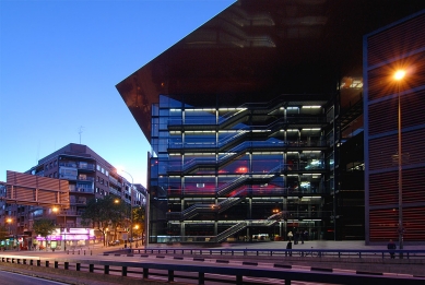
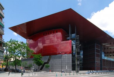
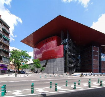
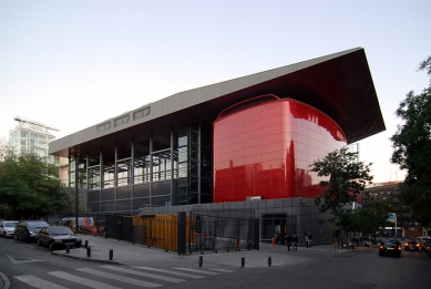
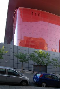
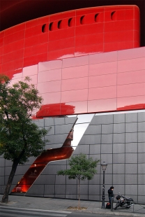
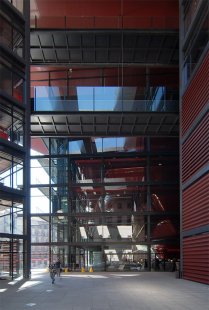
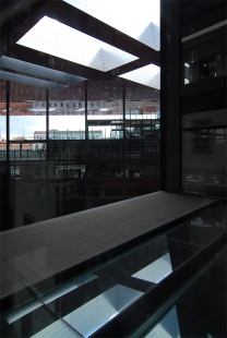
The front-side of this facade will be encased in glass, housing projectors and screens. A small glass tower completes the family of those that already punctuate the other facades of the museum.
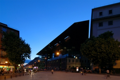
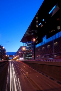
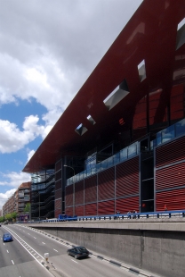
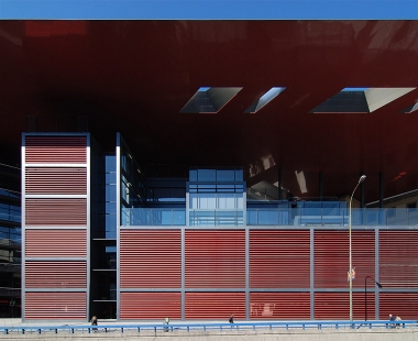
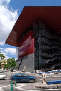
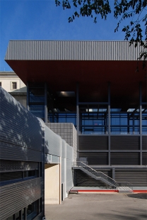
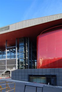
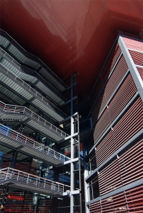
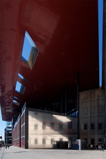
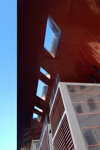
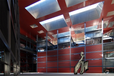
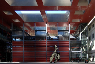
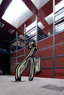
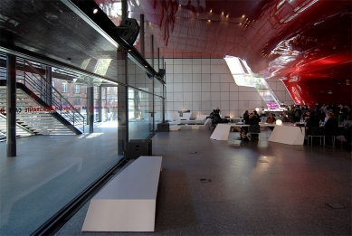
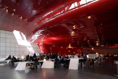
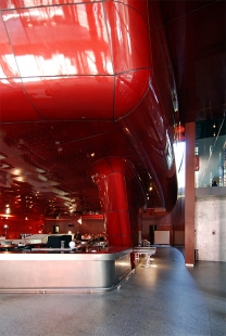
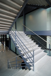
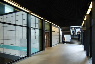
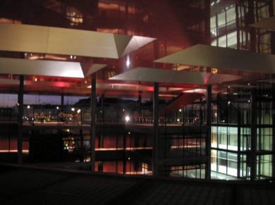
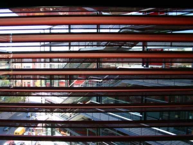
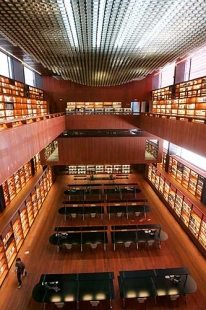
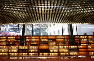
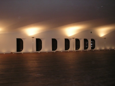
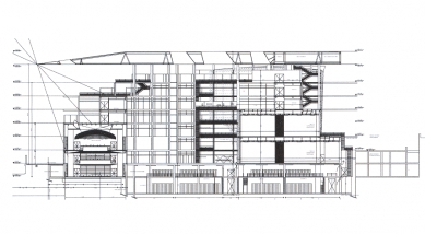
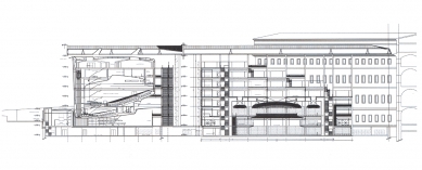
The extension is an extension; the stone and granite pedestal of the museum is extended into the site of the addition to become floors for the temporary exhibition halls, library, restaurant and offices. Of the pre-existing buildings, two walls are symbolically preserved, not for their beauty, but rather to affirm the sense of the transformation. Significant trees are maintained as well. The three new mutant buildins are organised around a courtyard. Each one has a dominant program. The first, to the south, is a library; the second to the west, is for meeting / the auditorium, the protocol room, bar and restaurant; the third, to the north, is for temporary exhibitions and the only one with a direct connection to the museum. Each building opens onto terraces, some public, others for emplyees. The library captures overhead light and shadow with suspended dome skylight. The large windows are protected by steel louvers that are perforated in calligraphic patterns – small refinement that create an intimacy and quality of light suitable for study. The auditorium and meeting rooms are unique because of their form, inherited from theatre typologies: a taut-skinned, jewel box with curved angles, surrounded by foyer terraces. The temporary exhibition spread out on three levels of varied and easy to use spaces. The flexibility is a result of a geometric diversity that allows for the transformation of the curatorial circuit and the spaces themselves, following orientation guides. A very high central space, a very low lateral space (for drawings, videoa and instalations), double thickness walls for integrating audiovisual material or creating depth, and a large, totally lit hall; all of this with the possibility of opening onto the courtyard or using lighting hung from the walls and ceiling. The public can prolong their visit with a promenade along the terraces and under the wing, under the roof. A roof precisely perforated to bring natural light into the library, the exhibitions and into the courtyard; a wing of red bricks, just briliant enough to reflect the facade of the museum and the trees. A wing under which we discover the sky in reflections and transparencies; a unifying wing that does not touch the museum but stops at least one meter before in order to let in a luminous ray; a wing whose underside corresponds exactly to the entablature of the penultimate floor of the museum. In order to grow, the museum as created a wing: a light wing the colour of roof; a protecting, amicable wing that signals to the visitor that it is keeping a watchful eye on him.
Jean Nouvel
1 comment
add comment
Subject
Author
Date
...Vida - taková ARCHITEKTURA!...
šakal
19.09.08 10:42
show all comments


