Townhouse

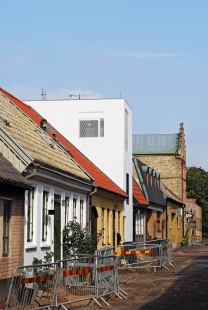
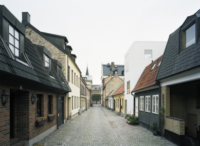
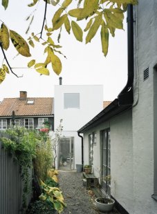
The narrow site is sandwiched between very old neighbouring buildings in Landskrona, Sweden. Since mid 20th century it has been empty, waiting behind a wooden fence. It is only 5 meters wide with a tiny area of 75 square meters. Immediately adjacent buildings are low, but the street is lined with buildings of various height, size, facade material, age, and approach. Behind the row of buildings is a colourful world of back yards, brick walls, sheds, and vegetation. We find this small-scale, motley, naturally worn place extremely beautiful.
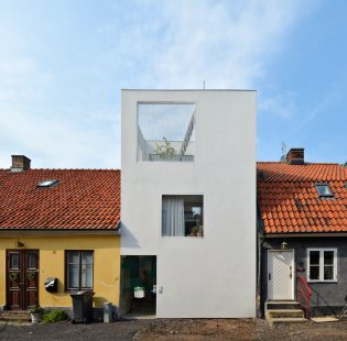
The building relates to the surroundings in scale, proportion and in the way it adds to the established rhythm of low and tall buildings along the street. A perpendicularly inserted crow-step gabled house a few lots down the street is a particularly important ancestor. Yet, our aim is to create a razor sharp contrast, to express inherent clarity, but more importantly to highlight the beauty of the surroundings. Our clients, a male couple that love art and run a café in a bigger city close by, plan to settle here for good. They see the potential in this small town, beyond its current economic and social problems.
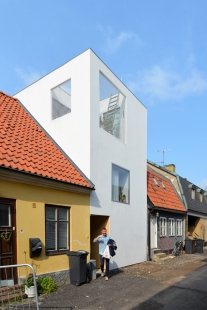
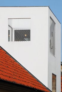
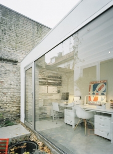
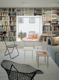
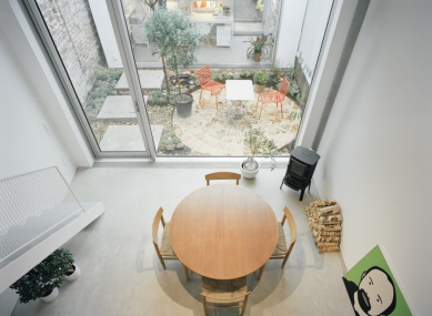
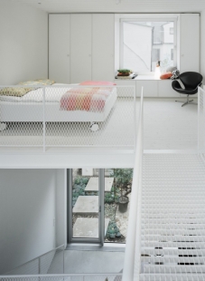
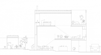
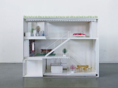
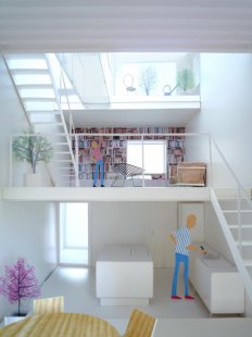
Compressed slab construction, unconventional ceiling heights, and the ground floor flush to the street level, permitted fitting three floors into a volume aligned with the neighbouring rooftops. The interior consists of a single space, softly partitioned by three exposed steel slabs. These span the entire width of the house and divide its program – kitchen, dining, living, library, bed, bath, and a roof terrace. A home office for a growing side business of art dealing is located in a separate building across a small garden in the back. Mechanical and service spaces are housed next to a glazed entrance from the street.
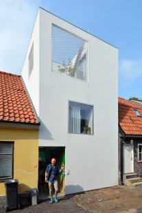
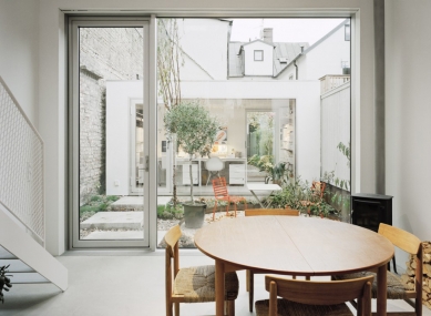
Our intention is to use small means to create an array of different spatial experiences in this very small project. The division of the single space aims at a non-minimalistic and lively sequence of confined and airy spaces, niches, interiors and exteriors, horizontal and vertical views as well as carefully framed views of the site. The continuous interior space is opening up to the street, to the middle of the block, and to the sky above.
The openness to all directions generates a building both monolithic and transparent. All facades are treated equally, exposing the interior and offering views through the building with similar apertures whether on the front, back or sides. The neighbouring facades are closed, yet there is something deeply humane about their tactility, detailing, and ornaments. We want to contribute to the street with a faded border to the private sphere, with artefacts, furniture, plants, and patios; traces of human presence, consideration, and care.
4 comments
add comment
Subject
Author
Date
Kontrapunkt
Silibrand
25.12.14 01:54
památkáři
Jaromír Rybár
25.12.14 09:51
škoda že tam není ...
hykal
28.12.14 07:58
Pekne
Matej Farkaš
29.12.14 11:11
show all comments


