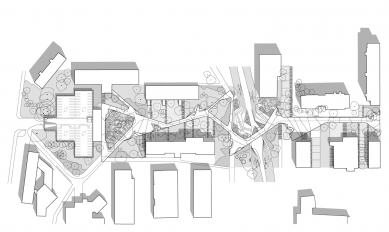
Velenje was designed as a garden city and as such, it had a lot of unoccupied ground-level surfaces. With the increase in the number of vehicles, these surfaces began to turn into car parks. Despite the fact that Velenje's centre is a pedestrian zone, a large - possibly too large - portion of the exterior ground surface is designated for stationary traffic, which crucially affects the quality of open-air habitation. With the envisioned increase in the number of users of the city centre, the parking required stands to become an even bigger problem. For a successful revitalisation, solutions need to be found which will increase the number of available parking spaces while reducing the surface area occupied by them at present.
 |
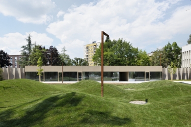
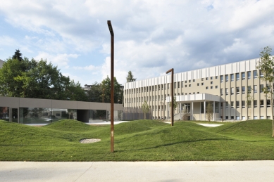
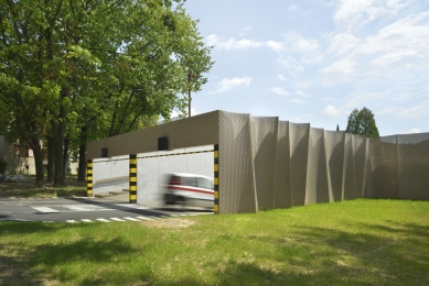
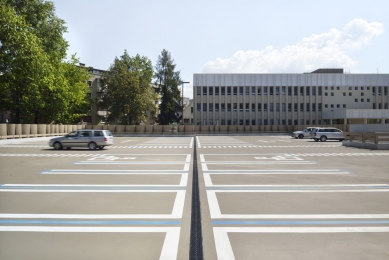
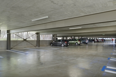
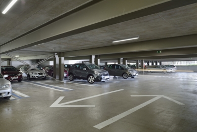
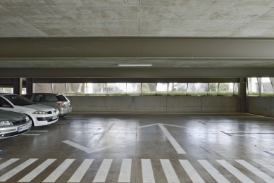
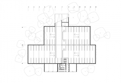
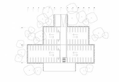
Like many others in the centre of the town, the car park in front of the community health centre was intended to expand to the surrounding green surfaces due to insufficient capacity. Instead of enlarging the floor area, we chose to partially dig in and cover the car park, doubling the capacity in a simple way. As other projects in the area have shown, the abundance of space in the city made the users reluctant to adopt multi-level parking. Accordingly, the new car park is not designed as a classical parking garage but features a double entrance leading to two car parks laid on top of each other. This makes for highly rational use of the space, as there is no surface lost to circling around the structure, with the building also being naturally ventilated.
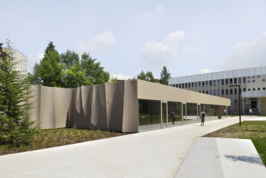
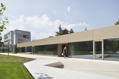
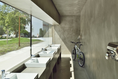
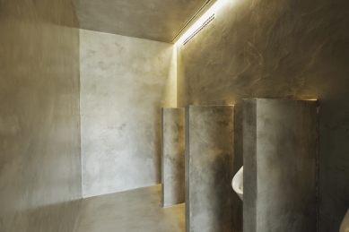
At the front of the building, adjacent to the city promenade, a single block concentrates all the commercial programme. Due to the proximity of the school complex, commercial programme had existed in this location before, but it was scattered around the area in several smaller, inarticulate temporary buildings. In the volume housing the retail spaces, there is also a public toilet, while - due to the specificity of the space - the roof is designed as a concert stage featuring all the necessary infrastructure.
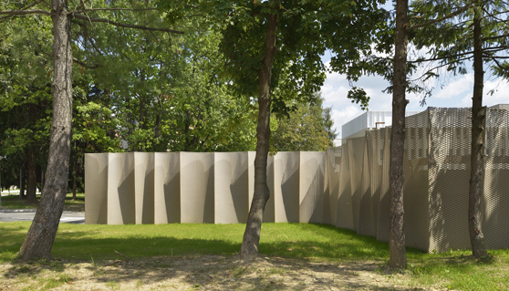
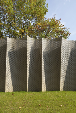
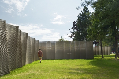
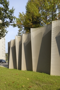
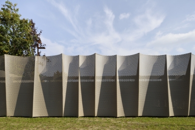
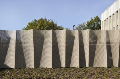
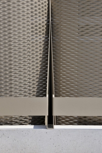
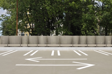
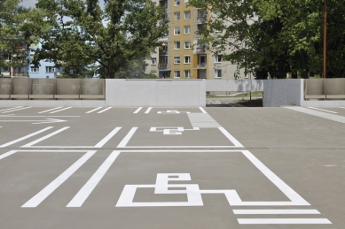
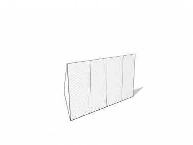
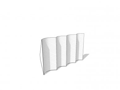
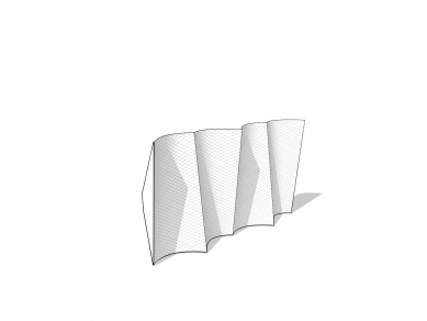
The form of the car park adapts to the surrounding landscape. The slight branching out in the floor area design reflects the sitting of the building among the existing trees, which had all been left intact. The front facade of the building features a very restrained design and references the simple shapes of other buildings in the immediate vicinity. The remaining circumference of the car park is covered by an expanded-metal facade skin of slightly more relaxed design. Its height is matched to that of the public programme at the front facade and it is also just tall enough to obscure cars on the upper level. Individual facade panels are parabolically bent out of the building plane. Beside the interesting shape, the result is also great static strength, which obviates the need for any additional supporting sub-construction. The repetition and careful arrangement of these lightweight facade elements produces a constant play of light and shadow, giving the building a soft appearance among the surrounding trees.
The Velenje car park is designed as a prototype of increasing parking capacity on the perimeter of the city centre. The highly rational design offers twice the parking capacity with no increase in the required space, as well as an attractive appearance, which blends with the natural environment of the town-in-a-park.

