Multi-storey car park Novi Šarabon

 |
The ability to park right in front of an institution, office, shopping centre or bar has gained the status of one of the basic human rights over the past years. All past city authorities have done Ljubljana a great disservice: mild provisions for car drivers have brought them votes but when faced with a drastic drop in the users of public transport, they jut shrug their shoulders powerlessly. It looks like the case of the Medical Centre epitomizes all the trafic problems of Ljubljana and Slovenia, from fetishizing one§s own vehicle, to underfunded and uncompetetive public transport, underdeveloped infrastructure and city trafic routes. At the end of 1990s, the growing car traffic within the ground of this facility of 2,700 beds and 6,000 employees required urgent remedies. The then city authorities were not able to find any other solution to this issue other than passing a decision on the building of a big new multi-storey car park.
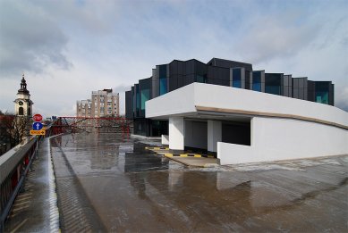
The construction of a hospita building for parking on an important city corner was considered as a transitional delusion right from the start. The architects, participating in the 2001 competition, were aware the location of the car park at the corner is troublesome due to the distance of the vehicular access points to the garage from the traffic junction and that its mute building fronts would také away a certain quality of the urban space in the vicinity of the hospital, especially from the Plečnik's Croatian Square. (incidentally, in spite of the celebration of 2007 as the year of Plečnik, this square has been incomprehensibly neglected and lacking in renovation).
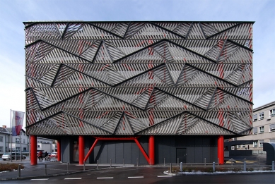
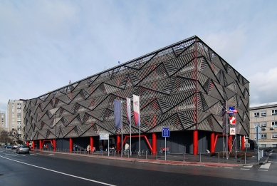
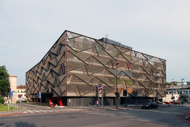
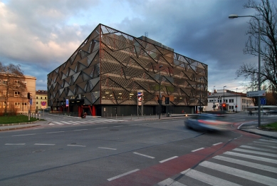
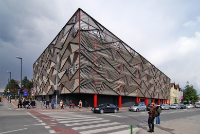
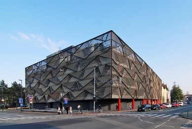
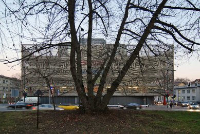
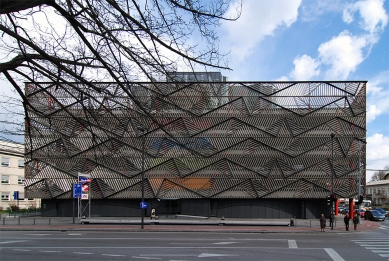
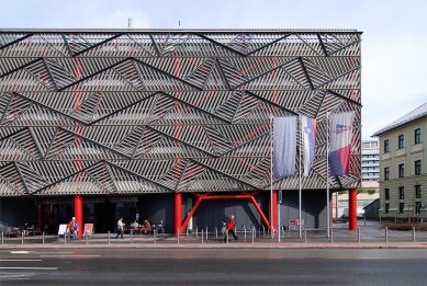
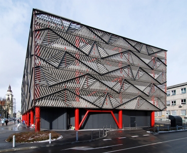
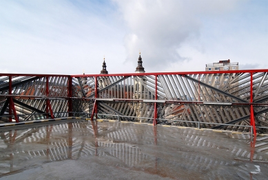
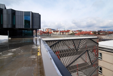
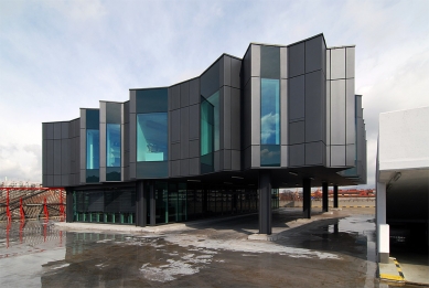
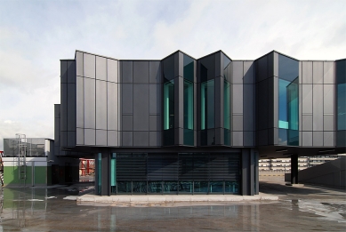
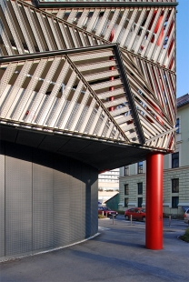
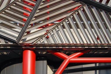
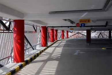
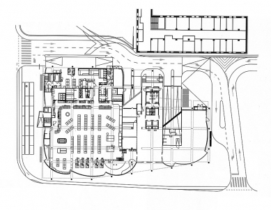
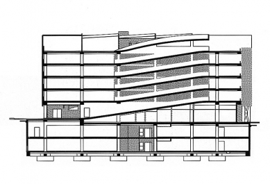
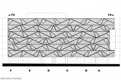
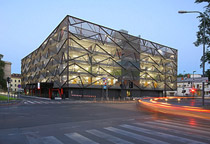
According to the preliminary designs, the car park should have been “humanized“ by incorporating business premises on one of the frontages or on the roof. However, even during the competition, a combination of low paring levels and high office levels turned out to be a nightmare. Finally, these difficulties were dealt with by a private investor, to whom the city sold the plot in the meantime, together with the project. He rejected the office floors as pointless and desired a supermarket on the ground floor where the competition brief saw a passage with smaller commercial facilities. The shape and the size of the garage's body were predefined by the town's urban planning office. The architects were left with not much more than to fill the set parking box with as many parking places as possible and to give it an attractive facade. Essential to the parking facility, the ventilation systém was one of the major items on the cost estimate; however, the architects dealt with the problem by a facade with openings. In this way they considerably lowered the costs of the fire protection equipment and fire alert systém. The facade, designed as a puzzle of various triangular nets made of specially profiled laminae of drawn aluminium, reflects the light in different angles in an ever changing manner. As a result, the huge fronts look like origami, stretched over a lively red structure. The attractiveness of the whole building is enhanced by the colours of different levels, which seductively filter through the web-like envelope. The blind facade of the supermarket turns its back to Croatian Square, but the entrance from the other side has become lively traffic point, and gives a feeling that a passage would have been a good idea, if the project had not been changed.
An unclear relationship to traffic regulation in Ljubljana has been manifested in several ways in relation to this project. This is illustrated by a fact that the town's urban planning office, even in the design phase, considerably downscaled the set traffic volume on account of a lane reserved for trams; a “phantom“ project, whose implementation not one politician in Ljubljana dares to announce even vaguely. In spite of everything, let us hope, this decision hails different traffic policies, since it is slowly becoming clear that additional car parks in Ljubljana's city centre will not alleviate its traffic agony, which is result of the dictatorship of private vehicles. So I say, let us hope, because it is impossible that in mid 2007, Ljubljana is closer to widening its main traffic exits to six lane highways than to the opening of at least one suburban railway line.
1 comment
add comment
Subject
Author
Date
cena
anonym
18.11.09 06:16
show all comments


