Municipal market in Caminha
Mercado Municipal de Caminha

The market
The market is a point of exchange, buying and selling, a meeting point, or even, nowadays, a point of cultural interest.
In these polyvalences of functions and definitions, it is concluded that the market, when functional, is a point of reference in a place. It is thus, in the importance of function, form or scale that urban space is designed and constructed.
The current Caminha market is not integrated into the site nor does it stand out due to its function.
It appears as a construction adulterated by time and necessity. It is provisional, which seeks to respond to the needs of its Market function. With structural problems, theorization and wear of the coverings, with temporary solutions for the wear of the roof, they raise problems in complying with the program, in complying with accessibility, in complying with hygiene, safety, fire safety regulations or in compliance with use.
It is a building that requires constant maintenance in an attempt to correct problems that arise from the rigors of the seasons and time. Under these conditions, we consider that demolishing the entire building will be the most economical and viable option.
The new market arises from the analysis of the site and function.
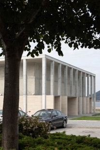
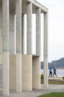
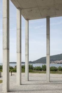
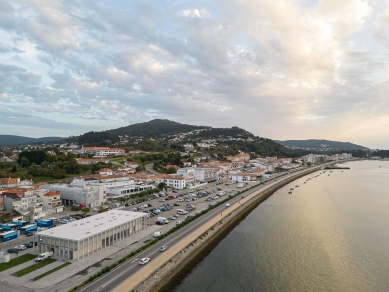
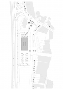
It fits into the location with a strong dialogue with the natural and urban landscape, but never neglecting the importance of the town's existing flows.
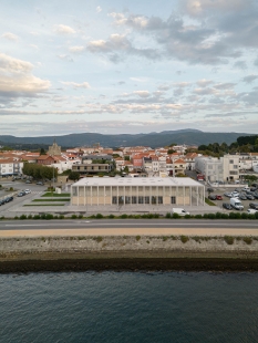
The site, Square Pontaut Combault, portrays an urban void, with different confrontations: the urban fabric to the east, the empty market to the south and the Minho riverfront to the west.
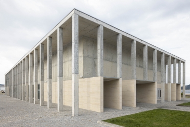
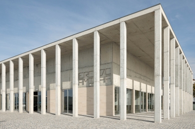
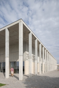
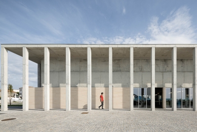
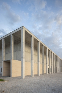
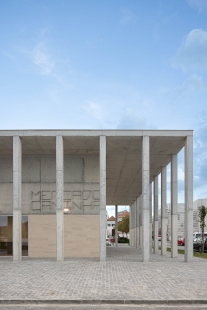
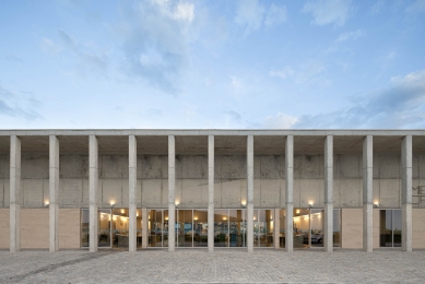
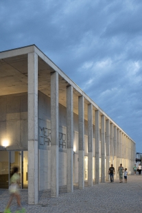
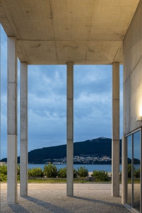
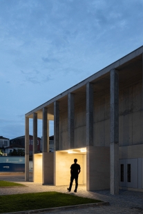
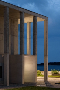
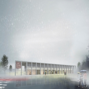
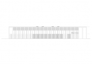
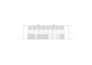
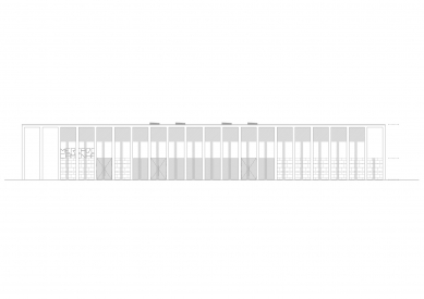
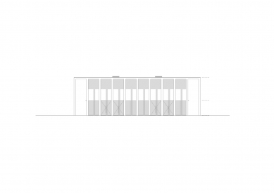
We intend for the proposed building to relate them through its location, form or programmatic organization. The public's interest is captured by its homogeneous, rational and serene form, as well as by the materialization of color and light. With a paralelepipedal volume, with straight lines, the volume appears surrounded by a rigid structure of pillars, thus composing an external gallery of “protection” for users.
All this rigidity represents for us the strength that a public building must have in the mesh, which, in turn, is broken by the movement created by the games of light/dark and light/shadow. This movement gives us different perspectives on volume throughout the day.
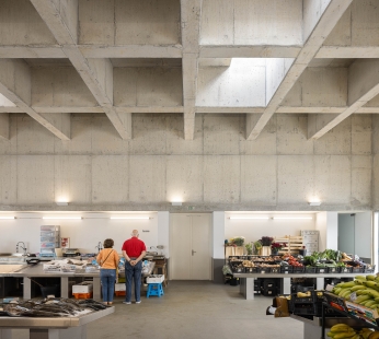
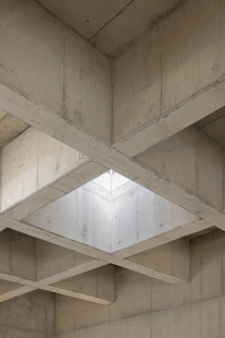
The entire volume is made of concrete. Resistant, with a “strength”, functional or “cold” character, it is contrasted by the Molianos stone cladding, yellow, noble and “warm” on the base. It is thus, on the scale of man and materials, that the project embraces the nobility and reference of a village as picturesque as Caminha.
In the union of form, function, scale and materialization we reconcile a set of premises for relationships with the environment and the individual. We do not turn our backs on the waterfront, we care about the fair's relationship and ensure that the entrance is directed to the village, as is the case.
We conclude that the more technical area should be related to a new square created to the north, a square that frees the market from the neighboring building, as well as opening the horizon to existing equipment in the urban fabric.
Given the current lack of this interior-exterior relationship, the relationship between the volume and the surroundings, we designed a simple volume with transparent planes that invite the user to enter or, when inside, to enjoy the view.
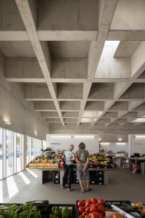
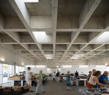
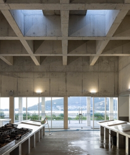
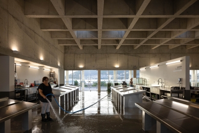
It is the scale of man, at ground level that the transparent elements allow us to glimpse the function and life inside the volume from the outside. It is these moments that project natural lighting into the interior and create visual relationships with the two surrounding realities, namely the town and the riverbank of the Minho River.
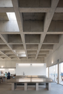
The interior of the building is covered with washable and waterproof epoxy paint up to the height of the openings (two and a half meters) on all interior walls, allowing for effective hygiene. This visual line created by the exchange of materials is evident throughout the volume, both outside and inside, thus creating a feeling of elegance and lightness.
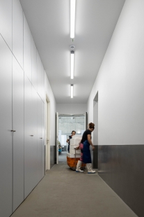
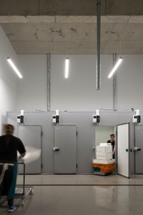
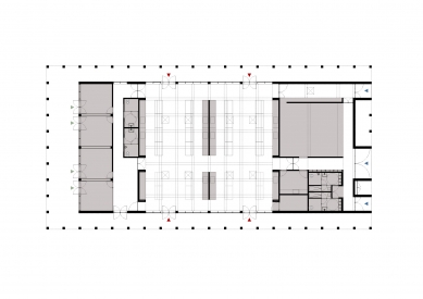
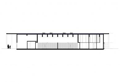
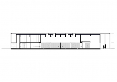
The interior space is organized into three sections: one to the south with shops with exterior and interior access and sanitary facilities, a central public area – fish and fruit market -, and a technical and restricted area to the north. The northern, technical section is made up of changing rooms, an area with (individual) cold rooms, administrative space and an outdoor space for waste. The latter, physically separated from the others, is accessible via an independent route. It is an act isolated from all loading and unloading moments or access to the building.
The staff space creates the hinge between public and private. The changing rooms, as well as the cold storage rooms, have autonomous routes and exits, without any intersection with the circulation of the general public. Administration is related to the sales space.
To the south, the front elevation is made up of four autonomous commercial spaces, but all with direct access to the interior of the market and common sanitary facilities. Here, there is the possibility of closing commercial spaces' access to the market depending on each person's schedule.
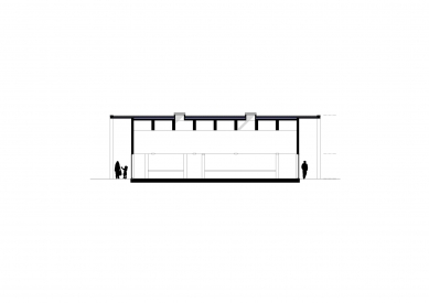
The central space, the market, is the space and use that dignifies the volume. A large space, with high ceilings and a “monumental” scale, is deeply bathed in natural light and views of the transparent planes of the elevations. This is where the primary act of the program unfolds. This is the meeting point for users. By being flooded with natural light, varied by the position of the sun throughout the day, an emotional and dynamic scenario typical of the market image and experience is created.
Arq. Tiago Sousa
Arq. Rui Correia
0 comments
add comment


