Elbphilharmonie Hamburg
Elbpharmonie

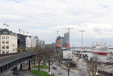
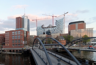
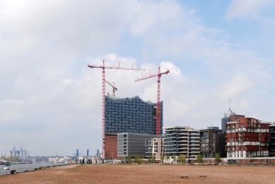
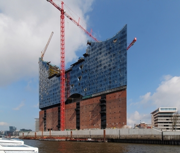
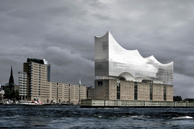
The Kaispeicher A, designed by Werner Kallmorgen and constructed between 1963 and 1966, was used as a warehouse for cocoa beans until close to the end of the last century. Originally built to bear the weight of thousands of heavy bags of cocoa beans, it will now lend its solid construction to supporting the new Philharmonic. The strength of the old building will now bear the weight of the new mass resting on top of it.
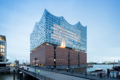
Our interest in the warehouse lies not only in its unexploited structural potential but also in its architecture. The robust, almost aloof architecture of the Kaispeicher provides a surprisingly ideal foundation for the new Philharmonic hall. It seems to be part of the landscape and it is not yet really part of the city, which has now finally pushed forward to this place. The harbor warehouses of the 19th century were designed to echo the vocabulary of the city’s historical façades: their windows, foundations, gables and various decorative elements are all in keeping with the architectural style of the time. Seen from the River Elbe, they were meant to blend in with the city’s skyline despite the fact that, being warehouses, they were non-residential buildings that neither required nor invited the presence of light, air, and sun.
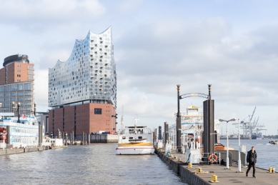
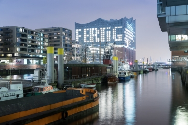
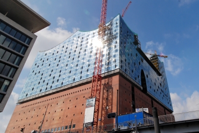
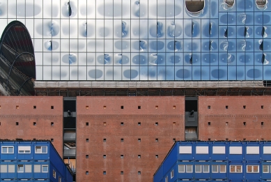
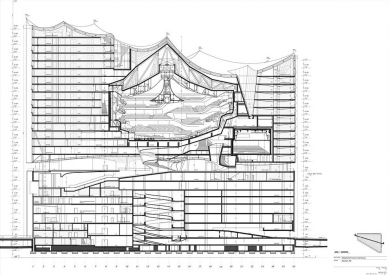
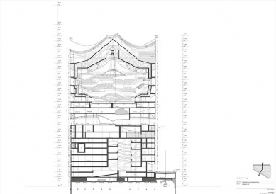
But not the Kaispeicher A: although its brickwork conformed contextually to that of its neighbors, its façades displayed an extraordinary radicalism and abstraction. The building’s regular grid of holes measuring 50x75cm can hardly be called windows; they are more structure than opening. The warehouse is heavy and solid.The new building has been extruded from the shape of the Kaispeicher, it is perfectly congruent with the brick block of the older building, on top of which it has been placed. The top and bottom of the new structure are, however, entirely different from the quiet and plain shape of the warehouse below: the broad, undulating sweep of the roof rises to a total height of 108 m at the Kaispitze (the tip of the peninsula), sloping down to the eastern end, where the roof is some 20 m lower. The Elbphilharmonie will become a landmark visible from afar, lending an entirely new accent to the horizontally conceived city of Hamburg – not in the sense of a sudden onslaught of Hanseatic megalomania but rather as an expression of reaching out into new territory, into the harbor area along the shores of the River Elbe. Space is more expansive here in this new urban location, owing to the surface of the water and the industrial dimensions of the seagoing vessels. The glass façade, consisting in part of curved panels, some of them cut open, transforms the new building, perched on top of the old one, into a gigantic, iridescent crystal, whose appearance keeps changing as it catches the reflections of the sky, of the water, and of the city.
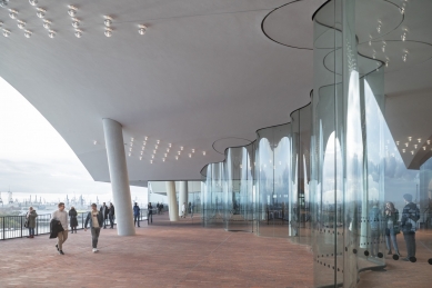
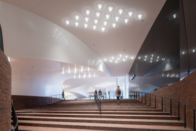
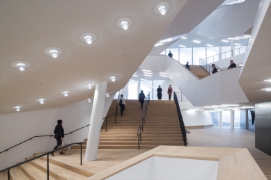
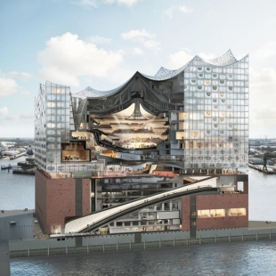
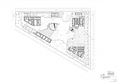
The bottom of the superstructure also has an expressive dynamic. Along its edges, vault-shaped openings allow a view of the sky from the Plaza and create spectacular, theatrical views of both the River Elb and downtown Hamburg. Further inside, deep vertical openings provide ever-new visual relations between the Plaza and the lobbies on different levels. The main entrance to the Kaispeicher complex lies to the east.
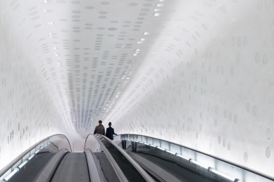
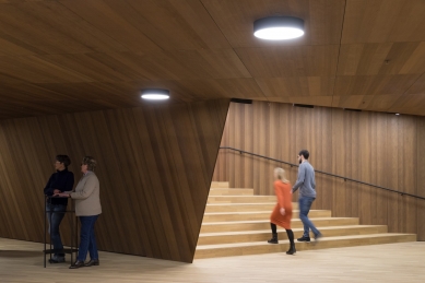
The elongated escalator curves slightly as it leads to the Plaza, so that it cannot be seen in full from one end to the other. The escalator affords its users a spatial experience through the entire Kaispeicher, past a large panorama window. The fin de siècle tradition of sweeping staircases in opera houses is expressed in a contemporary idiom. Upon reaching the top of the Kaispeicher, visitors find a spacious terrace, like another Plaza above the city. Sitting on top of the Kaispeicher and under the new building, it is like a gigantic joint between old and new.
This, too, is another new public space that offers a unique panorama. Restaurants, bars, the ticket office and the hotel lobby are located here, as well as access to the lobby of the new concert hall.
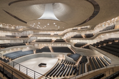
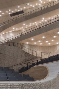
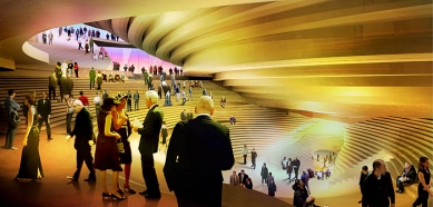
The premises alone – the radical givens of the location, namely the harbor and the existing warehouse – invite change. This is a project of the 21st century that would have been inconceivable before. What has been retained is the fundamental idea of the Philharmonic as a space where orchestra and conductor are located in the midst of the audience, as it were: here the architecture and the arrangement of the tiers take their cue from the logic of the acoustic and visual perception of music, performers, and audience. But that logic leads to another conclusion. The tiers are more pervasive; tiers, walls, and ceiling form a spatial unity.
The people, that is the audience and the musicians, determine the space; the space seems to consist only of people. In this respect, it resembles the typology of the football stadium that we have developed in recent years, with the goal of allowing an almost interactive proximity between audience and players. We also studied archaic forms of theater, like Shakespeare's Globe, with a view to exploiting the vertical dimension. The complex geometry of the hall unites organic flow with incisive, near static shape. Walking, standing, sitting, seeing, being seen, listening… all the activities and needs of people in a concert hall are explicitly expressed in the architecture of the space. This space, rising vertically almost like a tent, offers room for 2100 people to congregate in order to make and listen to music. The towering shape of the hall defines the static structure of the entire volume of the building and is correspondingly reflected in the silhouette of the building as a whole.
Herzog & de Meuron
0 comments
add comment


