Titan Kubus - Extension to the Historical Museum Bern
Erweiterungsbau Kubus Titan

Subtle dialogue through shape and colour
With the 'Kubus/Titan' project, the Swiss architecture bureau ":mlzd" has succeeded in solving the long-running space problem at the Historisches Museum Bern and at the same time has made a contribution to urban development.
Designed by the architect André Lambert, a multipartite castle-like building was constructed in 1894, prominently located at the head of the Kirchenfeld Bridge. Originally conceived as national museum, the design was built in a reduced form as the Historische Museum Bern after Zurich was selected as the location for the Swiss National Museum. Slightly raised on an artificial bank, the building with its historistic façade marks the beginning of the museum quarter, which has been developing in Bern's Kirchenfeld district since the late 19th century.
Since its completion, the Museum has been suffering from a lack of space. An extension to the building's southern side was carried out in 1922, and in 1938 the Swiss Rifle Museum was added to the western side. Lambert's plans for the National Museum would have included a small 'village' of various styles of Swiss houses to the south, but this idea was rendered superfluous when the structure became the Historische Museum, although the design was not changed. As a result, a somewhat isolated external space was created which largely went unused.
Thus the competition to design a further extension, announced in 2001, also had an urban development aspect in addition to the goal of finally resolving the eternal issue of insufficient space. The proposed location of the museum extension was in the eastern part of the area to the rear. Work and storage rooms and warehouses were required, as well as a space for changing exhibitions measuring approximately 1000m2. This was to be designed as a 'black box': neither natural light nor prominent architecture were desired.
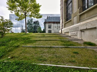
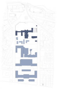
The architects of the bureau :mlzd, who won the competition, took the changing exhibition space with its generous dimensions as the starting point for their design. Of importance to them was the dialogue between the extension and the existing building, as well as the merging of the various external levels of the grounds created by the artificial bank. They gave the changing exhibitions hall a floor area of 21x43 m and a ceiling height of 6 metres, attached it to the back of the existing building and sank it halfway into the ground. In this way they created a plateau on top of the exhibition space and developed a vertical volume at its southern end. A broad staircase connects the external space created between the old and new structures with the area to the back, and at the same time joins it with the garden to the north.
Dialogue on several levels
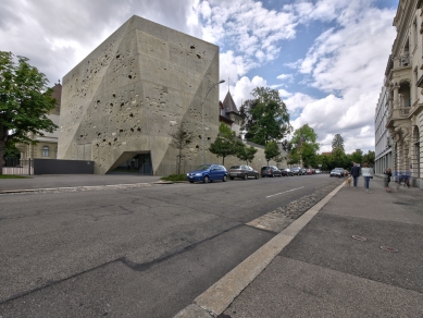
The architects designed the visible tall structure, which houses office space for the Museum, the Bern city archives, and a library on the top floor, 'to the scale of the existing side wing' and in so doing were able to relate it to the existing structure. The space for changing exhibitions, which is located underneath it, is accessed through the existing complex's central entrance hall. A separate entrance to the city archives is located on the Helvetiastraße and enables independent access.
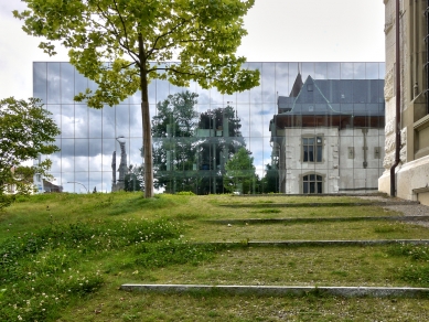
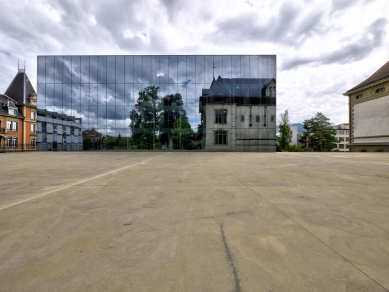
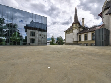
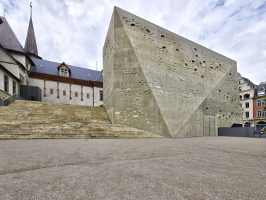
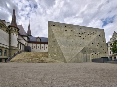
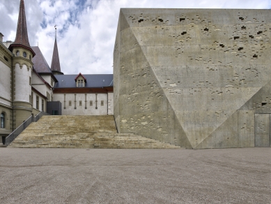
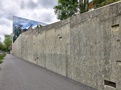
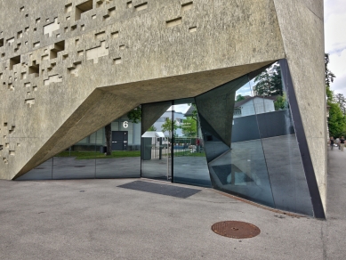
The tower-like volume has been given a rocky appearance on the southern side. Cut surfaces ease the massiveness of this monolithic construction and integrate the variously angled roof surfaces of the existing building in its shape. There is also a dialogue between the old and the new in terms of materials and surface structure. The concrete, which is also used for the surface of the new square, has been given a yellowish colour which approximates the sandstone of the existing building. The pixel-like indentations which characterise the southern façade are created by means of synthetic shapes applied to the formwork panels. Photographs of the partially carved square stone blocks, found in the old building, were repeatedly enlarged until only pixels could be seen. This revealed an abstract pattern of the structure of the stone blocks, and fourteen sections of this pattern served as models for the indentations and so create a subtle connection between the constructions. Another, much more obvious connection was created at the northern façade. The castle-like building is reflected across the square in the entirely glazed façade. On the one hand this serves to link the two sections, but on the other hand it also creates a respectful distance between the existing and new constructions.
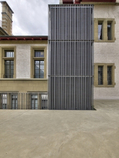
The glass panels of the 560m² surface join together almost seamlessly to create a neatly delineated copy of the old building. The Reynaers CW 50-SC façade system proved to be ideal for this, as it enabled the panes to be mounted without a clamp profile, thereby creating an almost completely flat surface which optimally supports the visual effect. Because of the narrow profile of the system (with internal sight lines measuring 50 mm), the view outwards is almost entirely unobstructed. In addition, the fact that the façade is perfectly oriented towards the north meant that sun protection was unnecessary.
Dignified and serene, focusing more on common ground than competition, the structure complements an existing complex and skilfully takes its place in the urban context - and may potentially have a stimulating effect on the further development of the 'Museum Island' in Bern's Kirchenfeld district.
Nora Kempkens
0 comments
add comment


