
EXPO 2000

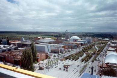
The location of the world exhibition in 2000 was Hannover, Germany. The relatively uninteresting city was chosen primarily as a stop on the highway from East Germany to the West, thus providing an opportunity for the West to showcase its development.
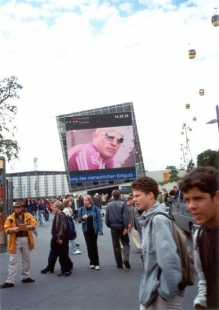
The theme of the world exhibition was the trifecta human-nature-technology, later supplemented by a rescue theme in the context of the coming millennium... The topic of ecology and the future of humanity on our planet was primarily addressed by thematic exhibitions in the halls of the Hannover exhibition center, while individual countries mostly focused on promoting tourism or selling souvenirs. Overall, it can be said that ideals have faded from the content of the expo, replaced by a culture of fairground attractions and presentations of cutting-edge exhibition technologies, occasionally spiced up with material humor.
If we are not too skeptical, we must acknowledge that some thematic exhibitions were worth seeing, particularly Toyo Ito and Jean Nouvel demonstrated that they know what they are doing. The robotic egg with its own intelligence was particularly impressive, as were Nouvel's ideas in the pavilion of work.
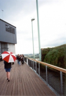
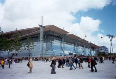
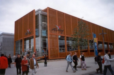
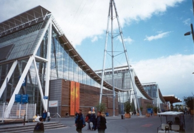
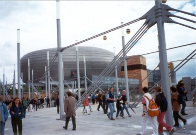
To return somewhat to the basic concept of the Hannover exhibition center - the existing pavilions covered both the needs of thematic exhibitions and those of countries that did not invest in their own pavilion. Most of the pavilions were situated in the new part of the exhibition center, separated from the existing one by a busy highway; however, an esplanade - a pleasant photogenic bridge - crossed it, although walking barefoot over its wooden surface was not very pleasant, as it was often wet and crowded with people, where are the feelings from Perrault's National Library. The main figure of Hannover's urbanism was Albert Speer, well-known to some from the competition for the university campus in Brno-Bohunice...
In conclusion, it must be stated that the expo was architecturally interesting, though less so in terms of content, with long lines, expensive food, and mediocre weather, but what can we expect from a contemporary Expo...
Belgium
Author:
A relatively uninteresting pavilion, however architecturally balanced, did not entice us to explore the interior...
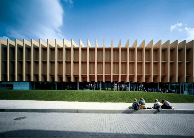
Czech Republic
Pavilion author: d u m architekti
Exhibition author: Eva Heyworth et al.
Our national pavilion was somewhat schizophrenic. From the outside, a sympathetic modern wooden box on thin steel legs, the impression of architecture by Baumschlager&Eberle was evident, but why not. Neither the interesting wooden joints of the pavilion frames nor the pleasant use of glass in the restaurant could mask the discomfort inside the pavilion.
The internal content probably revolved around the question "Who are we, where are we going," etc. The introductory display of wooden madonnas and their current naked photographed counterparts probably satisfied most Germans; however, even the medieval-robed volunteers handing out welcome leaflets did not help us.
This was followed by a walk through 75% of the chapel at Karlštejn, concluded with a book sculpture with rotating mirrors and a reincarnator, which is software based on Hair Studio. In summary = horror, horror, and horror. But there was one positive side to our pavilion - few visitors, thus more space to rest...
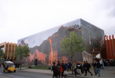
China
Author: Britta Kerber
The classic exhibition box is covered with fabric depicting the most famous Chinese building, but the resultant impression is spoiled by gusts of wind. Exhibition not seen.
Denmark
Author: Peter Bysted, sculptor Björn Norgaard
Compositionally, the pavilion is divided into two parts - the Danish box and the Greenland "glacier." The pavilions are complemented by strange sculptures, of which the paraphrase of the Little Mermaid is truly psychedelic.
Finland
Author: Sarlotta Narjus, Antti-Matti Siikala; SARC Architects
The pleasant mass of the Finnish pavilion with a clearly defined entrance was under constant pressure from visitors. The interior birch grove with flying Nokia-birds was a refreshing touch.
France
Author: Francoise-Hélene Jourda
The author, now without her husband, established the concept of the house based on the future mission of the pavilion, which is a department store. The classic box was covered with signs of France. Fortunately, the interior provided more interesting experiences than the exterior, particularly the popular tribal columnar structures, so typical of another of her buildings - the educational center in Herne-Sodingen. The exhibition was organized in a classic recognition path in darkness with illuminated exhibits.
Croatia
Author: Odak & Siladin
The blue block of the Croatian pavilion is permanently sprayed with water. The interior again utilizes a water element in the form of a glass floor above the surface of the Adriatic - somewhat a straightforward motif of a beach and stepping into the water. The entire exhibition is supplemented by a large video projection describing the short existence of independent Croatia.
Ireland
Author: Murray O'Laoire & Orna Hanly
The country that gave the world The Corrs, The Cranberries, and especially U2, showcased a great pavilion with a wonderful exhibition. The classical board architecture, though it could not surpass Mies, nonetheless created a dignified backdrop for the exhibition that, while not addressing the question of technology, nature, and civilization, offered a historical overview of Ireland, concluding with a work invitation to Irish high-tech factories. And lest I forget, the whole exhibition was accompanied by amazing traditional bagpipe music.
Iceland
Author: Ármi Páll Johannsson
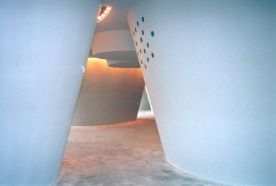
Compared to the Croatian block, Iceland offers a solid blue cube with a proper wave of water along its walls, which is quite uncomfortable while waiting in line, especially under the canopy above the entrance. Inside, after overcoming the déjà vu caused by the dome of the Berlin Reichstag, a sensory orgasm is evoked by a real Icelandic geyser observed from a spiral winding throughout the inner space. In moments when the pavilion is not rumbling with a geyser, you can view a cinematographic experience dedicated to the nature of Iceland on a projection screen at the bottom of the central spring.
Italy
Author:
Despite Italy's rich cultural history, the pavilion was quite stiff. The main exhibition dome did not stand out with Italian construction wit but rather with a sense of exhaustion; the overall impression was not helped by a virtual waterfall situated in a tower in front of the pavilion. The operation within the pavilion was rather impractical, as outdoor ramps (pleasant in the rain...) rose from the ground floor restaurant to the exhibition on the first floor. The exhibition highlighted the history of motoring in Italy.
Japan
Author: Shigeru Ban
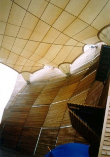
Even at the Expo, Shigeru Ban reaffirmed his mastery of using paper in architecture. Just as once Tadao Ando rediscovered exposed concrete, today Ban promotes another Japanese material - paper. The roof membrane of the Japanese pavilion is not made solely of paper but also includes an additional PVC component, which does withstand water better. The carrying structure again uses a traditional Japanese motif - a woven basket. However, the German authorities, influenced by fire safety regulations, insisted on a primary steel bearing structure. Even so, the Japanese pavilion remains, along with the Swiss one, the most recyclable piece of the world exhibition.
Colombia
Author:
A relatively conventional exhibition box with playful wooden cladding and a highlighted entrance did not entice us to visit.
Lithuania
Author: Audriu Bucas
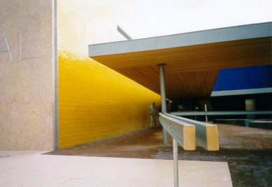
The bright yellow pavilion, perhaps in the spirit of the sixties, discouraged us with a long queue at the entrance. The initial impression of the pavilion's stylish plastic cladding was replaced by a tin revelation with places that were almost un-aesthetic, with gaping cracks.
Hungary
Author: György Vadász
The Hungarians did not hide their traditional aesthetics once born from Imre Makovec and presented a pavilion in the shape of a gate (symbolism of entry into the EU?) and a relatively rational extension for the restaurant, which appeared somewhat schizophrenic. Now and then, individual wooden panels in the interior of the pavilion would rise, revealing a television screen with a cinematic production. And by the way - an intrusive nostalgic recollection of the cut hat in Slovakia...
Mexico
Author: Ricardo Legorreta
The spacious Mexican pavilion with a water lake in the middle of the area was permanently surrounded by visitors, leading us only to an exterior tour. Nevertheless, the witty flying New Beetles and the generous cube with an internal holographic hall confirmed the qualities of the Mexican pavilion.
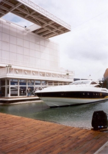
Monaco
Author:
Monaco truthfully presented itself as a state of luxury yachts and boats, which we, as landlubbers, found interesting. The wooden pier without a railing, however, frightened us enough that we postponed the pavilion visit for another time. However, the marina was pleasant.
Netherlands
Author: MVRDV
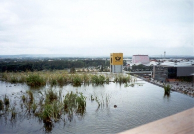
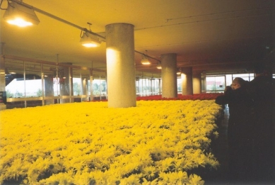
Oh, oh, oh. My materially conceptual soul found its happiness again. The Dutch sandwich undoubtedly became the dominant feature of the Hannover exhibition center. Hundreds of meters long queue of visitors fully pointed to the current trend of world exhibitions - offering an interesting experience with a touch of knowledge and unconventional attractions, which the Dutch did not skimp on.
The Dutch pavilion is a manifesto of the relationship between nature and technology in the contemporary world. MVRDV created a mini-ecosystem in which both nature and technology coexist on symbiotic principles. And it was precisely their contrasting contact that filled the pavilion with freshness and generosity.
Its form resembles a piece of the Netherlands cut out and transferred to Hannover. The highest layer belongs to the wind and is represented by four wind turbines surrounded by water, which produce current to illuminate the vegetation in the lower levels. Next is a layer hidden behind a white PVC mesh that contains two cinema halls for standing audiences with 360° panoramic projection. After the cinematic experience, we descend into a quiet grove, occasionally disturbed only by the reproduced noise of a passing plane. If we gathered enough forest soil in our sneakers, we can descend to a floor full of flower pots, from which trees of the upper floor likely grow; however, after a thorough inspection, we found that some pots conceal the technical background of the pavilion. Well, we are at an exhibition. The next layer is filled with a field for plant production, with vividly yellow and red fields of meticulously aligned pots being distinctly Dutch. But now we are already in the geological subterranean complemented by a stylish restaurant with expensive postcards.
All the layers are connected by a system of outdoor staircases and, mainly, an elevator core, which somewhat detracts from the compositional power of the sandwich; however, visitors must somehow get upstairs. The Dutch pavilion was undoubtedly one of the highlights of Expo 2000.
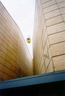
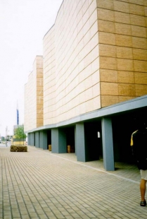
Germany
Author: Josef Wund
The German rational box with an attempt to enliven the inner expression hid a typical German eintopf, this time with various themes related to Germany. Not even the structurally interesting bracing of the supporting columns could suppress the gloomy experience of the exhibition, where we got lost due to various dead ends of the pavilion. In short, not much.
Norway
Author:
The rock with a fierce waterfall at the forefront was a cultivated form of Norway's presentation at the world exhibition. The motif of flowing water was used by many countries; however, Norway won with the strongest current and an appropriate acoustic backdrop. The interior not seen, but the exterior was excellent.
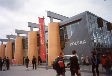
Poland
Authors: Wojciech Obtułowicz / Krakow
Structurally interesting, but horrid in formal morphology and internal exhibition was the pavilion of Poland. Few pavilions came with a wackier exhibition than the Czech one. The Polish booth contained several Polish log cabins with interesting internal content. We personally only saw the exhibition dedicated to Polish salt mines, and even that was enough...
Portugal
Authors: Álvaro Siza & Eduardo Souto de Moura
The Portuguese pavilion was entrusted to the hands of the most capable. Siza and Souto de Moura focused mainly on the archetypal essence of architecture, that is, the composition and proportion of individual masses. The entrance pergola covering the queue of visitors from the rain and wrapping around the two cork oaks, whose bark covered part of the pavilion, leads to a spacious hall with a rather wide projection screen. We then buy a glass of port at a nearby bar, sit on paper boxes, and let ourselves be carried away by the wide shots of life in Portugal. Upon leaving, we receive a pocket map of Portugal, and what more could we wish for? Simple yet not boring. Gentlemen, I tip my hat.
Greece
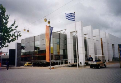
Author:
The Greek pavilion skillfully used a combination of water surface and its own exhibition booth. A similar entrance to the pavilion can also be seen in the Turkish pavilion. The interior did not entice visitors.
Romania
Author: Doru Comsa
"A pavilion at the last moment," would be a way to characterize Romania's pavilion. System scaffolding created the basic supporting structure for wooden trusses of the roofing. Koolhaas's OSB board was utilized on almost all elements of the interior, which appeared empty. The scaffolding, overgrown with climbing ivy, playfully responded to this year's Expo theme. It's just a pity that in places the ivy was plastic, which somewhat degraded the generous ecological gesture.
Spain
Authors: Antonio Cruz & Antonio Ortiz
The Tonis presented a very excellent to even genius spatial concept of the pavilion, where the central space was filled with a public square along with an adjacent restaurant and stage. The furniture, though somewhat in the spirit of beer fests, nonetheless, the wonderful wooden stump pavement made all doubtful comments disappear. Unfortunately, the exhibition was not particularly interesting. As a memento, we took home fragrant pieces of fresh cork with which the entire pavilion was clad and also smelled appropriately from afar! For reassurance - we took the cork from the bales next to the pavilion.
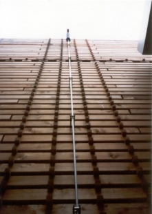
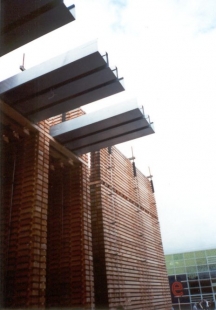
Switzerland
Author: Peter Zumthor
Today, the probably most famous Swiss architect, Peter Zumthor, convinced us of his genius and sense of humor. Already at his spring lecture in Brno, he had piqued our curiosity and certainly did not disappoint. Neatly stacked piles of Swiss wood dried out during the Expo, so after the exhibition ended, only an asphalt patch remained on the site. Let's hope the money taken for the wood paid for its transport to Germany. The pleasant wooden labyrinth was filled with musical instruments in the hands of Swiss musicians, and the Swiss restaurant was also refreshing; however, the culinary background needed a bit more finishing. In any case, Zumthor demonstrated that he knows how to make architecture, and Switzerland certainly did not lag behind the events, quite the opposite.
Turkey
Author:
The Turkish pavilion, although it may not seem so at first glance, drew us in for a visit. However, it did not bring us many experiences; nonetheless, it was cultivated and material-friendly. However, something was still lacking for a fascinating impression.
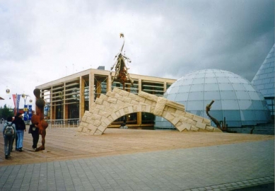
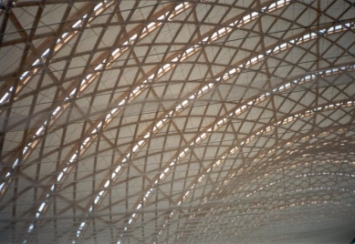
Hall 26
Author: Thomas Herzog
The environmentally conscious architecture professor from Stuttgart is the author of a large exhibition pavilion, where the pavilions of Asian countries were located. The interesting long-span cable roof structure serves as the main aesthetic expression function and is truly worth seeing. If only the structural truth found resonance at the last piece of the Brno exhibition center, formalism, formalism...
Bertelsmann AG
Author: Karl Karau
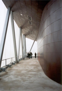
The media giant did not fall behind either and also built its pavilion. The main content was a cinema that occupied a steel bun. It is a pity that we were unable to observe the magnificent lighting of the ellipsoid, which could rival even such a piece as The Tower of Winds in Yokohama by Toyo Ito.
The theme of the world exhibition was the trifecta human-nature-technology, later supplemented by a rescue theme in the context of the coming millennium... The topic of ecology and the future of humanity on our planet was primarily addressed by thematic exhibitions in the halls of the Hannover exhibition center, while individual countries mostly focused on promoting tourism or selling souvenirs. Overall, it can be said that ideals have faded from the content of the expo, replaced by a culture of fairground attractions and presentations of cutting-edge exhibition technologies, occasionally spiced up with material humor.
If we are not too skeptical, we must acknowledge that some thematic exhibitions were worth seeing, particularly Toyo Ito and Jean Nouvel demonstrated that they know what they are doing. The robotic egg with its own intelligence was particularly impressive, as were Nouvel's ideas in the pavilion of work.
To return somewhat to the basic concept of the Hannover exhibition center - the existing pavilions covered both the needs of thematic exhibitions and those of countries that did not invest in their own pavilion. Most of the pavilions were situated in the new part of the exhibition center, separated from the existing one by a busy highway; however, an esplanade - a pleasant photogenic bridge - crossed it, although walking barefoot over its wooden surface was not very pleasant, as it was often wet and crowded with people, where are the feelings from Perrault's National Library. The main figure of Hannover's urbanism was Albert Speer, well-known to some from the competition for the university campus in Brno-Bohunice...
In conclusion, it must be stated that the expo was architecturally interesting, though less so in terms of content, with long lines, expensive food, and mediocre weather, but what can we expect from a contemporary Expo...
Belgium
Author:
A relatively uninteresting pavilion, however architecturally balanced, did not entice us to explore the interior...
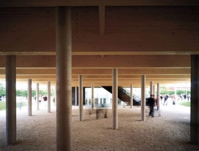
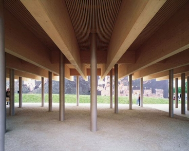
Czech Republic
Pavilion author: d u m architekti
Exhibition author: Eva Heyworth et al.
Our national pavilion was somewhat schizophrenic. From the outside, a sympathetic modern wooden box on thin steel legs, the impression of architecture by Baumschlager&Eberle was evident, but why not. Neither the interesting wooden joints of the pavilion frames nor the pleasant use of glass in the restaurant could mask the discomfort inside the pavilion.
The internal content probably revolved around the question "Who are we, where are we going," etc. The introductory display of wooden madonnas and their current naked photographed counterparts probably satisfied most Germans; however, even the medieval-robed volunteers handing out welcome leaflets did not help us.
This was followed by a walk through 75% of the chapel at Karlštejn, concluded with a book sculpture with rotating mirrors and a reincarnator, which is software based on Hair Studio. In summary = horror, horror, and horror. But there was one positive side to our pavilion - few visitors, thus more space to rest...
China
Author: Britta Kerber
The classic exhibition box is covered with fabric depicting the most famous Chinese building, but the resultant impression is spoiled by gusts of wind. Exhibition not seen.
Denmark
Author: Peter Bysted, sculptor Björn Norgaard
Compositionally, the pavilion is divided into two parts - the Danish box and the Greenland "glacier." The pavilions are complemented by strange sculptures, of which the paraphrase of the Little Mermaid is truly psychedelic.
Finland
Author: Sarlotta Narjus, Antti-Matti Siikala; SARC Architects
The pleasant mass of the Finnish pavilion with a clearly defined entrance was under constant pressure from visitors. The interior birch grove with flying Nokia-birds was a refreshing touch.
France
Author: Francoise-Hélene Jourda
The author, now without her husband, established the concept of the house based on the future mission of the pavilion, which is a department store. The classic box was covered with signs of France. Fortunately, the interior provided more interesting experiences than the exterior, particularly the popular tribal columnar structures, so typical of another of her buildings - the educational center in Herne-Sodingen. The exhibition was organized in a classic recognition path in darkness with illuminated exhibits.
Croatia
Author: Odak & Siladin
The blue block of the Croatian pavilion is permanently sprayed with water. The interior again utilizes a water element in the form of a glass floor above the surface of the Adriatic - somewhat a straightforward motif of a beach and stepping into the water. The entire exhibition is supplemented by a large video projection describing the short existence of independent Croatia.
Ireland
Author: Murray O'Laoire & Orna Hanly
The country that gave the world The Corrs, The Cranberries, and especially U2, showcased a great pavilion with a wonderful exhibition. The classical board architecture, though it could not surpass Mies, nonetheless created a dignified backdrop for the exhibition that, while not addressing the question of technology, nature, and civilization, offered a historical overview of Ireland, concluding with a work invitation to Irish high-tech factories. And lest I forget, the whole exhibition was accompanied by amazing traditional bagpipe music.
Iceland
Author: Ármi Páll Johannsson
Compared to the Croatian block, Iceland offers a solid blue cube with a proper wave of water along its walls, which is quite uncomfortable while waiting in line, especially under the canopy above the entrance. Inside, after overcoming the déjà vu caused by the dome of the Berlin Reichstag, a sensory orgasm is evoked by a real Icelandic geyser observed from a spiral winding throughout the inner space. In moments when the pavilion is not rumbling with a geyser, you can view a cinematographic experience dedicated to the nature of Iceland on a projection screen at the bottom of the central spring.
Italy
Author:
Despite Italy's rich cultural history, the pavilion was quite stiff. The main exhibition dome did not stand out with Italian construction wit but rather with a sense of exhaustion; the overall impression was not helped by a virtual waterfall situated in a tower in front of the pavilion. The operation within the pavilion was rather impractical, as outdoor ramps (pleasant in the rain...) rose from the ground floor restaurant to the exhibition on the first floor. The exhibition highlighted the history of motoring in Italy.
Japan
Author: Shigeru Ban
Even at the Expo, Shigeru Ban reaffirmed his mastery of using paper in architecture. Just as once Tadao Ando rediscovered exposed concrete, today Ban promotes another Japanese material - paper. The roof membrane of the Japanese pavilion is not made solely of paper but also includes an additional PVC component, which does withstand water better. The carrying structure again uses a traditional Japanese motif - a woven basket. However, the German authorities, influenced by fire safety regulations, insisted on a primary steel bearing structure. Even so, the Japanese pavilion remains, along with the Swiss one, the most recyclable piece of the world exhibition.
Colombia
Author:
A relatively conventional exhibition box with playful wooden cladding and a highlighted entrance did not entice us to visit.
Lithuania
Author: Audriu Bucas
The bright yellow pavilion, perhaps in the spirit of the sixties, discouraged us with a long queue at the entrance. The initial impression of the pavilion's stylish plastic cladding was replaced by a tin revelation with places that were almost un-aesthetic, with gaping cracks.
Hungary
Author: György Vadász
The Hungarians did not hide their traditional aesthetics once born from Imre Makovec and presented a pavilion in the shape of a gate (symbolism of entry into the EU?) and a relatively rational extension for the restaurant, which appeared somewhat schizophrenic. Now and then, individual wooden panels in the interior of the pavilion would rise, revealing a television screen with a cinematic production. And by the way - an intrusive nostalgic recollection of the cut hat in Slovakia...
Mexico
Author: Ricardo Legorreta
The spacious Mexican pavilion with a water lake in the middle of the area was permanently surrounded by visitors, leading us only to an exterior tour. Nevertheless, the witty flying New Beetles and the generous cube with an internal holographic hall confirmed the qualities of the Mexican pavilion.
Monaco
Author:
Monaco truthfully presented itself as a state of luxury yachts and boats, which we, as landlubbers, found interesting. The wooden pier without a railing, however, frightened us enough that we postponed the pavilion visit for another time. However, the marina was pleasant.
Netherlands
Author: MVRDV
Oh, oh, oh. My materially conceptual soul found its happiness again. The Dutch sandwich undoubtedly became the dominant feature of the Hannover exhibition center. Hundreds of meters long queue of visitors fully pointed to the current trend of world exhibitions - offering an interesting experience with a touch of knowledge and unconventional attractions, which the Dutch did not skimp on.
The Dutch pavilion is a manifesto of the relationship between nature and technology in the contemporary world. MVRDV created a mini-ecosystem in which both nature and technology coexist on symbiotic principles. And it was precisely their contrasting contact that filled the pavilion with freshness and generosity.
Its form resembles a piece of the Netherlands cut out and transferred to Hannover. The highest layer belongs to the wind and is represented by four wind turbines surrounded by water, which produce current to illuminate the vegetation in the lower levels. Next is a layer hidden behind a white PVC mesh that contains two cinema halls for standing audiences with 360° panoramic projection. After the cinematic experience, we descend into a quiet grove, occasionally disturbed only by the reproduced noise of a passing plane. If we gathered enough forest soil in our sneakers, we can descend to a floor full of flower pots, from which trees of the upper floor likely grow; however, after a thorough inspection, we found that some pots conceal the technical background of the pavilion. Well, we are at an exhibition. The next layer is filled with a field for plant production, with vividly yellow and red fields of meticulously aligned pots being distinctly Dutch. But now we are already in the geological subterranean complemented by a stylish restaurant with expensive postcards.
All the layers are connected by a system of outdoor staircases and, mainly, an elevator core, which somewhat detracts from the compositional power of the sandwich; however, visitors must somehow get upstairs. The Dutch pavilion was undoubtedly one of the highlights of Expo 2000.
Germany
Author: Josef Wund
The German rational box with an attempt to enliven the inner expression hid a typical German eintopf, this time with various themes related to Germany. Not even the structurally interesting bracing of the supporting columns could suppress the gloomy experience of the exhibition, where we got lost due to various dead ends of the pavilion. In short, not much.
Norway
Author:
The rock with a fierce waterfall at the forefront was a cultivated form of Norway's presentation at the world exhibition. The motif of flowing water was used by many countries; however, Norway won with the strongest current and an appropriate acoustic backdrop. The interior not seen, but the exterior was excellent.
Poland
Authors: Wojciech Obtułowicz / Krakow
Structurally interesting, but horrid in formal morphology and internal exhibition was the pavilion of Poland. Few pavilions came with a wackier exhibition than the Czech one. The Polish booth contained several Polish log cabins with interesting internal content. We personally only saw the exhibition dedicated to Polish salt mines, and even that was enough...
Portugal
Authors: Álvaro Siza & Eduardo Souto de Moura
The Portuguese pavilion was entrusted to the hands of the most capable. Siza and Souto de Moura focused mainly on the archetypal essence of architecture, that is, the composition and proportion of individual masses. The entrance pergola covering the queue of visitors from the rain and wrapping around the two cork oaks, whose bark covered part of the pavilion, leads to a spacious hall with a rather wide projection screen. We then buy a glass of port at a nearby bar, sit on paper boxes, and let ourselves be carried away by the wide shots of life in Portugal. Upon leaving, we receive a pocket map of Portugal, and what more could we wish for? Simple yet not boring. Gentlemen, I tip my hat.
Greece
Author:
The Greek pavilion skillfully used a combination of water surface and its own exhibition booth. A similar entrance to the pavilion can also be seen in the Turkish pavilion. The interior did not entice visitors.
Romania
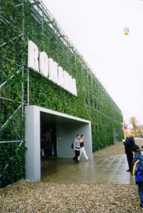
Author: Doru Comsa
"A pavilion at the last moment," would be a way to characterize Romania's pavilion. System scaffolding created the basic supporting structure for wooden trusses of the roofing. Koolhaas's OSB board was utilized on almost all elements of the interior, which appeared empty. The scaffolding, overgrown with climbing ivy, playfully responded to this year's Expo theme. It's just a pity that in places the ivy was plastic, which somewhat degraded the generous ecological gesture.
Spain
Authors: Antonio Cruz & Antonio Ortiz
The Tonis presented a very excellent to even genius spatial concept of the pavilion, where the central space was filled with a public square along with an adjacent restaurant and stage. The furniture, though somewhat in the spirit of beer fests, nonetheless, the wonderful wooden stump pavement made all doubtful comments disappear. Unfortunately, the exhibition was not particularly interesting. As a memento, we took home fragrant pieces of fresh cork with which the entire pavilion was clad and also smelled appropriately from afar! For reassurance - we took the cork from the bales next to the pavilion.
Switzerland
Author: Peter Zumthor
Today, the probably most famous Swiss architect, Peter Zumthor, convinced us of his genius and sense of humor. Already at his spring lecture in Brno, he had piqued our curiosity and certainly did not disappoint. Neatly stacked piles of Swiss wood dried out during the Expo, so after the exhibition ended, only an asphalt patch remained on the site. Let's hope the money taken for the wood paid for its transport to Germany. The pleasant wooden labyrinth was filled with musical instruments in the hands of Swiss musicians, and the Swiss restaurant was also refreshing; however, the culinary background needed a bit more finishing. In any case, Zumthor demonstrated that he knows how to make architecture, and Switzerland certainly did not lag behind the events, quite the opposite.
Turkey
Author:
The Turkish pavilion, although it may not seem so at first glance, drew us in for a visit. However, it did not bring us many experiences; nonetheless, it was cultivated and material-friendly. However, something was still lacking for a fascinating impression.
Hall 26
Author: Thomas Herzog
The environmentally conscious architecture professor from Stuttgart is the author of a large exhibition pavilion, where the pavilions of Asian countries were located. The interesting long-span cable roof structure serves as the main aesthetic expression function and is truly worth seeing. If only the structural truth found resonance at the last piece of the Brno exhibition center, formalism, formalism...
Bertelsmann AG
Author: Karl Karau
The media giant did not fall behind either and also built its pavilion. The main content was a cinema that occupied a steel bun. It is a pity that we were unable to observe the magnificent lighting of the ellipsoid, which could rival even such a piece as The Tower of Winds in Yokohama by Toyo Ito.
The English translation is powered by AI tool. Switch to Czech to view the original text source.


0 comments
add comment