House K

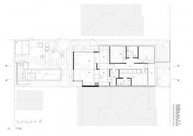
The clients for this project – a couple and their two kids – wanted a single-story house while also retaining as much of their garden as possible on a relatively small block. The design strategy was to remove the old lean-to and add a small 50 m² extension of connected living spaces, increasing the total footprint of the house by 30 m², making the most of each space by overlapping functions rather than adding a new room for each.
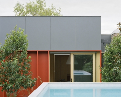
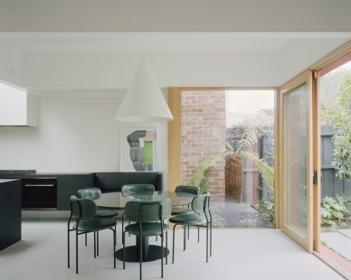
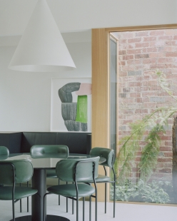
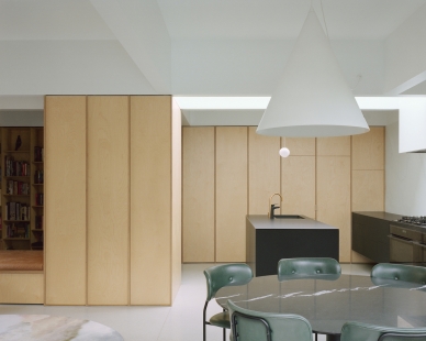
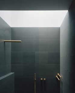
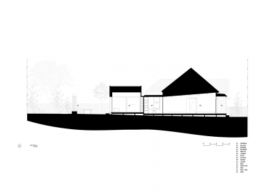
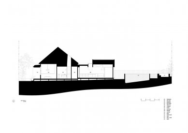
The new addition is set back from the northern boundary to maximize natural light and create two aspects for the living room. Internally, the coffered ceiling volumes over the extension reference the cellular plan of the existing weatherboard house by creating a series of loosely defined spaces above each ‘room’. This gives a sense of spaciousness and light by increasing ceiling heights where possible and adding a skylight into one of these ceiling voids to bring natural light deeper into the house.
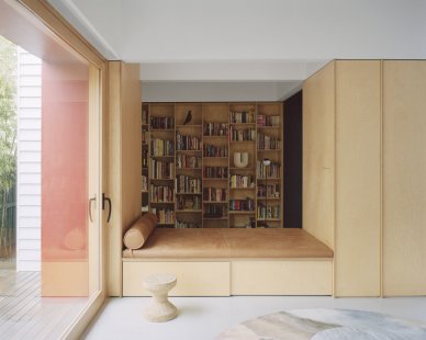
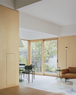
The new spaces are anchored around a storage volume housing a concealed, retractable TV and other tech and a day bed which creates a connecting space in between the study (the last room in the existing house) and the new living area. The landscape and pool continue this approach outside by overlapping different zones for planting, swimming and gathering. Mirroring the daybed and storage volume inside, the garden is punctuated by the above-ground pool, a long concrete bench and the vertical volume of a custom steel outdoor fireplace.
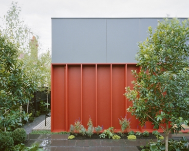
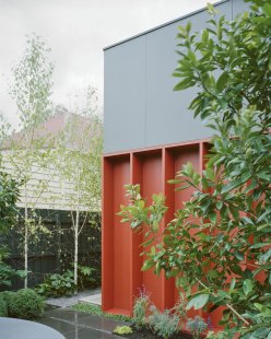
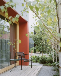
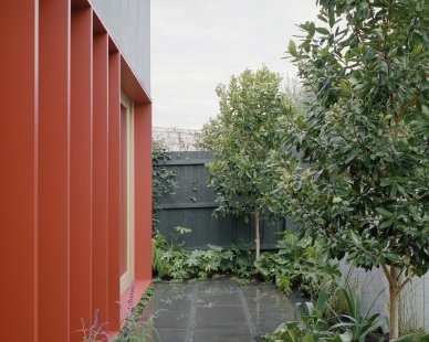
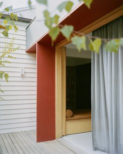
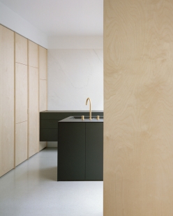
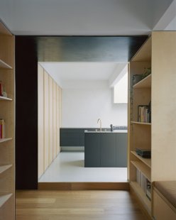
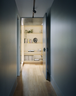
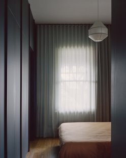
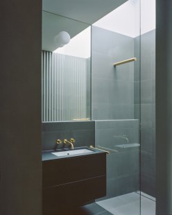
The materials and finishes are applied in blocks of texture and color to define different elements or sections of the house. The existing house is divided into two – a light volume for kids bedrooms and study, and a darker ‘moody’ volume housing the main bedroom/ensuite and the corridor connecting to the new extension. The new spaces are much brighter and more stripped back, with a combination of the terrazzo floor, plywood joinery and walls and two minimal black kitchen cabinets. Externally, the new addition is distinguished from the old house with a combination of dark cladding and a series of the deep red door reveals and fins which give the façade depth, texture and protect openings.
KART Projects | Architecture
0 comments
add comment


