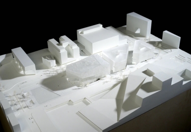
Deichman Bjørvika

The international architecture competition to design Oslo's new main library was won by Lund Hagem and Atelier Oslo architects in 2009. The librarians wanted a house that would inspire visitors to explore all the new facilities and activities the modern library can offer. This motivated us to create an open and intriguing building in which you are constantly invited around the next corner, to discover new places.
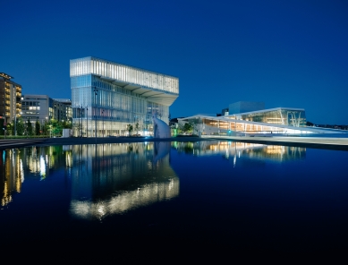
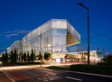
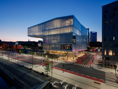
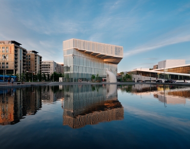
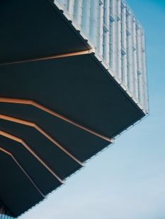
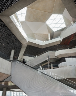
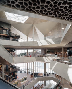
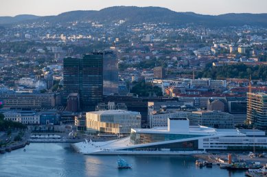
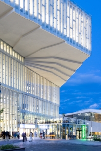
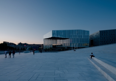
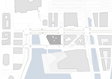
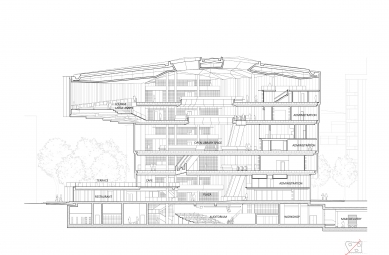
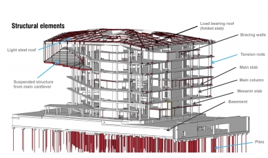
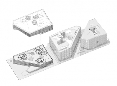
The site is relatively small. In order to avoid building too many floors, the building cantilevers out above its footprint: The first floor above the street to the east, and the fourth floor almost 20 meters out above the urban plaza, creating a protective covering for the entrance. This largest cantilever displays the building to the city and still preserves the line of sight to the neighbouring Opera. The cantilevered floors are suspended from the roof above. The roof has a characteristic folded geometry that provides structural strength.
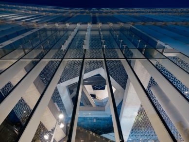
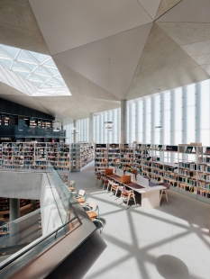
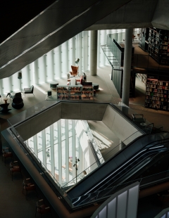
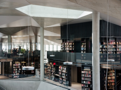
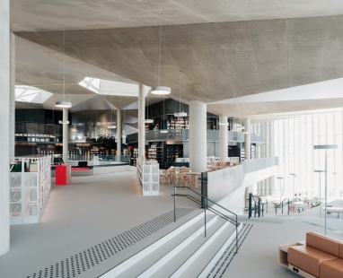
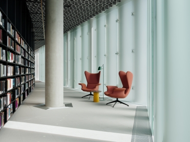
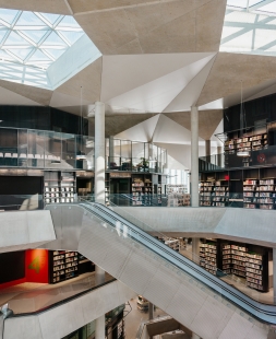
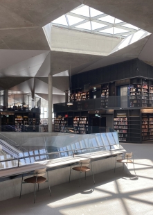
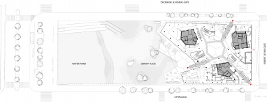
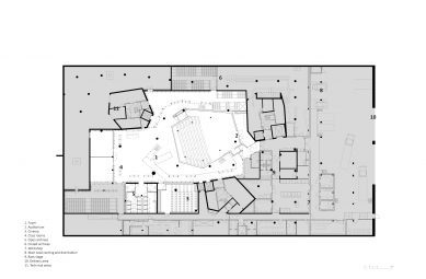
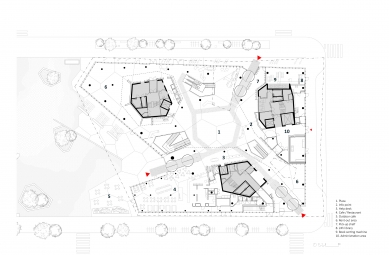
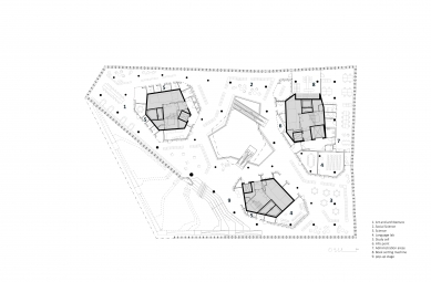
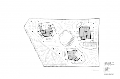
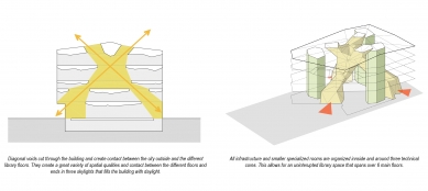
In order to create an enhanced feeling of openness and connection with the city, the ground floor facade is completely transparent. Visitors are received by three equivalent entrances, facing in different directions. Three ‘light shafts' cut diagonally through the building from each of the entrances, giving a glimpse into different sections of the library. The light shafts connect the floors and distribute daylight downwards from three big skylights in the roof.
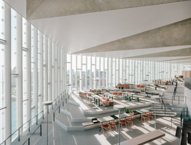
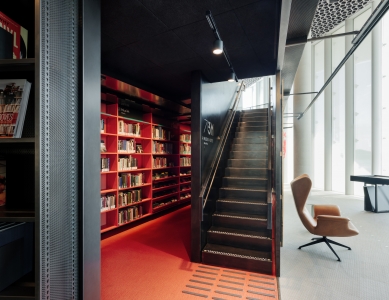
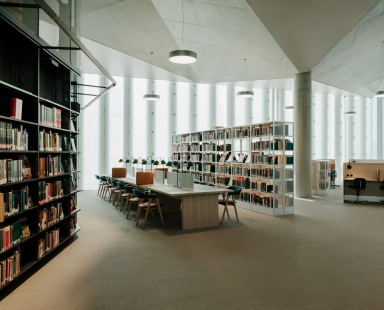
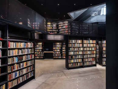
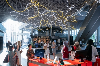
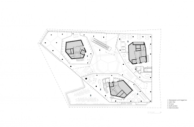
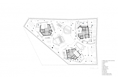
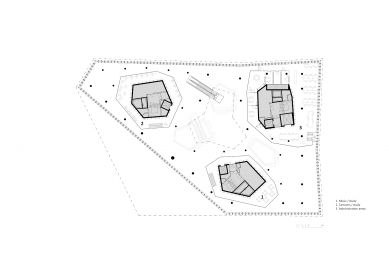
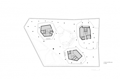
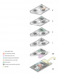
An open public space dominates the interior, with a variety of furniture and activities. Enclosed spaces and niches are organised around three free standing book towers, liberating the facades and allowing daylight to flow in from all directions.
Rooms and niches create arenas for temporal installations and exhibitions, with a rich variety of colours and atmospheres. The open areas have more permanent surfaces in neutral colours and robust materials. The concrete structures around the light shafts and in the folded roof are lasting elements that give the building a permanent and recognizable quality.
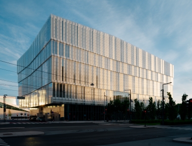
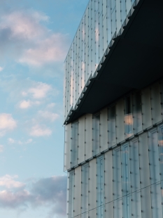
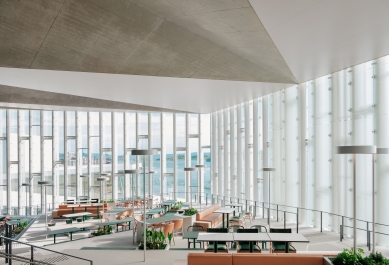
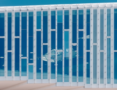
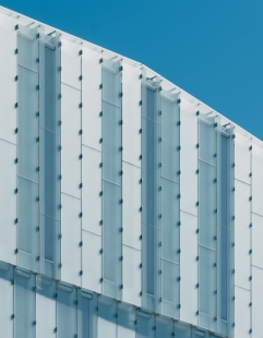
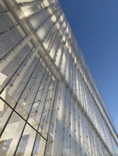
The facade combines high insulation value and even distribution of daylight. Narrow insulated panels alternate with narrow glass panels. The diffused glass of the interior eases the impression of the closed panels, creating a soft and even interior light. The facades are relatively closed in order to strengthen the impression of the light shafts and the library’s inner life and activities. In the corners of the building panoramic windows open views in different directions, lending variation and tension to the interior.
Deichman Bjorvika is an environmentally friendly building with innovative solutions for facade, ventilation and use of materials.
0 comments
add comment


