Apartment Svätoplukova

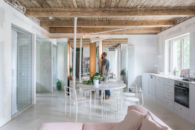
There are 2 main aspects of this project. The first one is reshaping the typically structured space arrangement of the apartment, originally from the 1950s, with the intention of creating a multipurpose living space for a young family, that would put an emphasis on the importance of social interactions.
The second aspect is more theoretical in its nature, we approached this project as an opportunity to take our internal discussions (on the use of space, materials, structures, processes, and the extent of the use-ability of the details in and of itself) and turn them into reality. As what is, what suffices, what is essential, and what eventually does not have to be important starts to lose sense once the focus is shifted towards space itself, the experience, the individuality, and most importantly, the people who will inhabit this space.
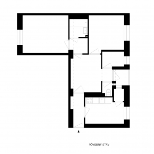
The original space arrangement of the apartment has consisted of a hall, which has led to a kitchen that had a small storage room and access to a modest living room, a guest room (that originally served as a maid’s room), and a toilet that directly neighboured the loggia. A bathroom, which was located centrally next to two bedrooms, was located at the end of the apartment.
Our concept opens the apartment up - in the space, materials, and construction, in height but also in width. It is divided into two tracts that are defined by the construction system of the building itself.
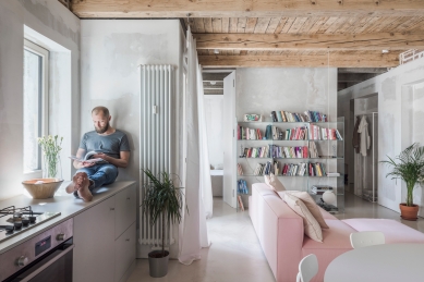
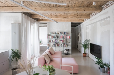
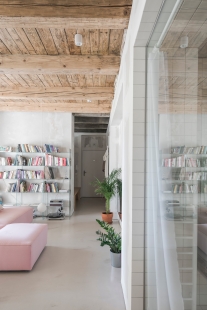
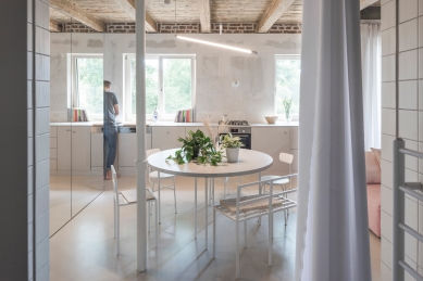
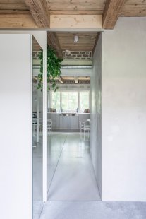
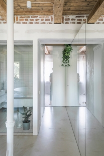
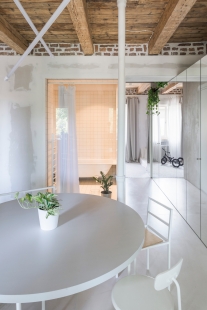
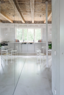
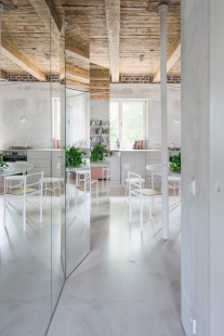
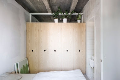
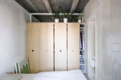
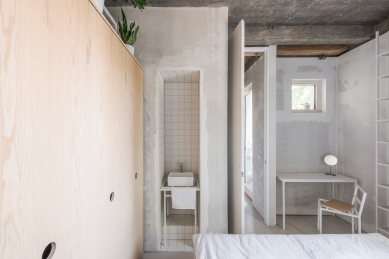
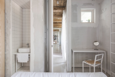
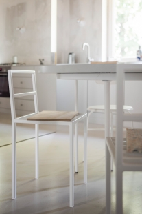
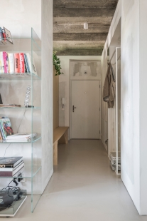
The apartment is oriented towards the west-east. The day-zone is located in the middle of the plan, connected to the bathroom, loggia, and the entrance area. It contains a large kitchen unit, a round dining table, a living space, and a mirror set piece, which defines the boundaries of the space and creates a connection between the beginning and the end of the apartment. This mirror also serves as an entrance to the toilet and two additional storage spaces. The entrance area is additionally lit up with a fanlight, that is located above the cupboard in the bedroom.
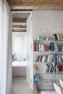
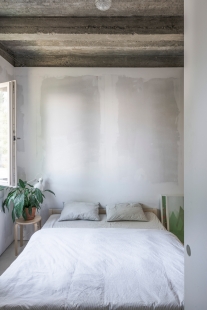
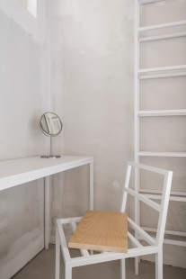
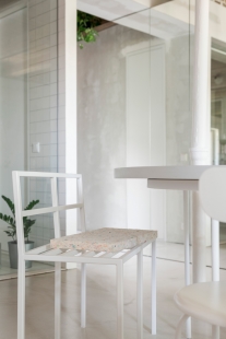
The bedroom is located near the entrance and on the opposite side of the plan as the kid’s room, which provides sufficient intimacy and privacy, while space-wise, these two rooms are designed so that they are still a part of the day-zone. The bathroom is entirely “open” towards the kitchen and dining table through a large glass wall that can be (in case of a need) covered with a curtain. The furniture itself is largely tailor-suited by a carpenter, some of the elements are rather special, created as our internal furniture experiments.
Kilo / Honč
1 comment
add comment
Subject
Author
Date
Ciste, lahke a hrave
04.06.20 10:46
show all comments


