Administrative Center Reding Tower 2

It's not the first thing that comes to mind when you enter the administrative complex REDING TOWER 2, but the question of adequacy will certainly arise for the perceptive visitor, and its echo will be felt from various perspectives and in different contexts. Along with it will be considerations of what is essential in architecture, what message it carries, and so on.
About the peripheries
A previously published contribution about the 1st phase – Administrative-Operational Building REDING, a. s. /1/ – named, so to speak, the substitutive trinity role of architects in the urbanization of suburbs. Although the location on Račianska Street in Bratislava can no longer be considered a suburb, much of what was said back then about the unclear development of the city and the interventions of investors and contractors unfortunately still holds true today, often even more acutely. Let us only mention the recent cases of the destruction of entire structures of valuable industrial architecture, the so-called Bratislava industrial, which was originally also on the outskirts of the city, but after being engulfed by the city and the desire of investors, it fell into total peripheral interest and ultimately into history. It is striking how the peripherality, provinciality creeps back in under a different guise to places that had their unmistakable genius loci, but also onto the heads of architects.
A consistently commendable example of entering former peripheries is the urbanism of Račianska Street, formerly "Februárka", established by architect Štefan Svetko in the 1960s. The tandem of Vitko – Kobák is well known for their obsession with broader connections, not only spatial but also temporal, of any work that touches on public space, even partially. You can read about the broader "február” context as well as the closer one with the former AB Kosmetika building in the first urban-architectural study of the site of the former operational yard of REDING from 2001, which already hinted at it. Fortunately, in the case of REDING TOWER 2, they "didn't forget anything" and even managed to "learn something." I mean that they did not remain mentally anchored in the fertile years of the first decade of the millennium and moved further in the search for adequacy. It should be noted that this search was aided not only by the changed times but also significantly by the project's investor.
About inserting, closing, and opening
Let us return to those feelings. The older I get, the more they seem to guide me. They are often traces of unclear experiences that confront me with reality. Streets like Račianska are passed by a person countless times in life, but they do not pay them special attention. The situation can change dramatically with the removal or insertion of volumes and elements. We are almost getting used to the fact that something disappears with new developments. This is quite natural, but it also depends on how it happens. Here, the slopes of vineyards and the silhouette of the Carpathians have long been a backdrop – commonplace, quite natural. Sitting in a tram or a car, you hardly notice them. A bad feeling arises when a few, even beautiful, boxes cut you off from this silhouette. Something bothers you about it, but in the end, you mostly get used to it.
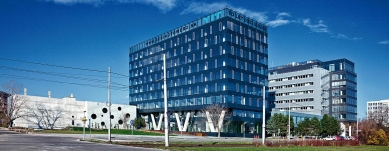
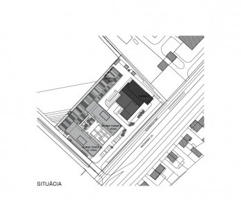
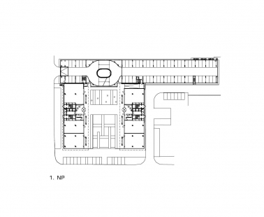
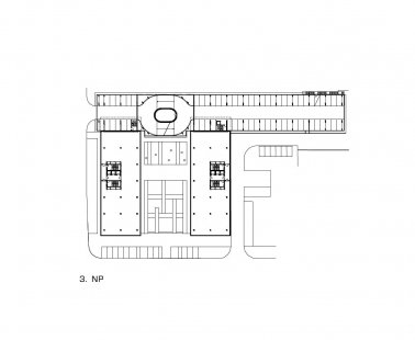
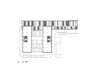
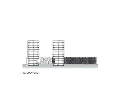
Architects Peter Vitko and Kornel Kobák with their team avoided this internal collision. The recently realized "head" object of REDING's headquarters was left untouched in its proper form. Already at that time, they established the principle of placing the administrative block with its narrower gable end facing the street. Above the low two-story part, the backs of the vineyards can still be perceived from a sufficient distance. In the 2nd phase, the authors inserted a new structure behind and next to the original object in the form of a horizontal inverted F. It consists of two administrative blocks quoting the main block of the first phase and a low longitudinal mass of the garage section, which does not exceed three usual floors and is partially set into the slope's base. The rarely seen orientation of the open courtyard to the street evokes the nobility of the good old days. The publicly accessible and slightly raised micro-square with an elevated agora with V-shaped pillars is simultaneously the cheapest entrance hall. You want to linger there for a moment and just watch the stage of life. The courtyard should be closed on the southwest side by the second administrative block. Its non-realization is (for now) the only significant shortcoming of the work.
Overall, however, the work with the inserted and omitted volumes evokes a sense of natural "tidiness" of the space, simply that it should have been this way. This is simultaneously a prerequisite that even after many years, the entire complex will function just as well – outwardly and inwardly. And if we return once again to the highly valued Svetko's Februárka, this is, with the passage of time, yet another commendable contribution to the urbanization of gaps or entire sections not only of Račianska Street.
About decision-making and restrained freshness
If the urban and volumetric-spatial concept is well thought out, drawing up and designing the building should already be a child's play. Known typological types, operational schemes, construction details, and omnipresent standards, regulations, and certifications. But if you yield too much to their dictates, suddenly you are not making architecture, but a puzzle. Among these pieces, the authors managed to move with a certain grace. The building has a few proven elements and solutions, even those you might think, "this is not how it's done." However, when perceiving the whole and the details, I did not feel forced or tense. For example, compared to the first phase, where the garage is situated "normally" in the basement of the building, in REDING TOWER 2 it is in a separate tract, which is not even directly communicatively connected with the administrative blocks. It is designed as a multi-story public parking lot in a democratic spirit, where no privileges play a role (this can also be an aspect of architecture).
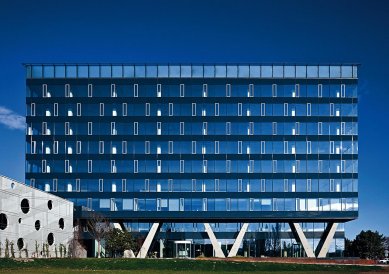
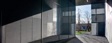
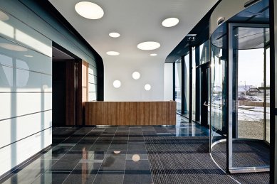
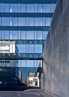
So if you come to work by car, which ultimately you might not have to do at all with excellent transport connections of all kinds, including bike paths, you will exit the garage into the air to a passage cleverly connecting the ground floor of the first phase with the new courtyard, and further through a covered arcade into the administrative block. Certainly, geological conditions and the groundwater level played a role in this decision, for which the zero point was ultimately raised about 1.2 m above the level of the original terrain. This decision, which did not go "against nature," has a few good effects: a raised courtyard with very gentle sloping barrier-free ramps and savings on embedded materials, energy, and operating costs. Also from other selections and decisions, there are no feelings of collisions or stress. The acknowledgment of function on the facades is traditional and fresh at the same time. Despite a significant reduction in the range of materials compared to the first phase, the complex does not come across as undernourished from an artistic perspective. The glass facades discreetly refer to the grid of ventilation windows of REDING 1. The low inner sill of the opaque part contributes to both stability and a sense of security, providing a good view of the happenings in the ground floor. The "patchwork" of strips of expanded metal with varying mesh sizes, which wraps the parking house, appears discreet, yet not boring. Full concrete walls are lightened by perforations with round openings, allowing for natural lighting and ventilation of the garage module with communication ramps. The principle of "restrained freshness" applies naturally also in the interior as it was realized at the time. The pleasantly dimensioned and designed entrance hall only serves as a small information and distribution center, yet it does not give up on the moment of an important first impression for visitors. Office spaces are airy, bright, with natural ventilation and practically unlimited variability for large and small users.
About the green plan
The authors certainly did not consider ecological principles only in the spirit of the general trend and avoided often formal gestures. Apart from technologies and solutions respectful of the environment, which are already quite common, though still not self-evident, they focused more on the psyche of a person in relation to the existing, albeit in this case already significantly transformed, surrounding landscape. They gently remind it, serving it in various doses and contexts in both the interior and the exterior. I like that employees and visitors to the building practically do not lose visual contact with the natural framework anywhere in the house (except in the background). This has a very calming effect and is certainly not insignificant in terms of employee productivity or creativity. Visually following the slopes of the vineyards, the roof of the garage tract is "green," and a web of guiding cables is stretched over its facade for climbing plants or plants that wrap around like vines. The greenery from the vineyards, the roof, and the facades can thus gradually grow into the courtyard space and plantings in the area according to its own green plan.
About adequacy
The question in the title could be rephrased to "how much EFFORT does adequacy cost?" Because aside from financial, utility, and many other mostly economic parameters, which are set by the investor, there is also the authors' effort for uniqueness and their own statement. If it, as in the work of AVK ARCHITECTS, is accompanied by a desire to meet the requirements and not harm (the client, the surroundings, etc.), balancing between these poles is not an easy task at all. The path, the means is – as in good families – adequacy. This building is a strong example of consciously cultivated adequacy for this special time and towards the future.
Note:
1 Špaček, Róbert: When the city has no opinion, the investor wants, and the architects know. ARCH 10, 2005, no. 1, pp. 18 – 23.
The English translation is powered by AI tool. Switch to Czech to view the original text source.
0 comments
add comment


