
Baumaxx Hypermarket

 |
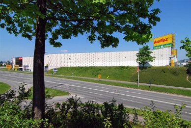
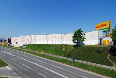
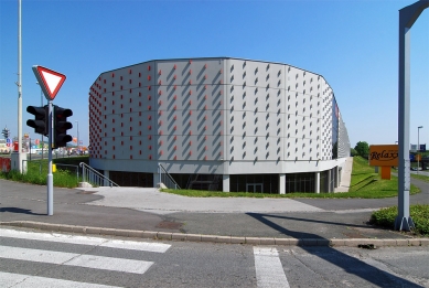
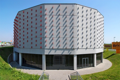
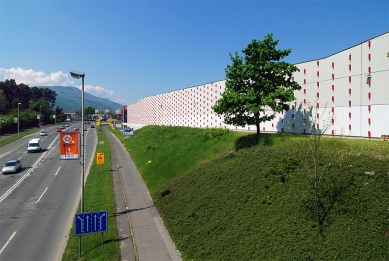
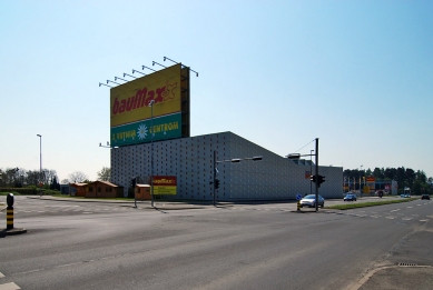
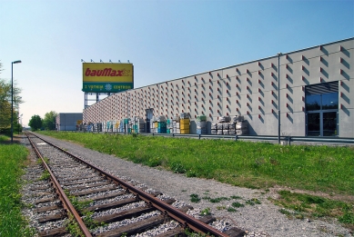
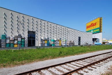
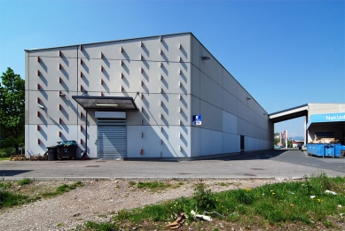
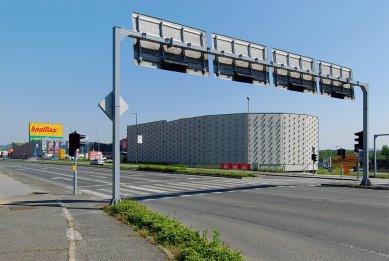
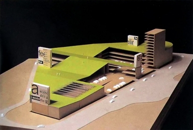
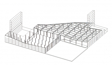
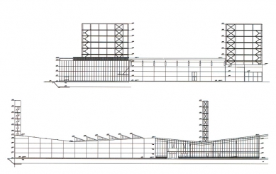
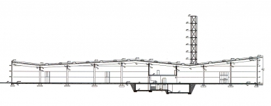
An urban concept of reversing the figure/ground ratio of american hyperkmarkets. A celebration of traffic, performed by cutting the regular parking patterns into the irregular plot contour, should be strenghtened by the green roof substance, as a new elevated ground, publicly accessible. The negative reaction of developer turned the former concept into the new perceptual reality – 'no trespassing'. The landscape is thus to be observed /mentally consumed/ remote-controlled. The surreal nature of fireplace on the roof terace of de Bestégui appartment by Le Corbusier is equaled by the virtual statis of the landscaped zone in the Hypermarket. All inward-bound planes are entirely glazed, all perimeter ones are mute, but user-friendly. A green roof as a common denominator and recreated artificial topography. Four billboards 'anchor' the vast slopes of the House to the site and turn to the traffic streams.
Immediately after completion, the Slovens 'discovered' unparalleled similarity with the oeuvre of The Father. What came out of necessity to resolve the tension of the site and objectives of the program, was suddenly seen as a blasphemous remake of Plečnik (the Church of The Holy Hert, Prague 1933). Should a comparable design – in overall layout and formulation of the skin, really be prosecuted? Although we had never considered it as referential to our project, the hints put forward by the high priest of the Plečnik religion, made us think.
Isn's a temple of christianity the right typological ancestor for the house of contemporary 'religion' / that of consume?
What are parallels like / entrance Baumaxx panel/statue of St.Mary over main doors.
Or bell-tower/billboard, but a document of shifte social concerns / from the spiritual to the material?
Could the Venturi0like semiotics testify of the similar systém of signifiers, appropiated for the masses?
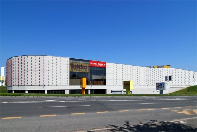
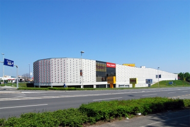
Colour 'classification is an attempt to handle architecture by ordinary, if not banal, criterie / size, smell or colour. By assigning colour, as a consumption-profiled term to the projects, we are trying to resume the manifold facets ambition of every single one to an understandable and communicative platform but also not to limit ourselves with a couple sizes. On the contrary, different shades of a single colour, could transmit even subtle expectations of particular design. We think of a house in its natural appearance: wood is wood, brick is brick, concrete is concrete. Even the glazed elevations from the first facade concept exploited the properties of insulating wool as such. We used its yellowness as a part of the Baumaxx corporate identity, attaching simply the red logos ontoit and blurring them slightly with corrugated polycarbonate sheets. Colour as a marking strategy. In the theory of visual communication yello and red are considered as 'cheap', low-budget colours. That is why such D-I-Y markets use them.
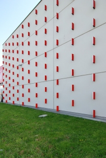
Finally, the client rejected the solution in favour of prefab concrete panels. In order not to loose the impact of 'active' elevations. It was decided to remain in the realm of readymades by choosing to put a layer of custom-made traffic reflectors in signal red and silver atop of concrete. The 'op-art' efect is addressed to the drivers as major circulation force on the spot. Such a kinetic experience of the envelope – silver from the north, red from the south, nautral from the west, blends with the firm's corporate colours. In the night the House turns to the pure Light.
Meta-Balkan: Njirić+Njirić 1997-2003, El Croquis 114/II, Madrid 2003, p.36-49
0 comments
add comment